
Redesigning a Generative Legal AI Knowledge Management Platform for Asia's Largest Law Firm
uipirate
295 views · 17 min read
17 min read | 4 months ago
An AI knowledge management platform sat almost unused at one of Asia's largest and oldest law firms, until a UX redesign made it a daily tool lawyers now trust.
What happens when an AI tool is powerful, but nobody trusts it enough to open it twice?
One of Asia's largest and oldest full-service law firms had already built an Generative Legal AI knowledge management platform for their legal teams. It could analyze contracts. It could extract clauses. It could translate documents and redact sensitive data. It could answer questions across an entire library of files.
On paper, this Generative Legal AI knowledge management platform did everything right. In practice, lawyers tried it once. They got lost. Then they went back to doing things manually.
That's the brief we walked into.
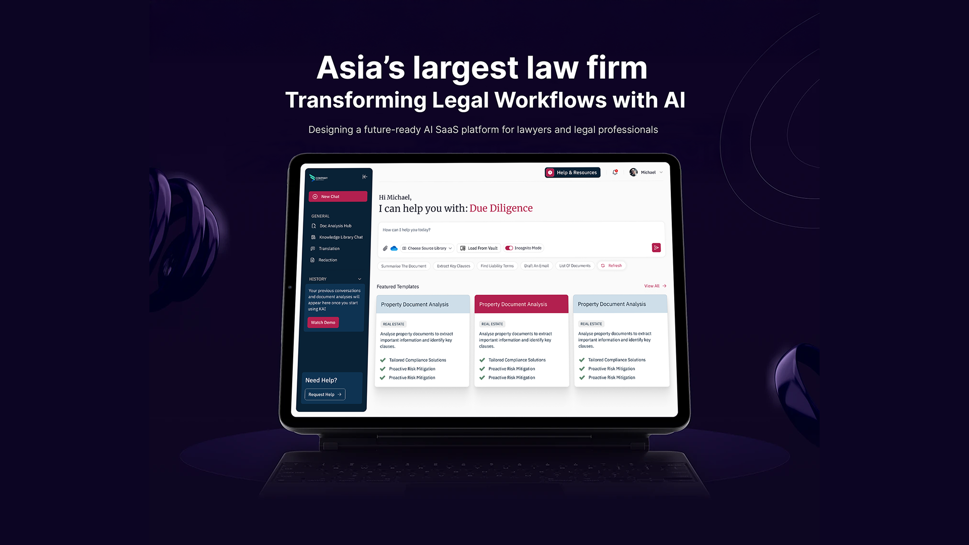
"The tool wasn't wrong. It just never gave anyone a reason to trust it."
Starting with someone else's brand system
Before any screen work began, the firm handed over a full brand system. Values. Logo usage. Print and digital color rules. Typography. Collateral guidelines. This was a redesign, not You won't find logo usage guidance or the firm's collateral decks here. Neither is shareable under NDA.
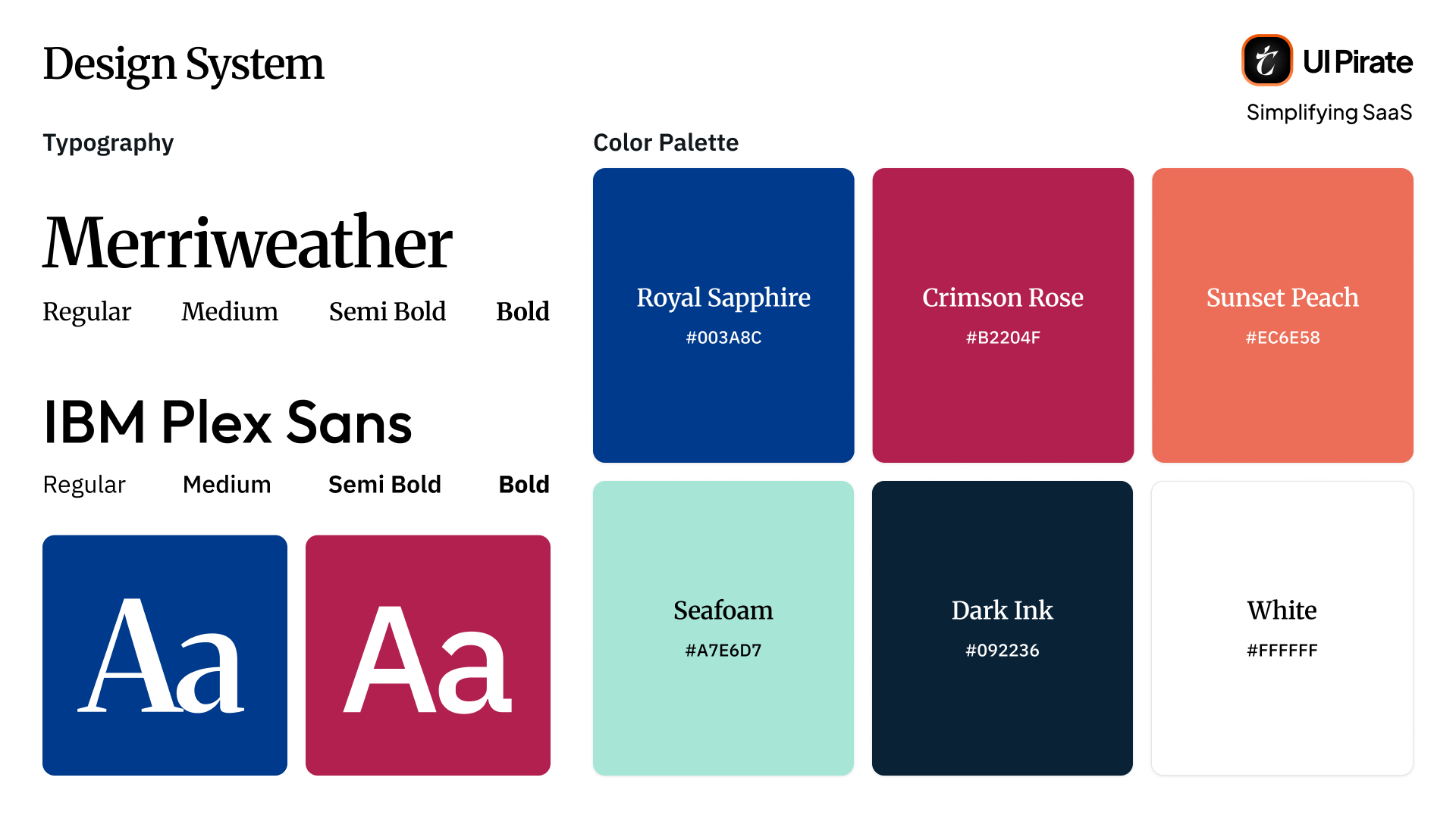
Colours
The palette had six colors, each with a defined role:
Royal Sapphire (
#003A8C), the original primary color, built to signal trust and traditionCrimson Rose (
#B22045) and Coral Charm (#EC6E58), added for warmth and adaptabilitySunset Peach (
#A7E6D7), used for clarity and a lighter accent toneSeafoam (
#A7E6D7), used for highlightsDark Ink (
#092236), used for depth and groundingWhite (
#FFFFFF), for base surfaces
The firm specified exactly which colors could pair together. That detail mattered more than it sounds. Enterprise legal software depends on visual restraint. A palette this saturated needed firm rules, or every screen risked looking chaotic.
Typography
For typography, the brand called for Merriweather in headings only, paired with IBM Plex Sans for body and interface copy. This pairing holds up at the density an Generative Legal AI knowledge management platform like this one requires, where Merriweather alone would struggle.
Why the redesign was necessary
The existing Generative Legal AI knowledge management platform wasn't badly built. It was inconsistently built. Chat, document upload, templates, and history had each been added over time as standalone pieces. None of them talked to each other.
Lawyers described the same pattern, again and again. Open the tool. Stare at a blank input field. Close the tool.
"Nothing about the interface told a lawyer what to do first. It just waited."
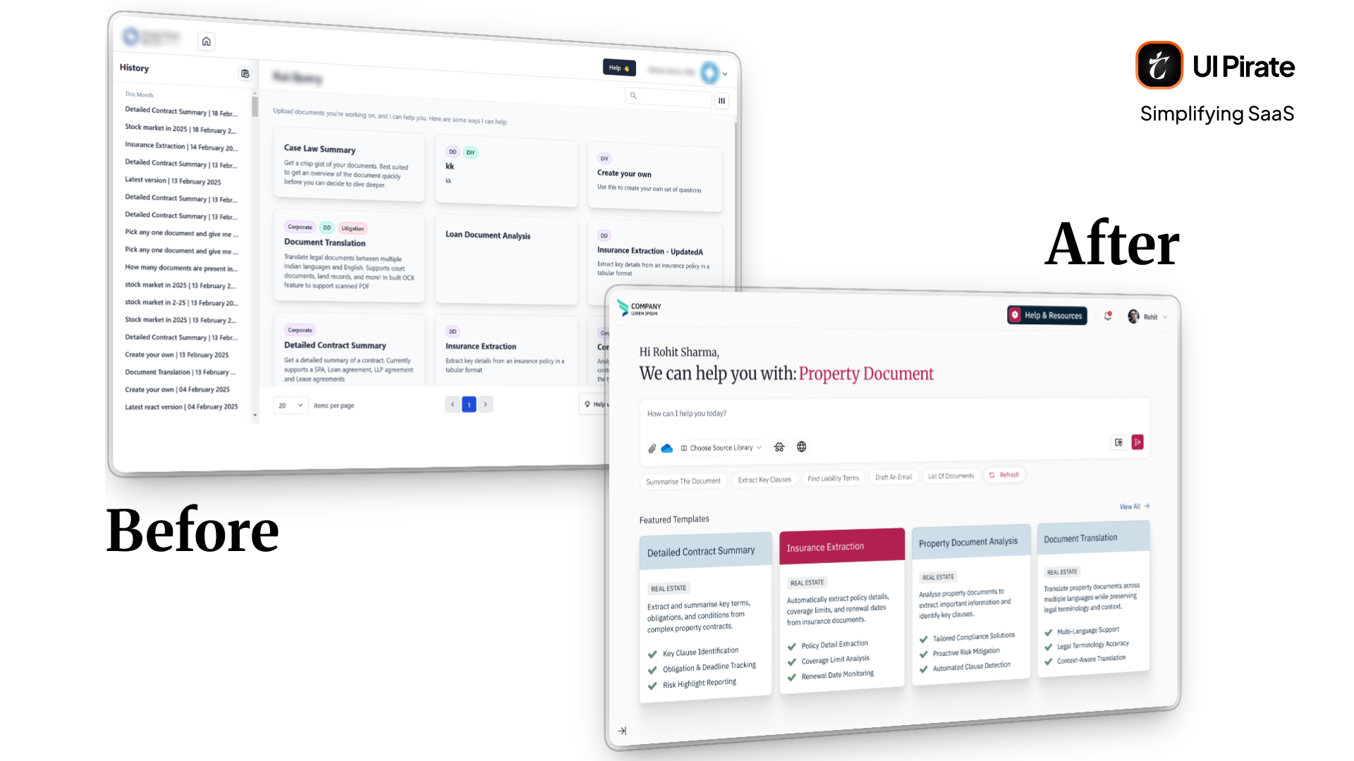
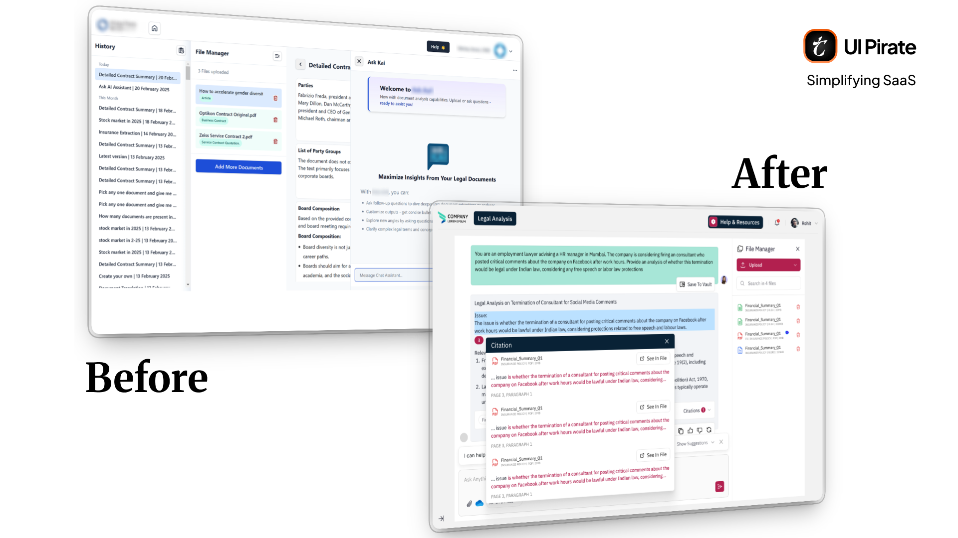
A few problems kept surfacing across the platform:
No guidance on where to start, just a blank input field
Features that worked in isolation but never connected to each other
No clear path from uploading a document to getting a usable answer
That combination was enough to justify a full redesign, not a patch. As we got deeper into the platform, the real complexity surfaced, and the project grew into two full design phases. We're documenting the second, more complete phase here, since it carries forward everything from phase one plus the refinements that followed.
Rebuilding the shell: sidebar, header, and navigation
Before touching any single screen on this Generative Legal AI knowledge management platform, we rebuilt the shell first. That meant the sidebar and header that every other screen would live inside.
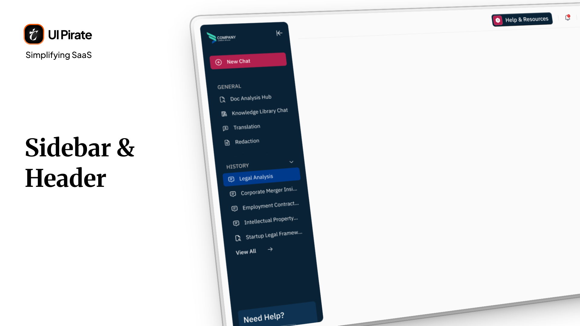
A sidebar that carries the whole platform
The sidebar became the backbone of your entire experience on this Generative Legal AI knowledge management platform. It included:
A new chat button at the top, always accessible
A collapse and expand toggle, so the sidebar could shrink to icons only
A General section: document analysis, the knowledge hub, the knowledge library, chat, translation, and redaction
A History section, listing every previous chat and session
A Help section
You get every core capability of this Generative Legal AI knowledge management platform in one place. No more hunting across disconnected tools. That single change improved adoption more than any single screen redesign, because it gave you a consistent map of the platform, not a new layout to learn every time.
A header built for a formal environment
The header stayed intentionally light. Collapse the sidebar, and the firm's logo takes its place. On the right, you'd find Help and Resources, notifications, and a profile menu holding data controls, the Prompt Vault, and account settings.
We kept the header minimal on purpose. In a platform this dense, every extra element at the top pulls your attention away from your actual work.
The login screen and first impression
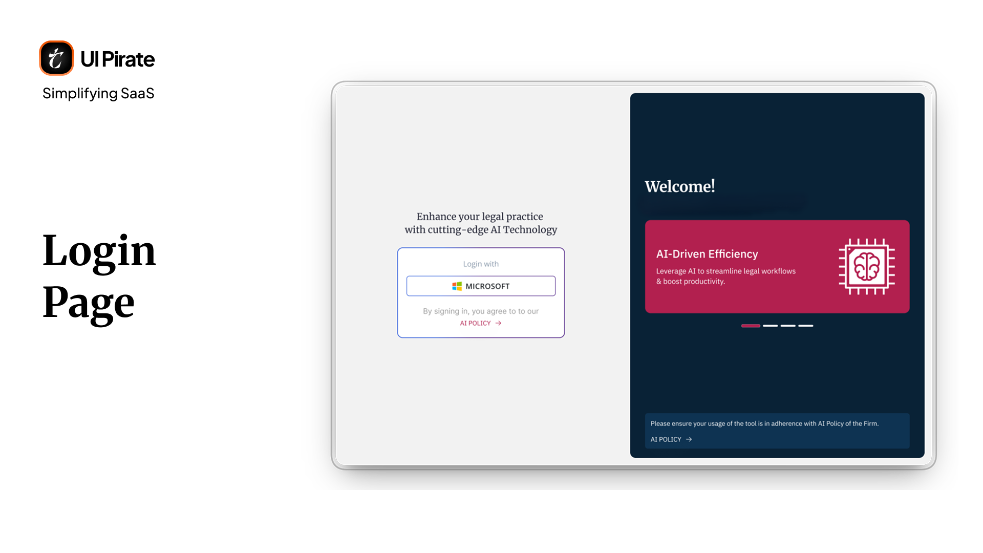
Access ran through Microsoft single sign-on only. That constraint simplified the layout. You'd see a clean login panel on the left, and a rotating carousel on the right introducing what this Generative Legal AI knowledge management platform could do for you.
The carousel wasn't decorative. It gave you, often a lawyer skeptical of AI tools by training, a preview of what you were about to walk into. That preview mattered, before the blank-page problem ever had a chance to set in.
The Conversational Workspace: killing the blank page
This was the single most important redesign decision on the entire project.
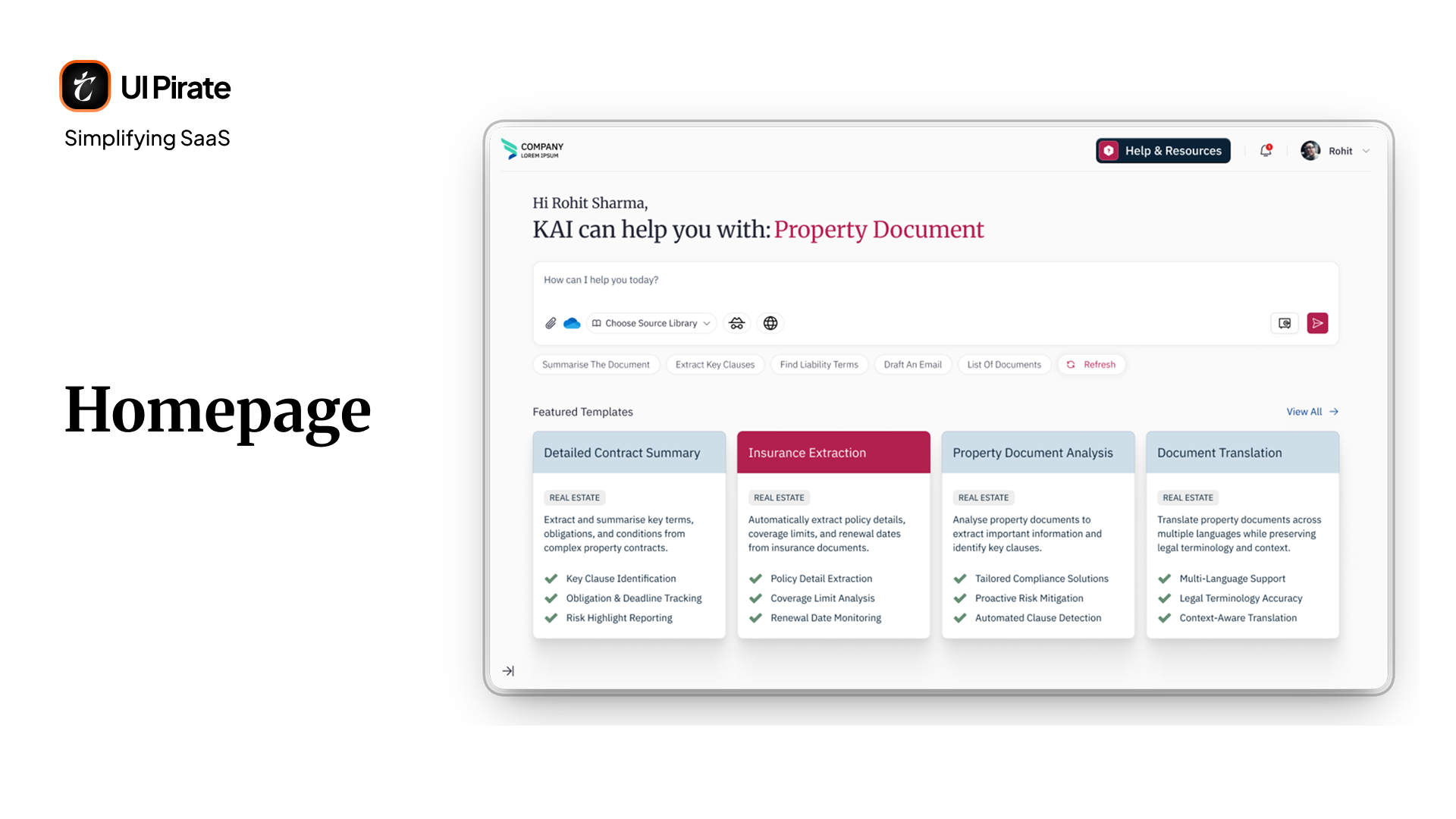
The original homepage was a blank chat box. No guidance. No suggestions. No starting point. We replaced it with a structured landing page instead.
Open the platform, and it welcomes you with a chat box. Below that sits a row of suggestions, refreshed on demand. Further down, featured template cards give you a shortcut into the platform's most common workflows.
"We didn't want the homepage to ask a question. We wanted it to hand you a starting point."
This was a deliberate call on our part. A pure chat product, closer to consumer AI tools, would have been the easier default to design. We ruled it out early, because lawyers don't think in open-ended conversation. You think in tasks, comparisons, and evidence. A blank prompt field actively works against that. The greeting-plus-suggestions model won out for exactly that reason, and it became the template for every entry point across this Generative Legal AI knowledge management platform.
Input states and controls
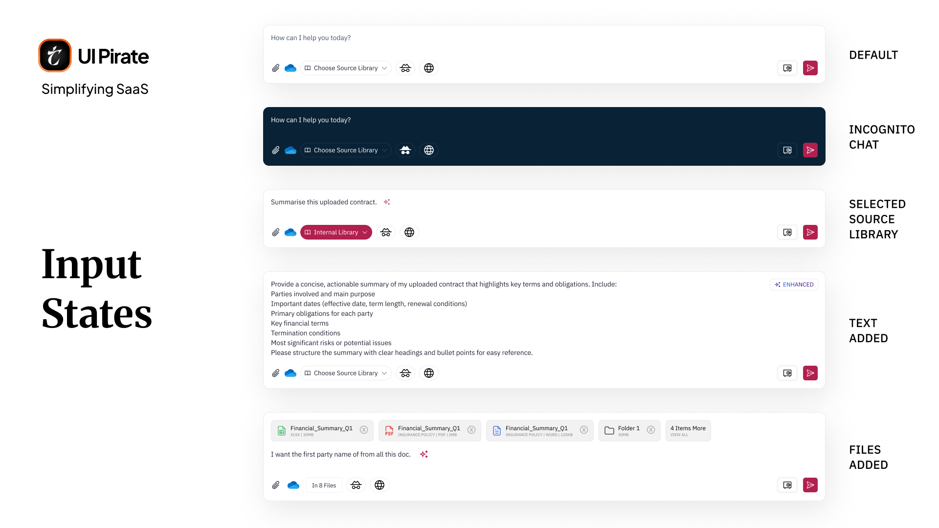
The input box carries more than a text field. Along the bottom sit:
An attachment button for direct file upload
A cloud sync option, connecting to OneDrive and similar storage
A source library selector, so you choose which document library to pull context from
An incognito mode toggle, for queries you don't want logged
An internet access toggle, for web-sourced answers
A Prompt Vault icon
We also designed distinct states for the input itself. One text field needed to represent several situations clearly: default, file attached, text entered, AI-suggested, and incognito mode. Getting these states visually distinct mattered more than it sounds. You need to know instantly whether your query is private, sourced, or still empty.
The Prompt Vault
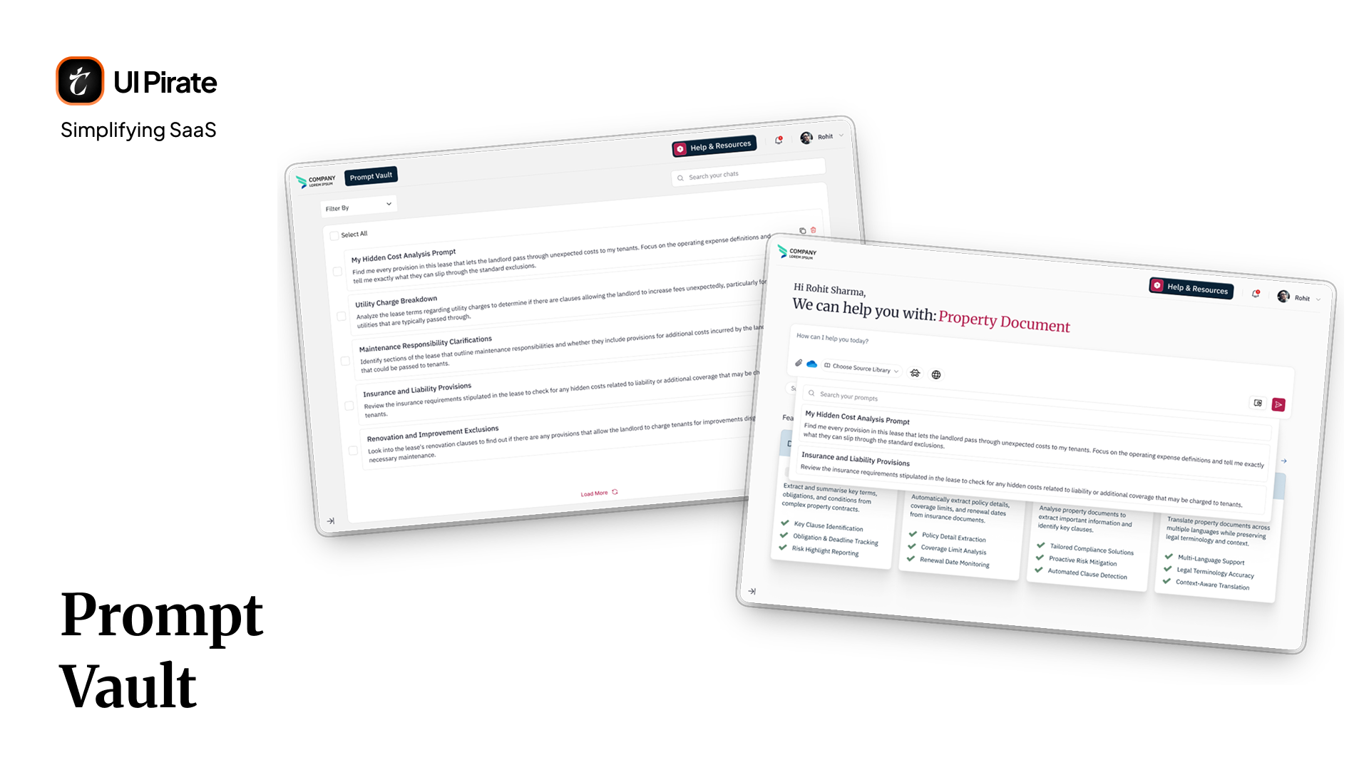
There are two different ways to reach your saved prompts, and it's worth telling them apart. A separate, dedicated Prompt Vault page lives behind the profile dropdown in the header, distinct from the landing page entirely. Here you can see every prompt you've ever saved, copy any of them, or delete the ones you no longer need.
Click the Prompt Vault icon on the input itself, though, and you get a lighter version of the same idea. A bar opens directly below the input, where you can search your saved prompts and load one straight into the current conversation, without ever leaving the page.
Inside an active conversation
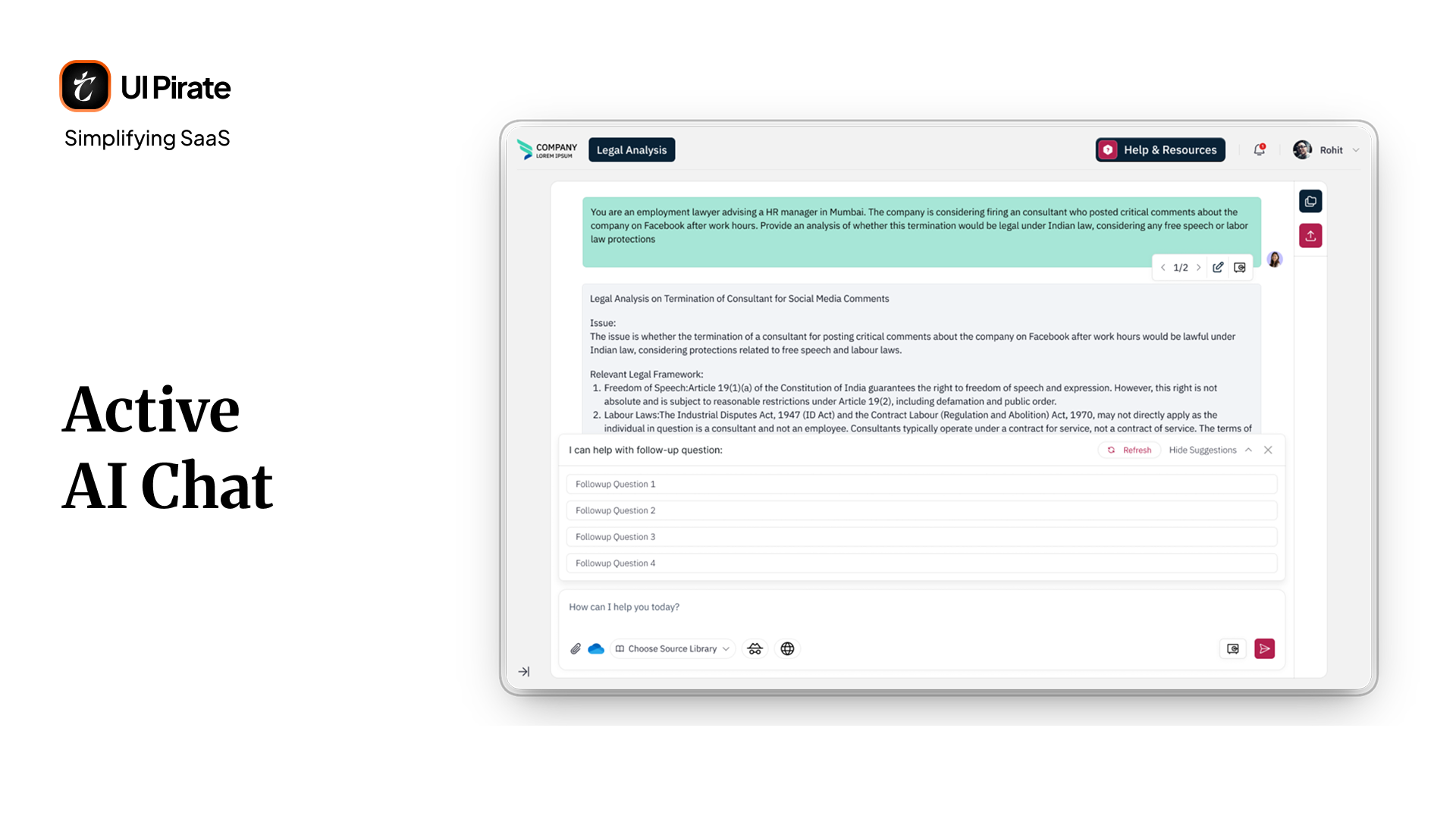
Once you submitted a query, the featured template cards disappeared. The screen shifted into a full conversation view. Every message you sent could be saved to the Prompt Vault or edited directly. Every AI response carried its own controls: copy, like, dislike, regenerate, and the option to move between multiple regenerated responses.
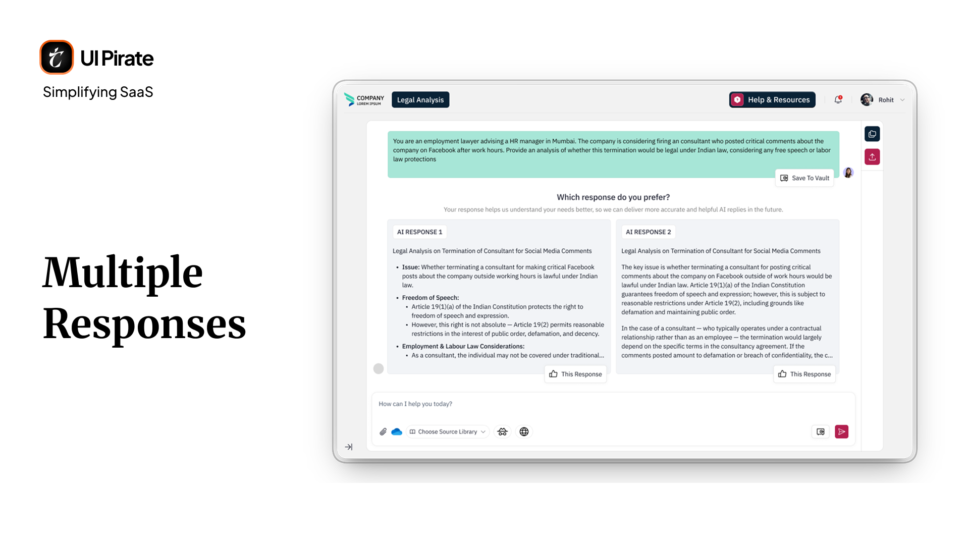
Some responses gave you two alternate answers side by side. You could choose the one that fit your needs, instead of accepting a single output as final.
Above the input box sat a row of suggested follow-up questions, closable or refreshable. Your conversation kept moving, without forcing you to think up the next question yourself.
A feedback system built for a profession that doesn't trust blindly
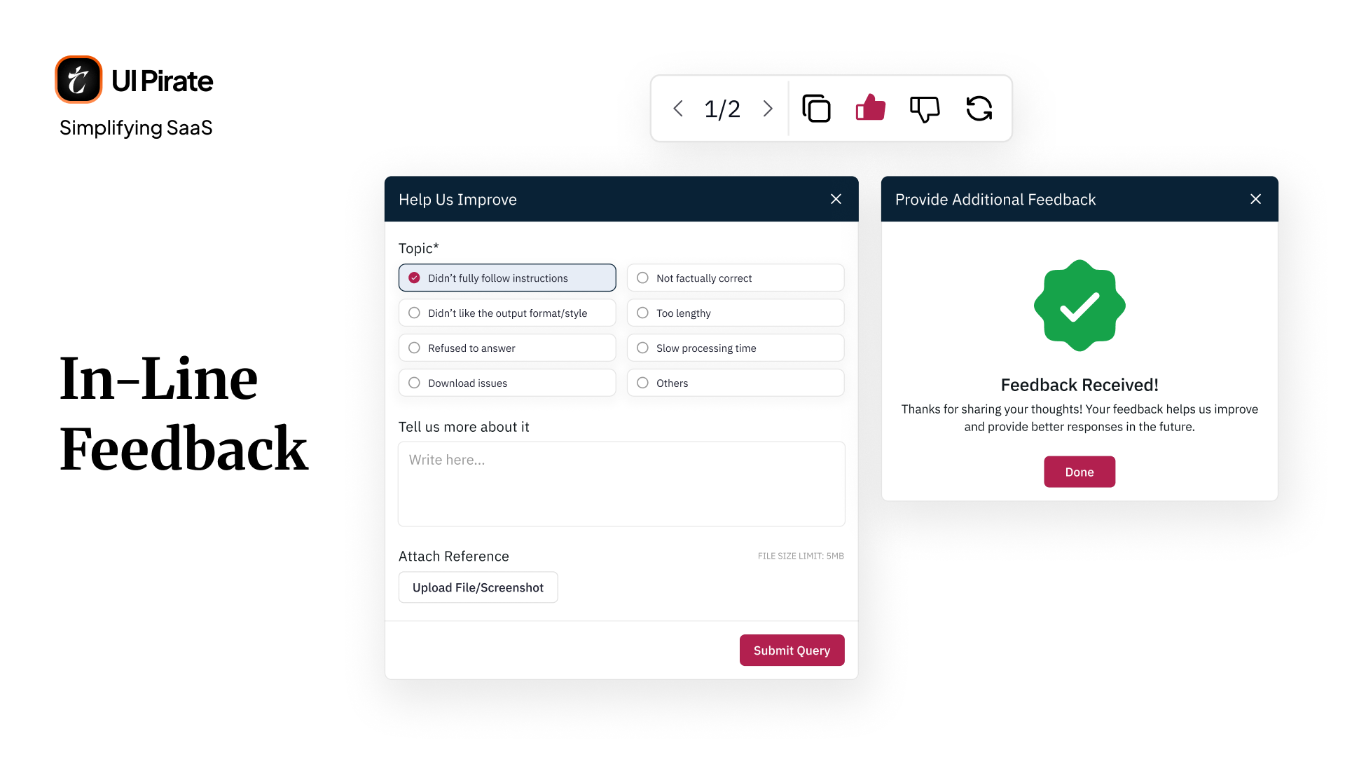
Structured feedback on dislike. Dislike a response, and a structured feedback flow opened instead of a silent dismissal. You could flag the issue as inaccurate, incomplete, poorly formatted, too long, a refusal to answer, slow, or a download failure. You could add free-text detail. You could attach a file if needed.
Choosing between two responses. When a query returned two alternate responses side by side, choosing between them worked as its own quiet form of feedback. Picking the one that fit your needs told the system which direction to lean toward next time, without you having to fill out anything extra.
A time-based prompt for hesitation. The platform also watched for a different signal entirely: time. Spend too long reviewing a response, and a separate prompt opened on its own, asking, "Didn't quite hit the mark? We noticed you're taking a closer look. Help us improve this result." It offered a set of quick options, information missing, something looks wrong, data irrelevant, formatting issues, or anything else you wanted to specify in a text box, then let you submit it. This ran independently of the like and dislike buttons, catching hesitation the explicit feedback controls would have missed entirely.
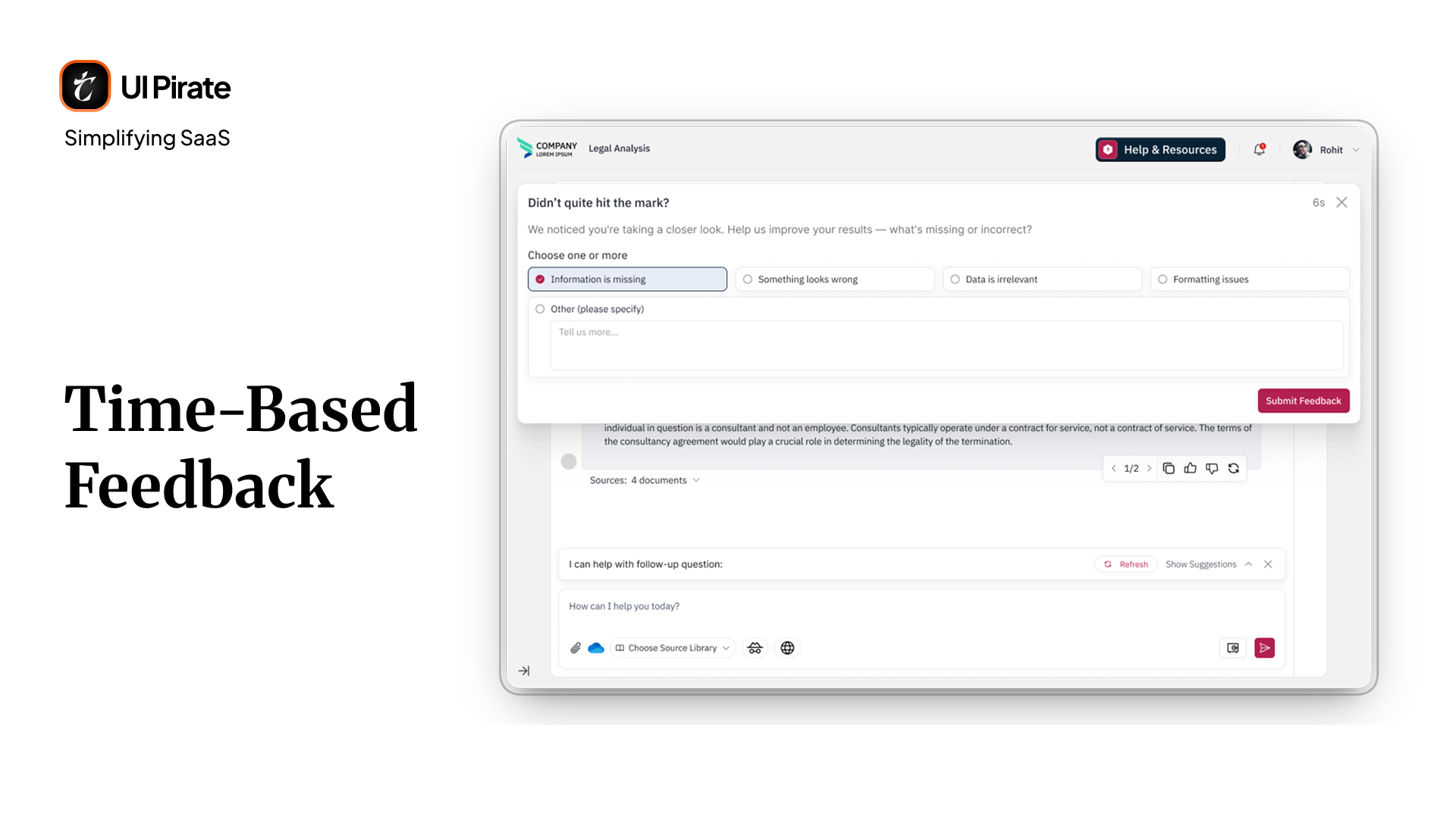
"In a legal tool, silence after a bad answer is worse than the bad answer itself."
This mattered because trust in an Generative Legal AI knowledge management platform isn't built by being right every time. It's built by giving you somewhere to go when the tool gets it wrong.
Citations in chat: proving every answer, not just stating it
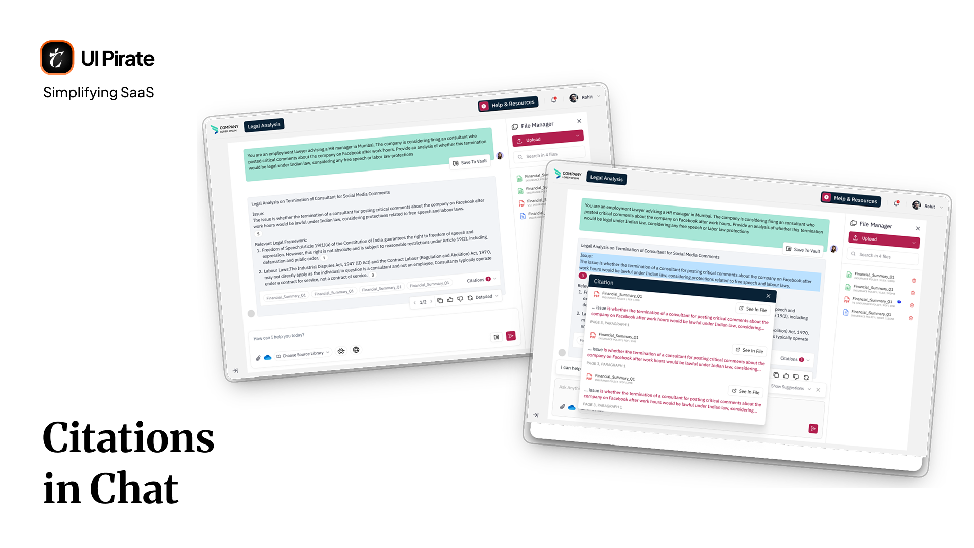
For a legal tool, an uncited answer is functionally useless. Every paragraph an AI response generated carried a small numbered citation marker. Click one, and a Citation dialog opened, showing exactly which source document backed that claim, the specific quoted line, and a page and paragraph reference, with a See in File button on each entry.
Clicking See in File here opens the source document externally, in its own window. That's a deliberate difference from output pages, covered later in this case study, where the same action splits the screen instead. In chat, you're moving fluidly between a conversation and your files. In output, you're verifying a finished result, and staying anchored to the screen matters more.
Below each response, a row of source chips showed up to four documents at a glance. If a response pulled from more sources than that, a Citations count and dropdown opened a fuller modal, listing every file used across the entire response.
We treated this as non-negotiable, not a nice-to-have. Early testing showed lawyers wouldn't act on an AI-generated answer they couldn't verify in seconds. Citation depth became a hard requirement across every part of this Generative Legal AI knowledge management platform, chat included, not an optional layer bolted on afterward.
The file manager: utility on the right side of the screen
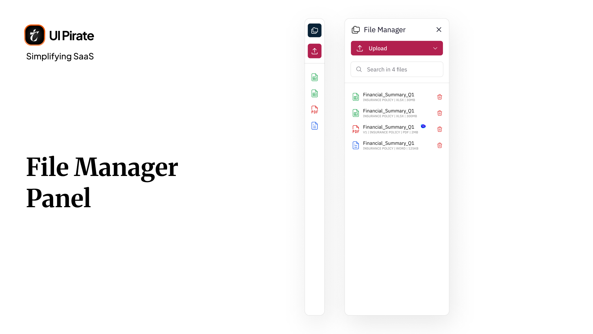
Every core screen on this Generative Legal AI knowledge management platform carried a collapsible right-hand utility panel. Inside a chat, that panel became your file manager. You could upload, browse, search, and delete files tied to that specific conversation, without ever leaving the chat.
Uploading in detail
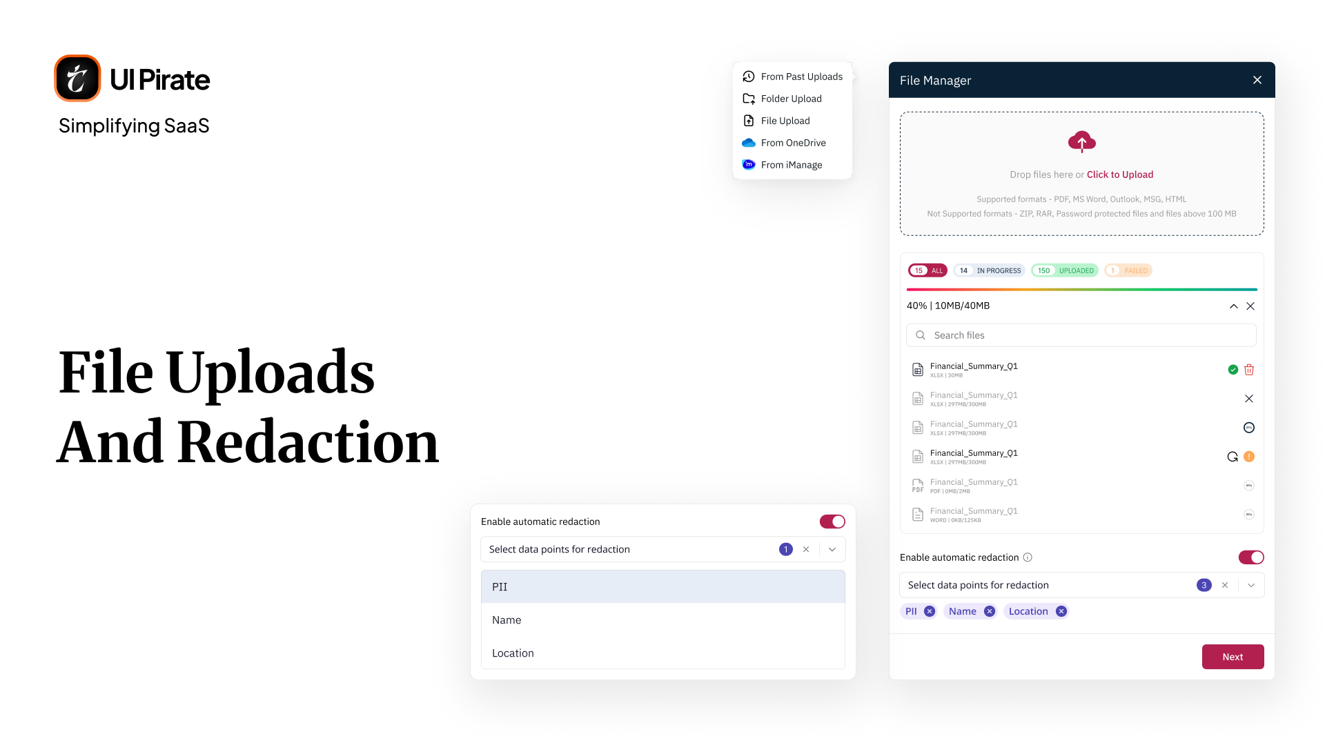
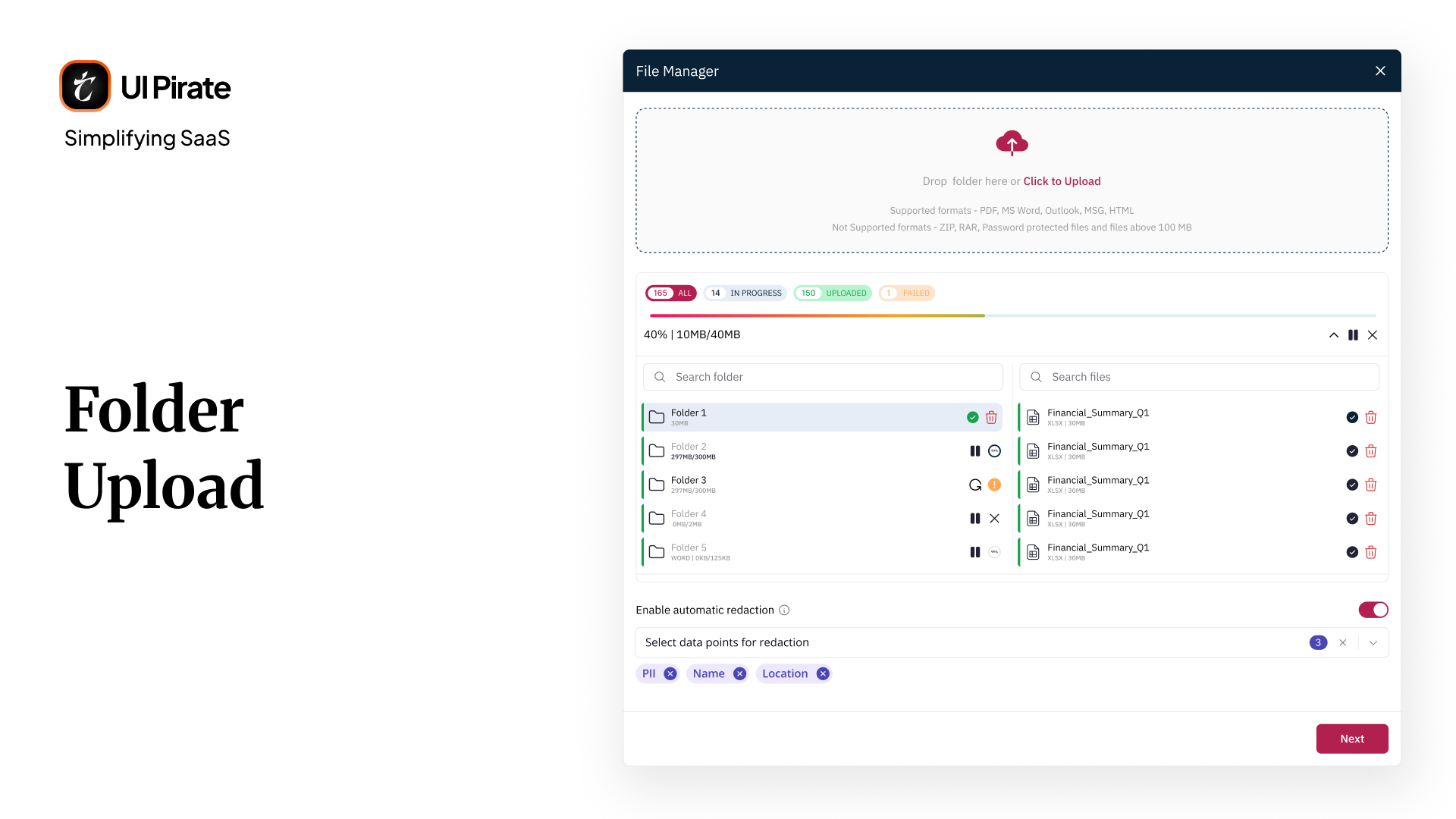
File uploads and redaction. Clicking upload opened a dialog with several paths: past uploads, folder upload, direct file upload, or a connected tool the firm already used for document management, alongside OneDrive. Each path included an automatic redaction toggle, so you could redact personally identifiable information, like names and locations, before a file ever entered the platform. Once you added files, a progress area showed upload status per file: uploading, complete, failed, or retryable, with summary counts across all four states.
Folder uploads. Folder uploads worked differently from a flat file list. The screen split into two panes: folders on the left, and the files inside whichever folder you selected on the right. Click through a folder on the left, and its contents populated instantly on the right, without breadcrumb navigation or nested menus to manage.
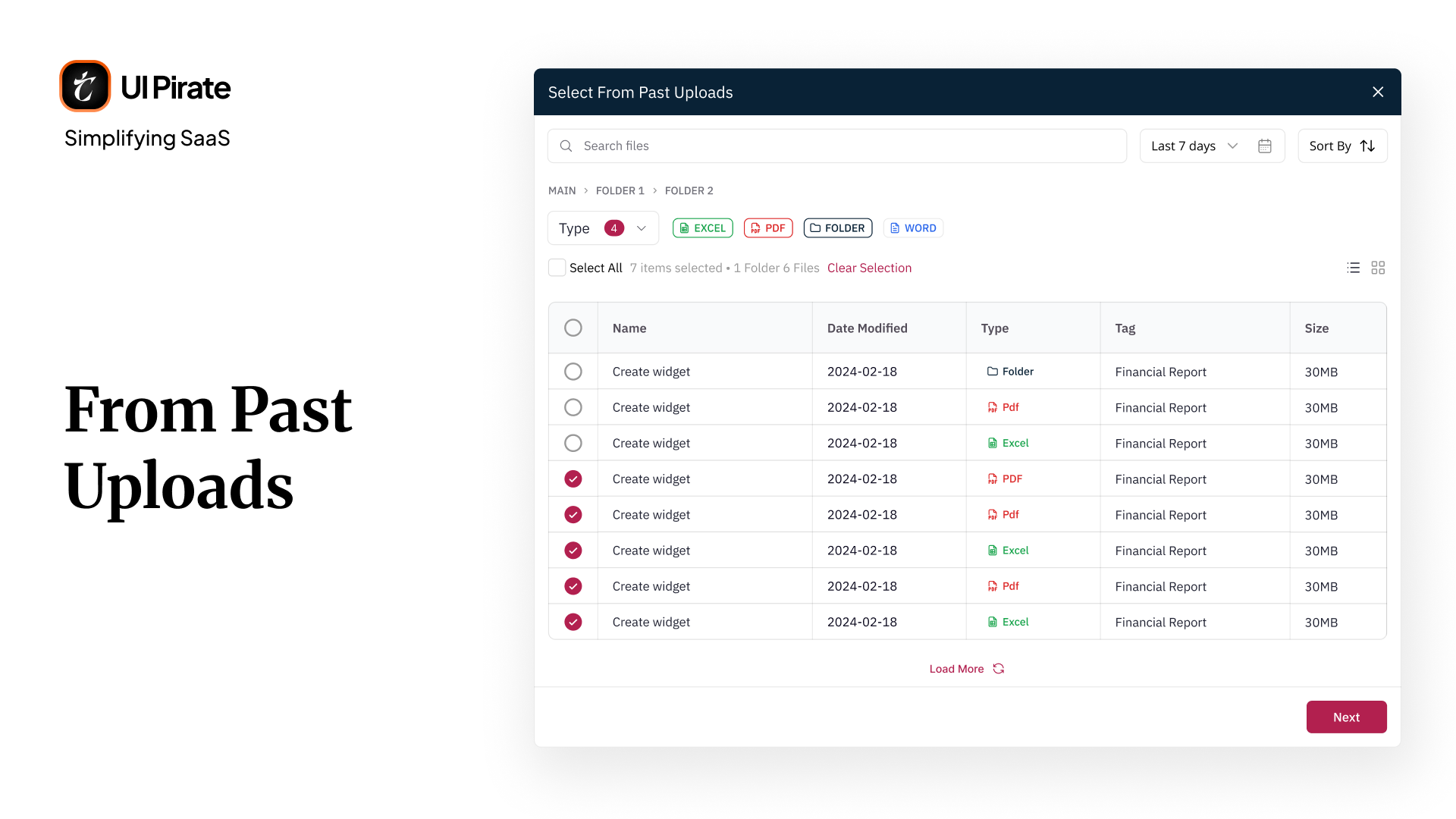
Past uploads. Past uploads appeared in a table with checkboxes. Reattach a previously uploaded file to a new conversation in a few clicks, and you'd save yourself from uploading the same contract for the fifth time.
The Document Analysis Hub
Every template surfaced in chat lived inside a dedicated hub. Filters across the top: All, Featured, Personal, Real Estate, Corporate, and Due Diligence, sat above a search bar, with a sort control for surfacing the most used templates first. A persistent Create Your Own button sat in the top corner.
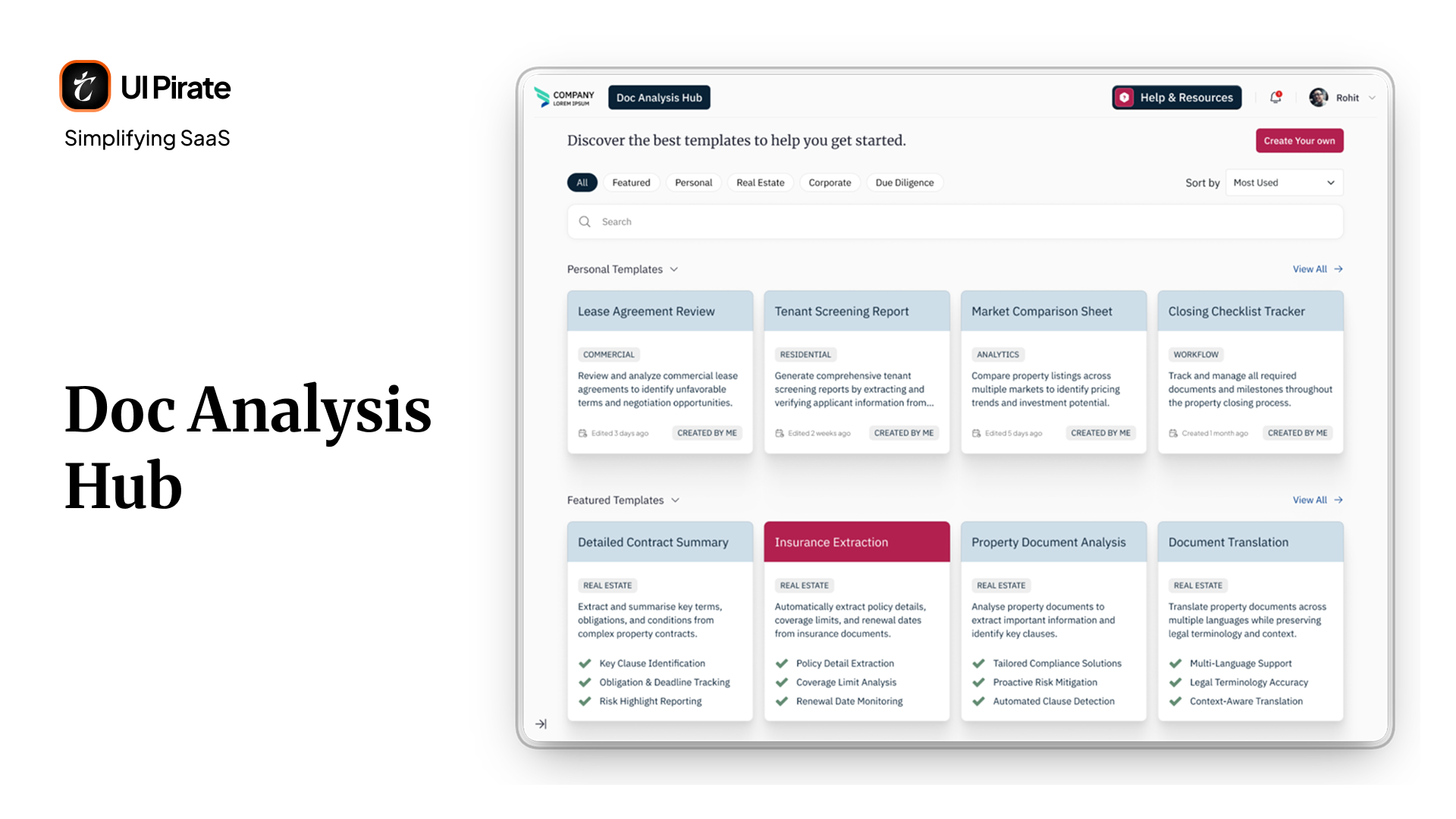
Below that, the page organized itself into sections rather than tabs. A Personal Templates row came first, showing templates you'd built yourself, each with its own View All link to expand the full set. A Featured Templates row followed, with the same layout and its own View All link.
Building a template without needing to think like a developer
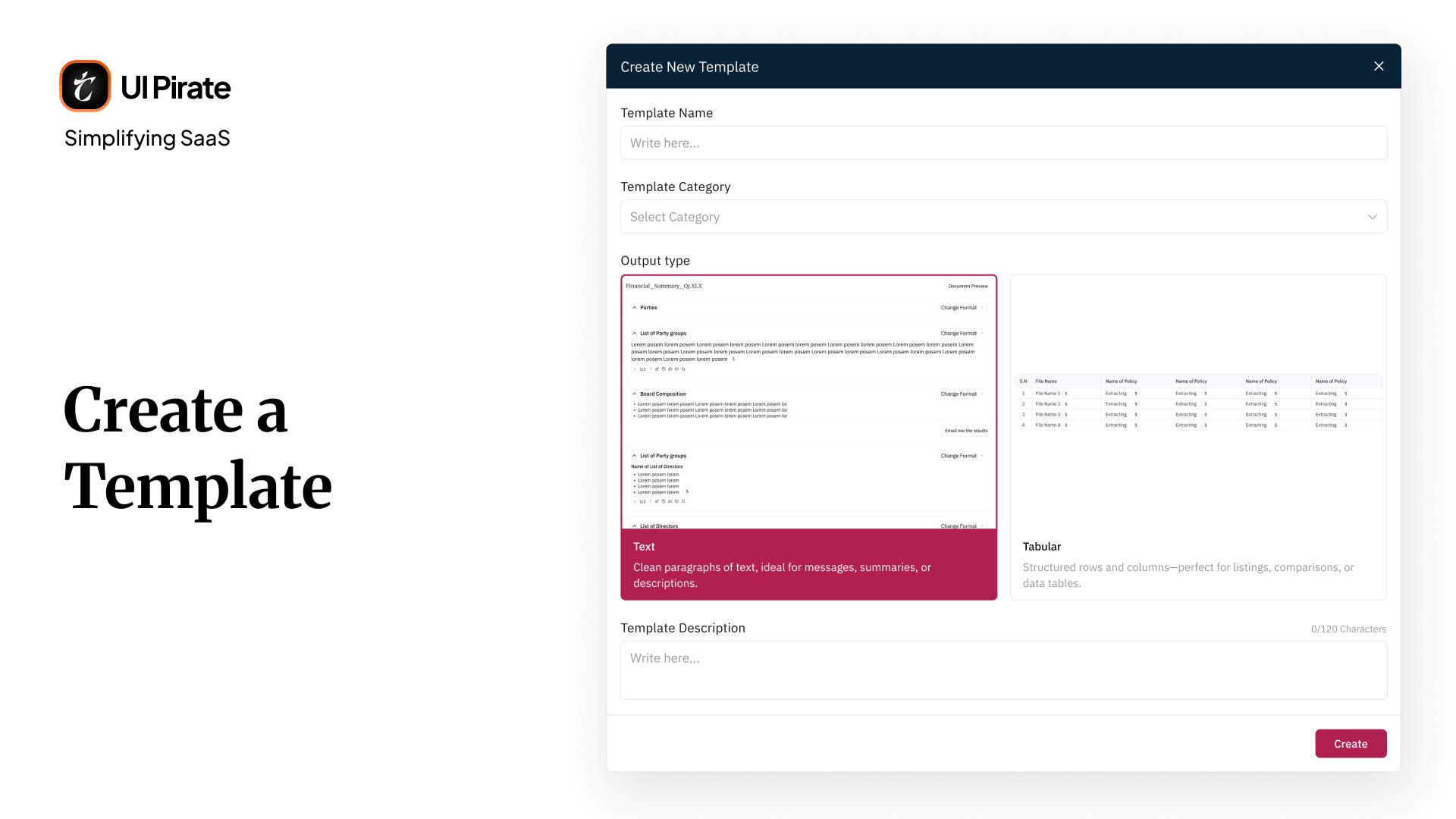
The original template system asked you to configure extraction fields and output structures directly. It effectively asked lawyers to think like database administrators. We collapsed that entire flow into one unified creation modal, covering:
Template name
Template category
Output type, either narrative text or structured tables
From there, you'd land on a build screen starting empty: "No questions yet. Get started by adding a new question." Add a question, and a lightweight chat-style input opened, complete with commonly used prompt suggestions. Each question carried its own output type setting, independent of the template's default.
You could edit, delete, or reorder every question individually. That gave power users granular control, without forcing that complexity onto anyone who just wanted to run an existing template.
This went through more iteration than almost any other part of the platform. Our first version kept a multi-step modal flow: name first, category second, output type third. Testing showed that structure slowed down the moment a template started taking real shape. We collapsed it into one screen. We gave question-building its own dedicated space instead.
Running a template: from upload to output
Open any template on this Generative Legal AI knowledge management platform, and the same file manager panel from chat appeared on the right, with a clear prompt on the left: "Your output will appear based on the below questions." Two actions sat front and center: Proceed, to run the analysis, and Email Me the Results, for output delivered outside the platform.
Adding a question opened a lightweight chat-style input, complete with commonly suggested questions, so you weren't starting from a blank field. Each question carried its own output type, narrative or tabular, independent of the template's overall default, and every one could be edited, deleted, or reordered individually.
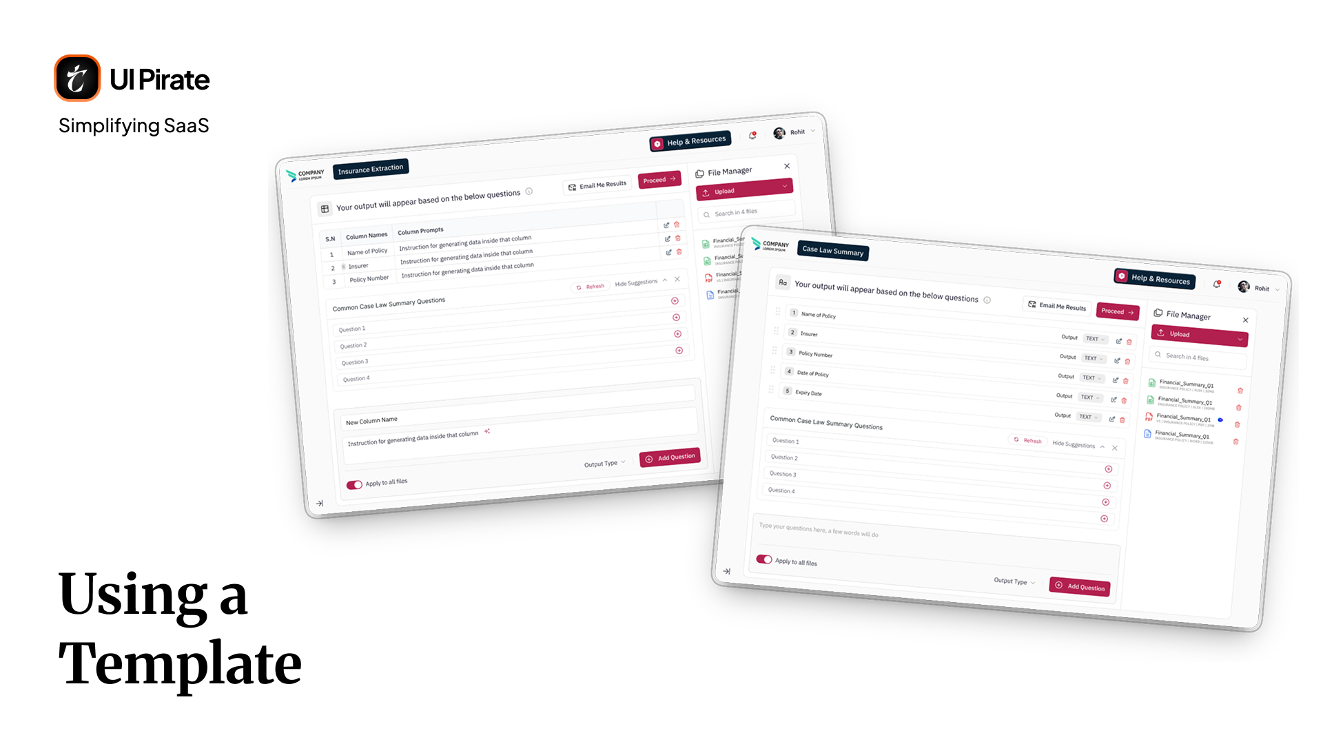
This went through more iteration than almost any other part of the platform. Our first version kept a multi-step modal flow: name first, category second, output type third. Testing showed that structure slowed down the moment a template started taking real shape. We collapsed it into one screen, and gave question-building its own dedicated space instead.
Output: the platform's biggest module
Output is where this Generative Legal AI knowledge management platform had to prove itself. Every template run and every chat-based analysis fed into the same output system.
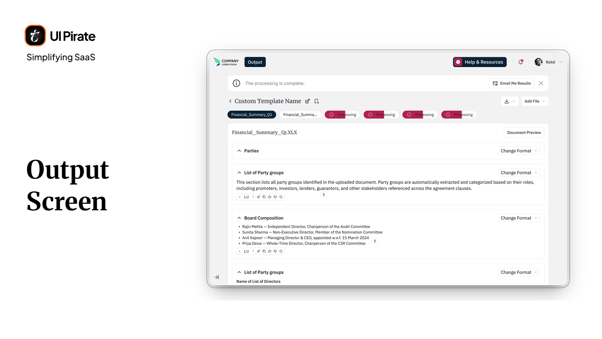
When processing finished, a toast notification confirmed completion, with a close action and an option to email the results. Your output showed every question from the template alongside its answer. Format controls let you switch between concise, detailed, bullet, or tabular views. A preview mode showed you exactly how the document would look once exported.
Textual output and citation depth
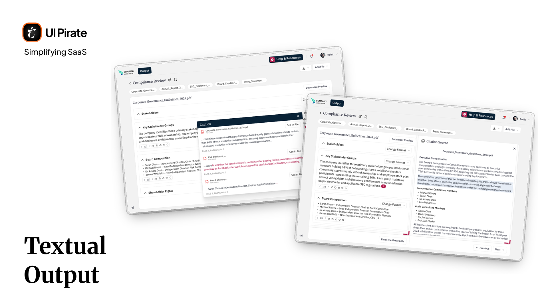
Click a citation chip, marked with a count like "5," and a modal listed every source it pulled from, down to the specific line of text used. From there, See in File split the screen and jumped straight to the highlighted source passage. Next and previous controls let you move through multiple citations without closing the panel.
Every question carried its own dedicated citation bar beneath its answer. You could verify sourcing at the level of a single question, not an entire multi-question output at once.
Tabular output
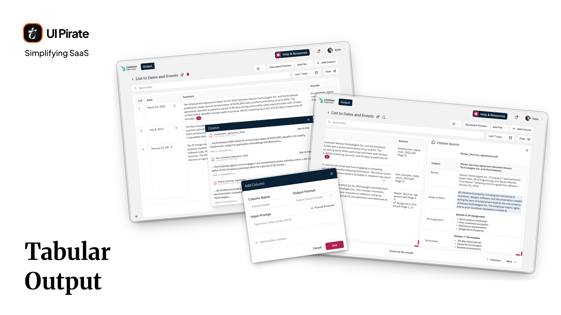
For structured extraction, your output rendered as an editable table. Add columns, add rows, and edit any cell directly with a double-click. Citations appeared inline as chips inside individual cells, opening the same citation modal and source panel from the textual view.
Translation: a different shape entirely
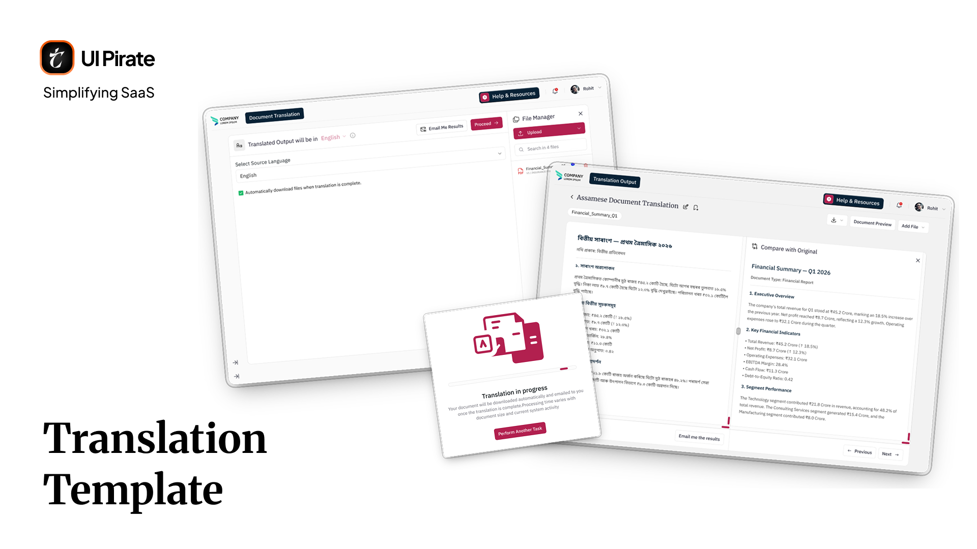
Translation had no questions to configure. Instead, you selected a source language and chose a target output language. You could enable automatic download once translation completed. Submit a file, and a processing state appeared with its own illustration. An explicit error state showed up if the platform couldn't detect your selected source language, prompting a correction or a different file.
While a translation ran in the background, you could start another task elsewhere on this Generative Legal AI knowledge management platform without losing progress. On completion, you could email the results out, or compare them directly against the original document, split screen. It's the same pattern used for citation verification elsewhere in the product.
History, Help, and everyday utility screens
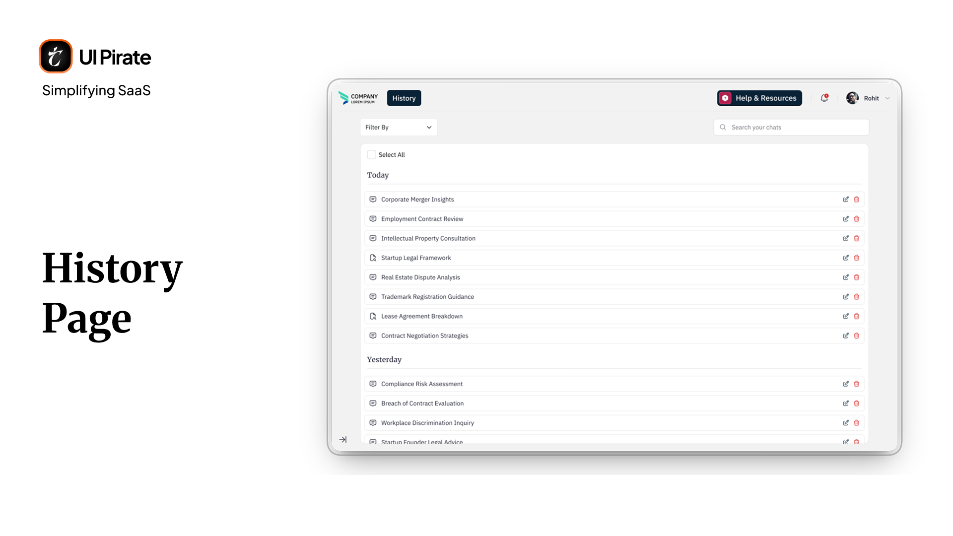
The History section listed every past chat, with rename, edit, and delete controls, and a dedicated modal for updating a chat's name without losing its content.
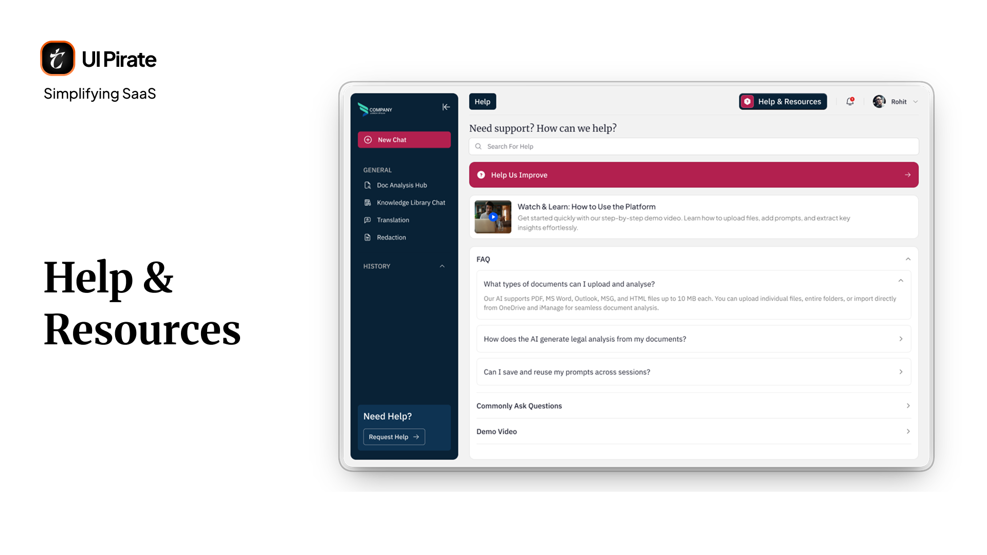
Help and Resources opened a support page built around one simple question: "Need support? How can we help?" A feedback flow up top collected your full name, email, topic, a description of the issue, and optional file attachments. Below that sat an accordion of three mutually exclusive panels: FAQ, common questions, and a demo video. Open one, and the other two closed. The page never turned into a scroll of unrelated content.
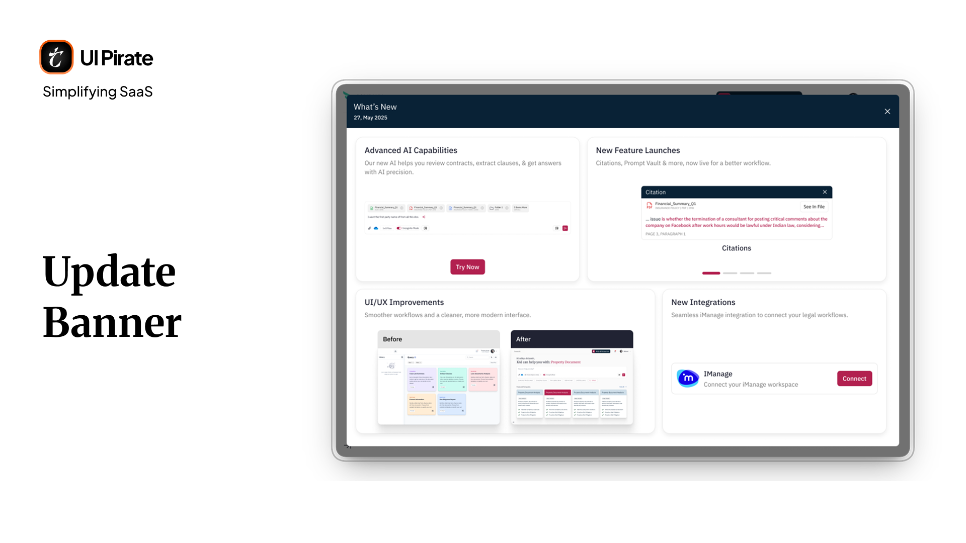
Update banners and onboarding moments
First-time access, and major updates after launch, triggered a lightweight banner summarizing what changed. We tested this at six cards, then five, before settling on four as the version that actually got read: Advanced AI Capabilities, New Feature Launch, UI/UX Improvement, and New Integrations.
"Fewer cards, more attention. That pattern held true almost everywhere in this platform."
Design decisions worth calling out
Cards over lists, used throughout templates, documents, and prompts. You see essential information first. You drill into detail only when you want it.
Toasts over interruptive modals. Legal work depends on sustained focus. System feedback, like upload confirmations and processing updates, appeared as toasts rather than dialogs that stopped you mid-task.
A right-side utility panel used consistently across this Generative Legal AI knowledge management platform, not just for files. Utility functions stayed anchored to the same side of the screen, no matter which core feature you were using. You never had to relearn the product screen to screen.
Reflection
This project reinforced something we've seen across other AI-driven products: the AI is never the actual product. The workflow around it is.
A few things that stuck with us from this engagement:
Trust has to be designed, not stated. A citation system did more to improve adoption than any amount of chat polish could have.
A blank input field is a bigger barrier than it looks. Replacing it with a guided landing experience changed the entire tone of your first-time experience.
Simplifying for experts is harder than simplifying for beginners. Lawyers didn't need a simpler tool. You needed a tool that respected how much expertise you already had.
Working inside an existing brand system is its own discipline. Every color and typography decision had to help this Generative Legal AI knowledge management platform grow easier to use, without breaking rules the firm had already set.
"We didn't make the platform simpler. We made it make sense."
What started as a technically capable but confusing internal tool became a structured AI knowledge management platform you could build a daily habit around. Not because we added new features. Because the existing ones finally connected to each other, and finally helped you save time instead of costing it.
Ready to design an AI platform people actually trust?
If your product handles evidence, decisions, or high-stakes work, your interface has to earn trust before a single answer gets accepted.