
MedJourney: A Patient Support Platform Built for Pharma Companies
uipirate
235 views · 24 min read
24 min read | 4 months ago
MedJourney is a patient support platform built from zero to track patients after the sale, follow-ups, next doses, tests, doctors, and hospitals, in one screen.
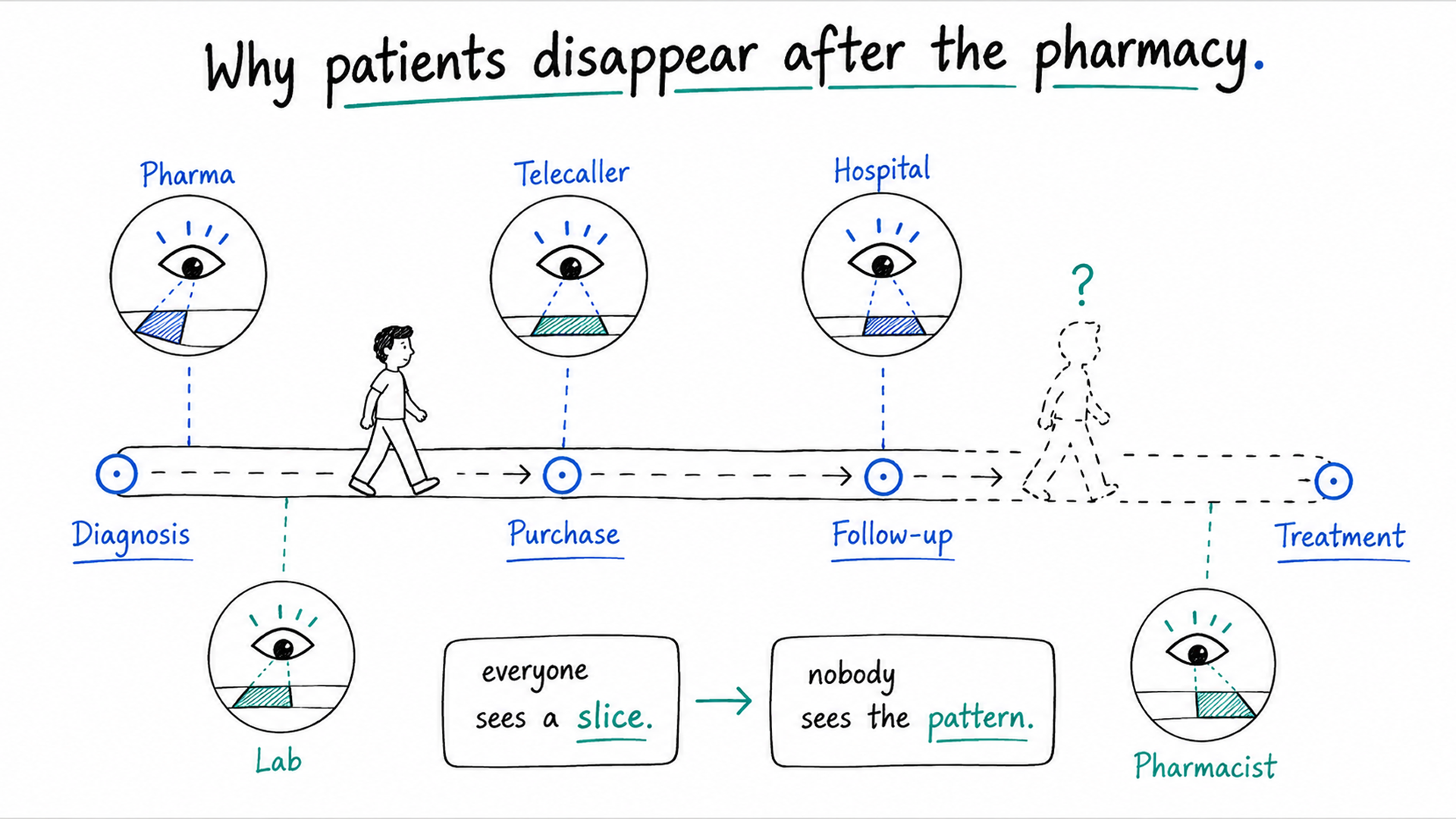
What happens to a patient after they walk out of the pharmacy?
In most healthcare systems, nobody knows. You buy your medicine, you go home, and every system that touched you goes quiet. Nobody's tracking when your next dose is due. Nobody's confirming you got the diagnostic test your treatment depends on. Nobody's connecting the doctor who prescribed it, the hospital you came from, or the pharmacy that filled it, into one picture of your care.
That silence is the problem MedJourney was built to solve. It's a patient support platform that follows your journey from diagnosis to purchase to follow-up to outcome. It gives every stakeholder in the chain the visibility to act before you fall away.
"Every stakeholder saw their slice clearly. Nobody saw the patient."
One more thing made this project unusual. The client didn't bring a product to fix. They brought a problem, an RFP, and nothing else. No screens, no wireframes, no design system, no name, no logo. We were responsible for inventing all of it, design, frontend, and backend.
Starting with Nothing but a Problem
Pharmaceutical companies sell a patient their medicine, and then the trail goes cold.
This isn't primarily an inventory problem or a sales problem, even though stock and purchases are part of the picture. It's a patient care problem. After the sale, nobody is reliably answering:
When is this patient's next dose actually due?
Who's supposed to follow up with them, and did it happen?
Where can they get their medicine if their usual source runs out?
What diagnostic tests or program benefits are they eligible for, and have they used them?
Which doctor prescribed this, and from which hospital?
Patient Support Programs (PSPs) exist to answer exactly these questions. But most PSPs still run on spreadsheets, disconnected CRMs, and manual telecaller workflows, so the answers live in five different places, if they exist at all. The client wanted a patient support platform that could replace that patchwork with one connected system built around patient care, not around moving inventory.
We pushed back early on one framing: this was not a patient database, a call center tool, or a hospital system. Locking that definition down before design started saved the project from building the wrong product politely.
Our Solution: Introducing MedJourney
This patient support platform closes that gap. It's the layer that sits after the sale, so a patient's journey doesn't just end at the checkout.

For every patient, the platform tracks:
Follow-ups, scheduled and logged, so a missed check-in is visible instead of silent
Refill timing, so you know when the next dose is due before the patient runs out
Diagnostic tests and program benefits, so eligible patients actually use what they're entitled to
The doctor and hospital behind the prescription, so the clinical context travels with the patient, not just the transaction
Where the medicine is available, connecting patients to pharmacies, stockists, and retailers who can actually fill it
None of this replaces the sale. It picks up right where the sale leaves off, and keeps going for as long as the patient is in the program.
Key Modules at a Glance
MedJourney isn't one feature. It's a set of connected modules, each responsible for one piece of the patient care story:
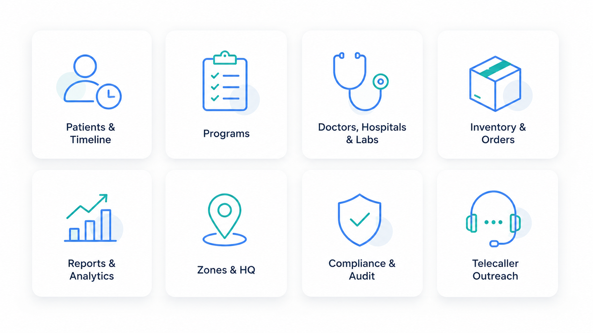
Patients & Timeline: the record and history behind every patient
Programs: the Patient Support Programs themselves, as first-class entities
Doctors, Hospitals & Labs: the clinical network around each patient
Inventory & Orders: medicine stock, medicine orders, and lab test bookings
Reports & Analytics: performance, demographics, and trend reporting
Zones & Headquarters: the organizational structure behind a multi-region rollout
Compliance & Audit Trail: who touched what, and when
Telecaller Outreach: the calling and follow-up layer that keeps it all moving
Naming and Branding from Zero
Before a single screen existed, this patient support platform needed a name. The name mattered more than it might seem: it would shape how pharma companies, hospitals, and daily users perceived the entire platform.
Why "MedJourney"
Every module on the roadmap, follow-ups, diagnostics, adherence tracking, program management, existed to support one continuous progression. Not isolated transactions. A journey.
Med: grounded in healthcare, clinical, trustworthy
Journey: continuous, progressive, patient-centered
The name also became a design constraint for the whole patient support platform. Every feature had to answer one question: does this help you see where the patient is in their journey? If it didn't, it got questioned.
A Brand Built Alongside the Product
Most branding happens in isolation and gets applied to a product later. Here, brand and product grew at the same time, shaped by the same healthcare workflows and compliance constraints. The identity had to feel:
Trustworthy, because healthcare demands credibility
Modern, to stand apart from legacy health IT
Approachable, since telecallers and pharmacists live in it daily
Scalable, from enterprise decks to mobile dashboards
Nine Roles, One Patient Support Platform Access System
MedJourney's access model isn't a simple in/out toggle. It ships with nine default roles, each with a distinct access level baked in from day one:
org_admin: full system access, everything
TELECALLER: patient and follow-up management, patients (create/read/update), follow-ups, purchases, reference view
REPRESENTATIVE: read-only visibility, patient summaries, program progress, PSP reports
MANAGER: program management, programs (create/read/update), telecaller assignment, reports
PHARMACIST: inventory and order lifecycle, inventory read access, full order control except delete, stock operations
INVENTORY_MANAGER: full inventory control, full inventory CRUD, stock operations, pricing, orders, bulk upload
STOCKIST and RETAILER: inventory read, write, and update, medicines, suppliers, orders, no delete rights
LAB_MANAGER: lab management, full control over labs and lab bookings, inventory read, patient view
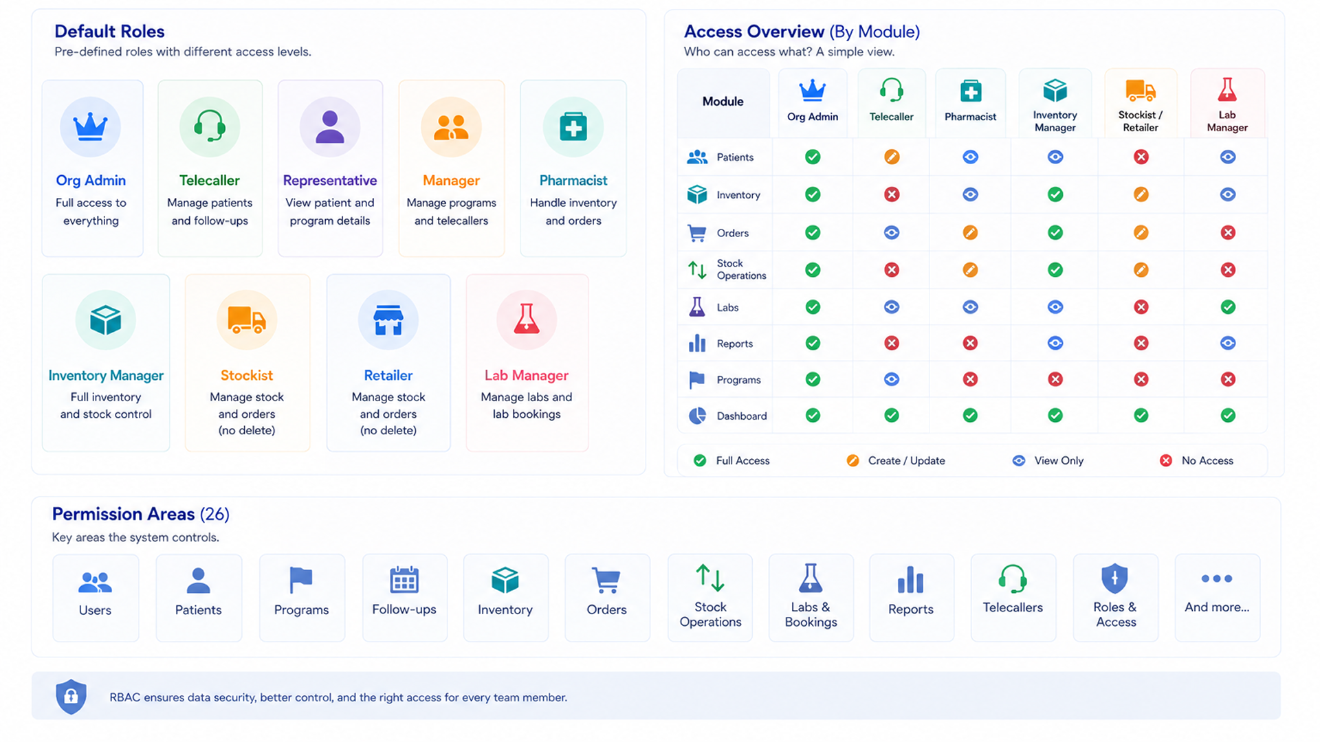
Telecallers get their own focused login, built purely around calling and follow-ups, covered later in this case study. Every other role works inside the same Organisation console, where the sidebar carries the real weight of the platform:
Overview: Dashboard and Reports, the daily pulse of the organization
Patients: the full patient list and every patient's record
Clinical Operations: doctors, hospitals, and labs, the network around each patient
Commerce: orders and purchases, medicine and lab test alike
Admin: one Organisation section covering Users, Roles, Programmes, Zones, and HQ
Whoever you are inside that console, pharmacist, stockist, program manager, you're working inside the same five-section structure. What changes is what your role, and its access level, allows you to see and do.
Granular Privileges Behind the Roles
Underneath those nine roles sits the real engine of this patient support platform: 111 granular privileges organized into 26 groups. Coverage spans everything from Users and Patients to Zones and Bulk Upload. A few examples:
Patients: create, edit, delete, view, view assigned patients, view patient summary
Inventory: separate groups for medicines, suppliers, stock operations (add, deduct, reserve, release, adjust), and pricing and alerts
Programs: create, edit, delete, view, assign telecallers, add patients, monitor progress
Reports: view, export, engagement metrics, telecaller performance, PSP summary
Admins aren't limited to the nine defaults. A custom role builder lets them combine any mix of these 111 privileges into a role built for their organization's exact structure, then assign it directly, no engineering ticket required.
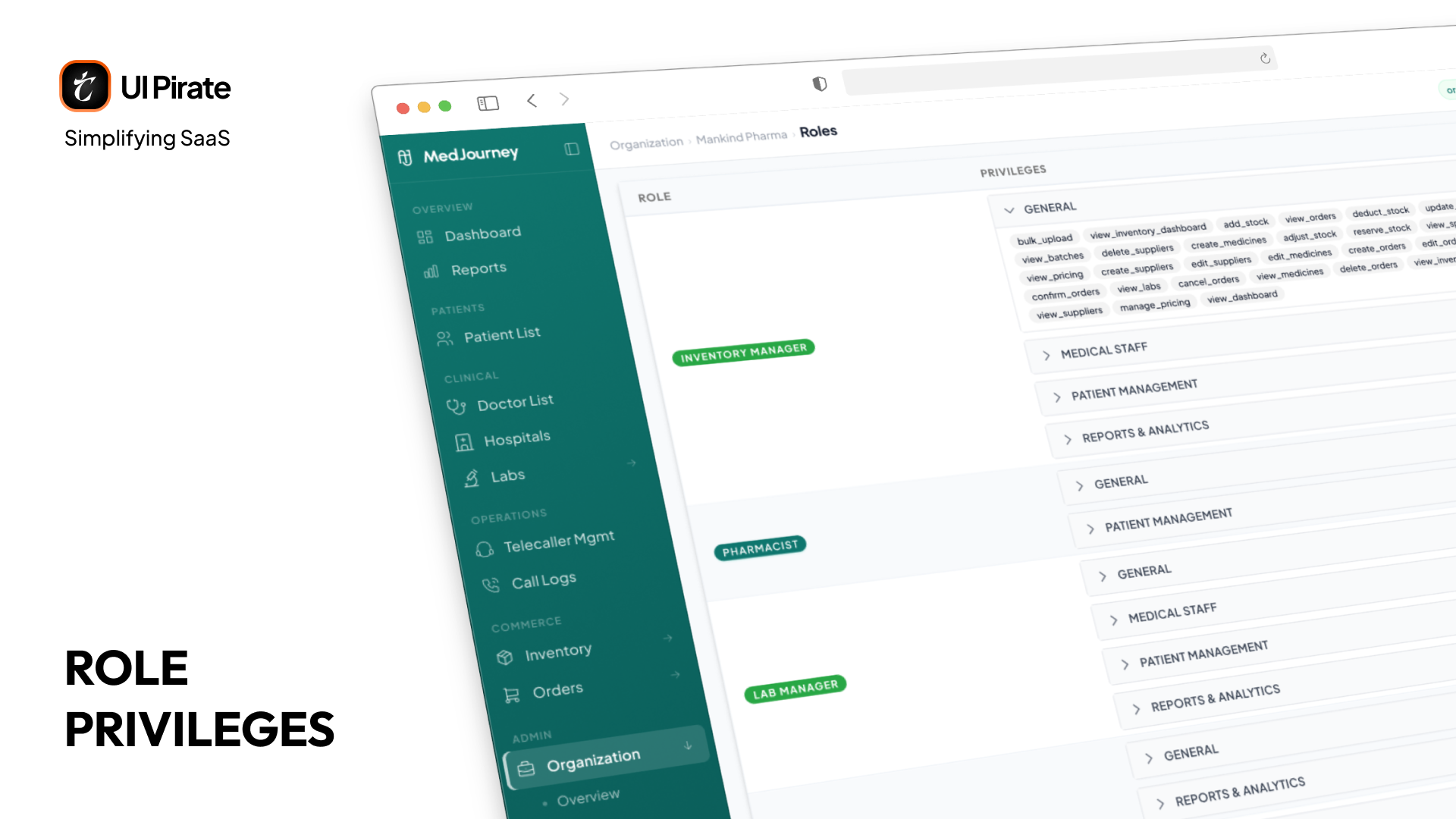
We could have shipped a separate polished dashboard for every one of those roles. We didn't. Instead:
Everyone logs into the same Organisation console
Buttons, sections, and actions hide or appear based on your privilege set
A stockist and a pharmacist can sit in the same console and each see only what applies to their job
"The challenge wasn't building nine separate products. It was making one console feel tailored to whoever's using it."
This was a contested call internally. A bespoke interface per role reads cleaner in a pitch deck. A single console with granular privileges is harder to design well but far easier to maintain, especially once a client adds a new role six months after launch.
The Patient Timeline: One Screen for the Whole Journey
If this patient support platform has a single defining feature, it's the patient timeline.
Healthcare data is naturally scattered across time. A purchase in January. A follow-up call in February. A missed diagnostic in March. A therapy change in April. In the old workflow, piecing that history together meant cross-referencing spreadsheets and CRMs by hand.
The timeline consolidates everything into one chronological view:
Calls and reminders
Purchases and refills
Doctor interactions and therapy milestones
Diagnostic results
Program enrollment and adherence changes
One screen. One scroll. The entire patient journey. As a telecaller, you see in seconds that a patient bought medication three months ago, completed one follow-up, missed two, and skipped their blood work. You don't ask the patient to repeat their history. You have an informed conversation, and you catch adherence risk early.
"The timeline didn't just show patient history. It showed patient momentum: whether someone was progressing through treatment or quietly falling away."
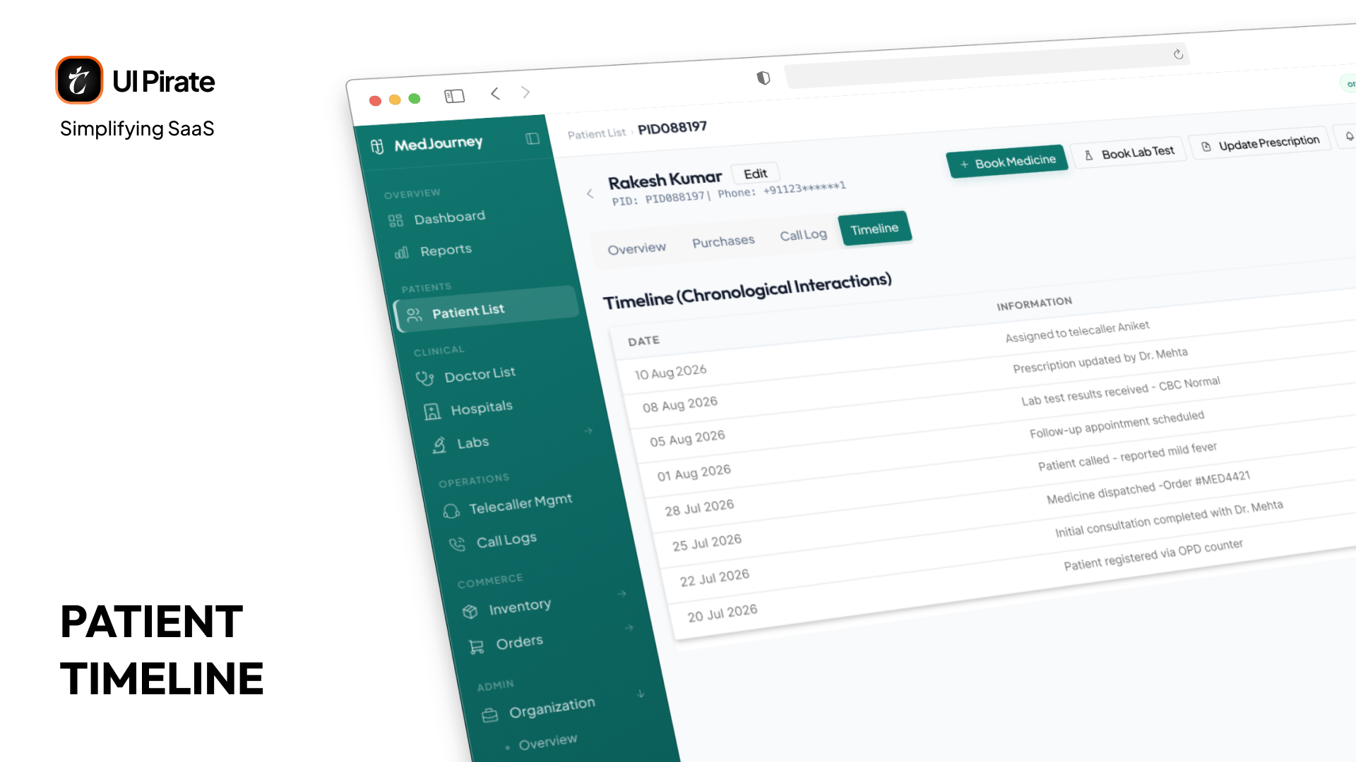
Our first version nearly failed. Every event carried equal visual weight, so a patient with a year of history became an unreadable wall. We rebuilt it with hierarchy: major events like missed follow-ups get full treatment, routine reminders get compressed.
The Patient Record: One Click, Several Actions
Every patient in the Patients list is one click away from the actions you actually need, no digging through menus:
Book medicine
Book a lab test
Update prescription
Send a reminder
Add a follow-up
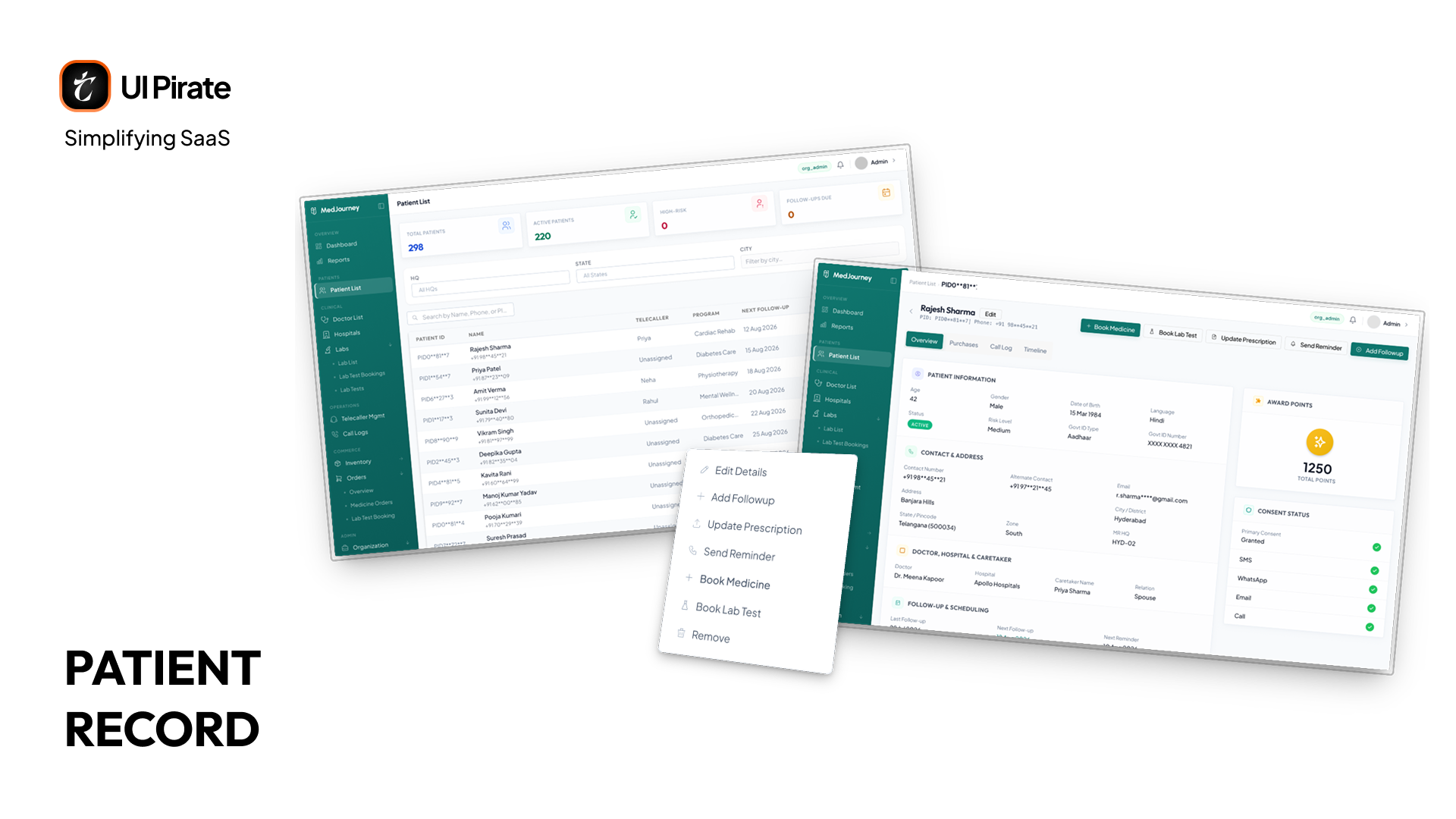
Open a specific patient and you land on a four-tab record:
Overview: the patient's snapshot, where their journey stands right now, including their points
Timeline: the chronological view covered above, right inside the patient record
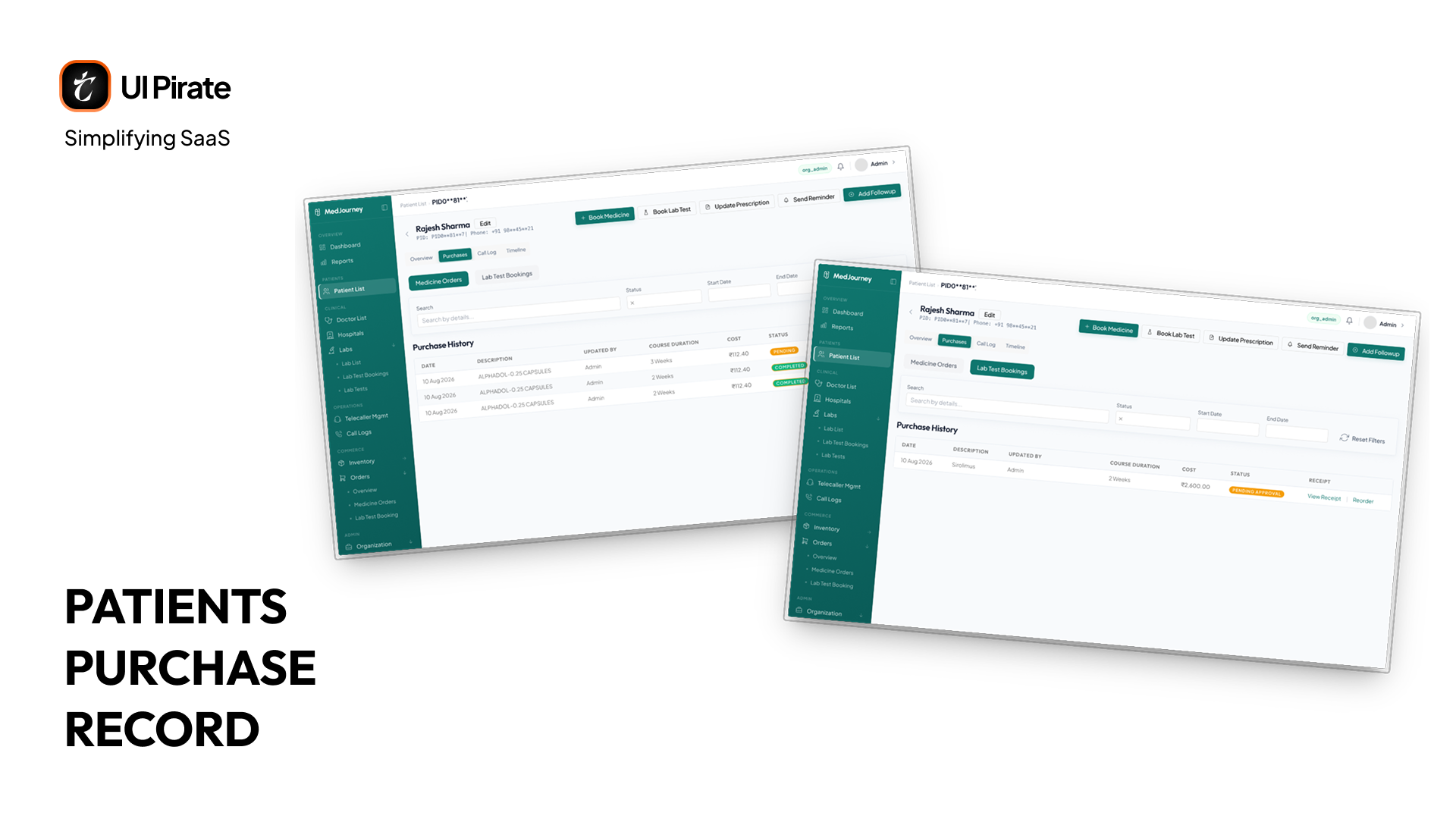
Purchases: split into Medicine Orders and Lab Test Bookings, so you can see what they've bought and what they've booked without leaving the record
Call Logs: every call placed to this patient, in one list
Doctors and Hospitals: The Care Network Around the Patient
The Clinical Operations section of the console tracks the network around the patient, not just the patient.
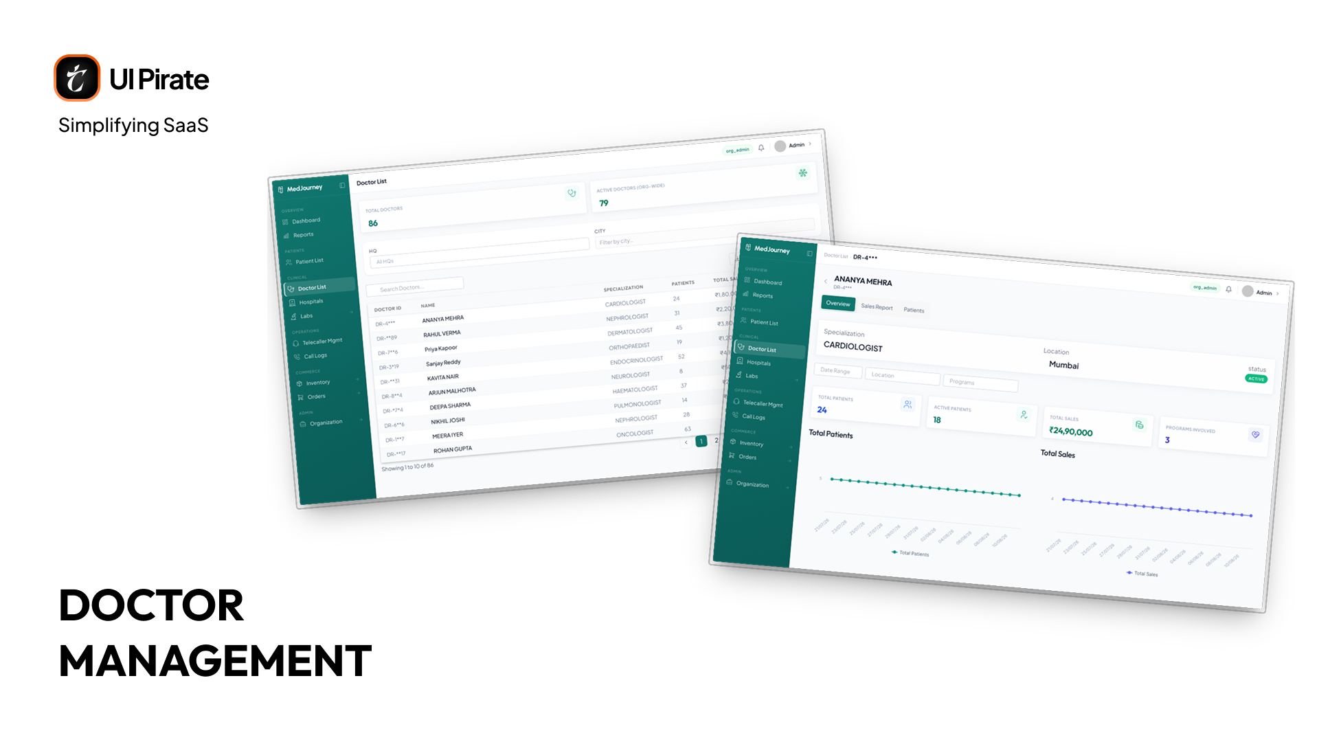
Doctors get a full management view: add a doctor, assign a specialization, see their patient list and sales performance, export the list, or bulk upload an entire roster at once.
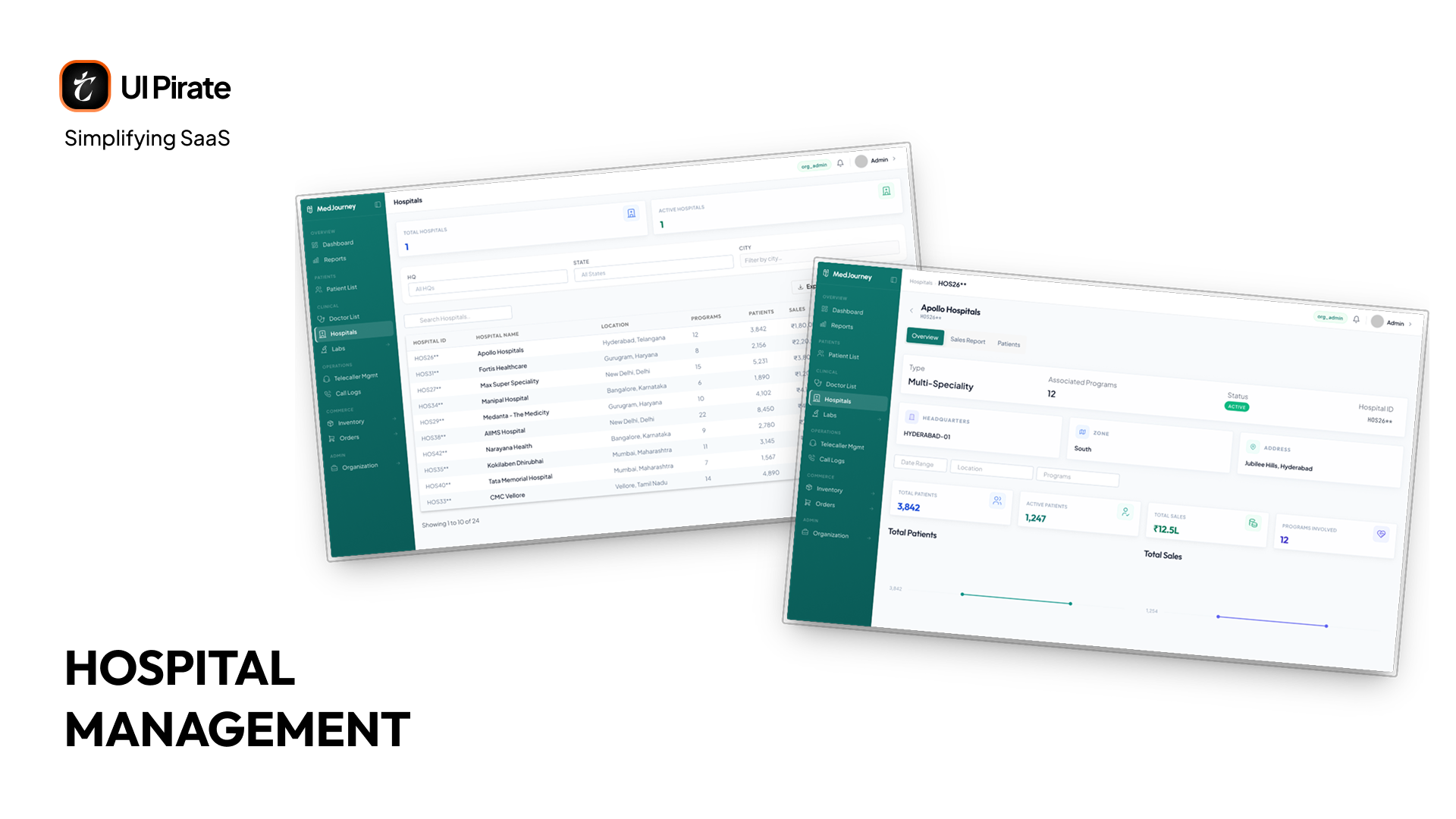
Hospitals get their own management module too, tracking the facilities behind a patient's care, their patient counts, and their sales performance. It's a real, separate part of the platform, though it hadn't made it into the Figma file at the time of this write-up, so there's no mockup for it here yet.
Labs and Lab Test Bookings
Labs carry more weight than Doctors or Hospitals, and it shows in the design. The Labs module isn't one page. It's three connected pages: the lab directory itself, the bookings that flow through it, and the test catalogue behind both.
Lab List
This is the directory of every lab on the platform. Two stats sit up top, Total Labs and Active Labs, followed by a table of every lab you've listed, with columns for lab name, city, state, mobile number, patients, tests conducted, total sales, average order value, and status. The primary actions are Add Lab and Export, and each row carries Edit, Detail, Change Status, and Remove.
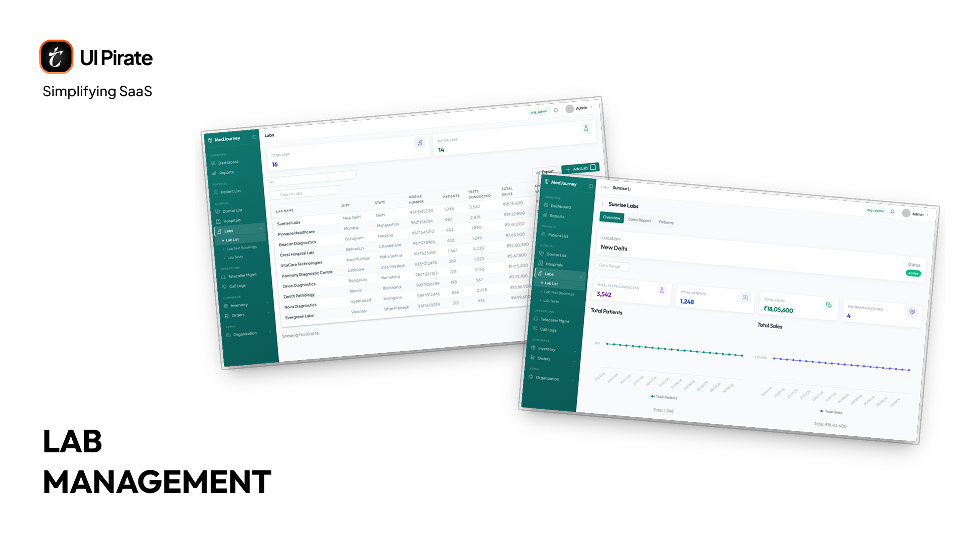
Click into any lab and you land on a three-tab detail view:
Overview: location, and the stats behind this specific lab
Sales Report: this lab's sales performance on its own
Patients: every patient currently assigned to this lab
Lab Test Bookings
This is where every booking made against those labs actually lives. Stats up top break bookings down by status: Total Booking, Pending, Approved, Completed, Cancelled. From here you can Book a Test, Export cost data, or jump straight into the Lab Test Master catalogue.
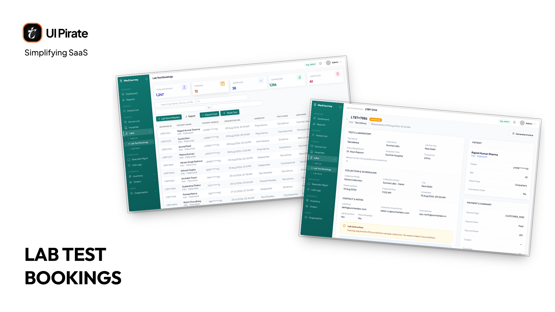
The bookings table itself carries real depth: Booking ID, patient name and mobile, when it was requested, who added it, test name, lab name, reason for not choosing (when a preferred lab wasn't available), preferred collection date, collection mode, payment term, and status. Each row supports View, Detail, Edit, Confirm Test, Cancel Test, and Delete.
Open a single booking and you get the full picture: lab test, laboratory, collection details, scheduling, contact info, notes, amount spent, payment, a summary, the patient, the order, and a trail of what happened to this booking over time. You can generate an invoice directly from this view.
That status field is doing more work than it looks like. Behind it sits a real lifecycle: Pending when a telecaller or admin first creates it, Approved, Sent to the lab with sample collection tracked, Completed with results and an invoice attached, or Cancelled with a reason logged and a rebooking option if needed. Each stage exists because a diagnostic result feeding back into this patient support platform's timeline can't be treated like a simple purchase. It has to be tracked, followed up on, and confirmed before it means anything for adherence.
Lab Test Master
The catalogue underneath both of the above. Two stats, Total Test and Active Test, sit above a table of every test the platform knows about: test name, category, sample type, lab, lab test, pricing, and status. Add Test is the primary action, Export the secondary one, and each row supports Book Test, Edit, and Change Status.
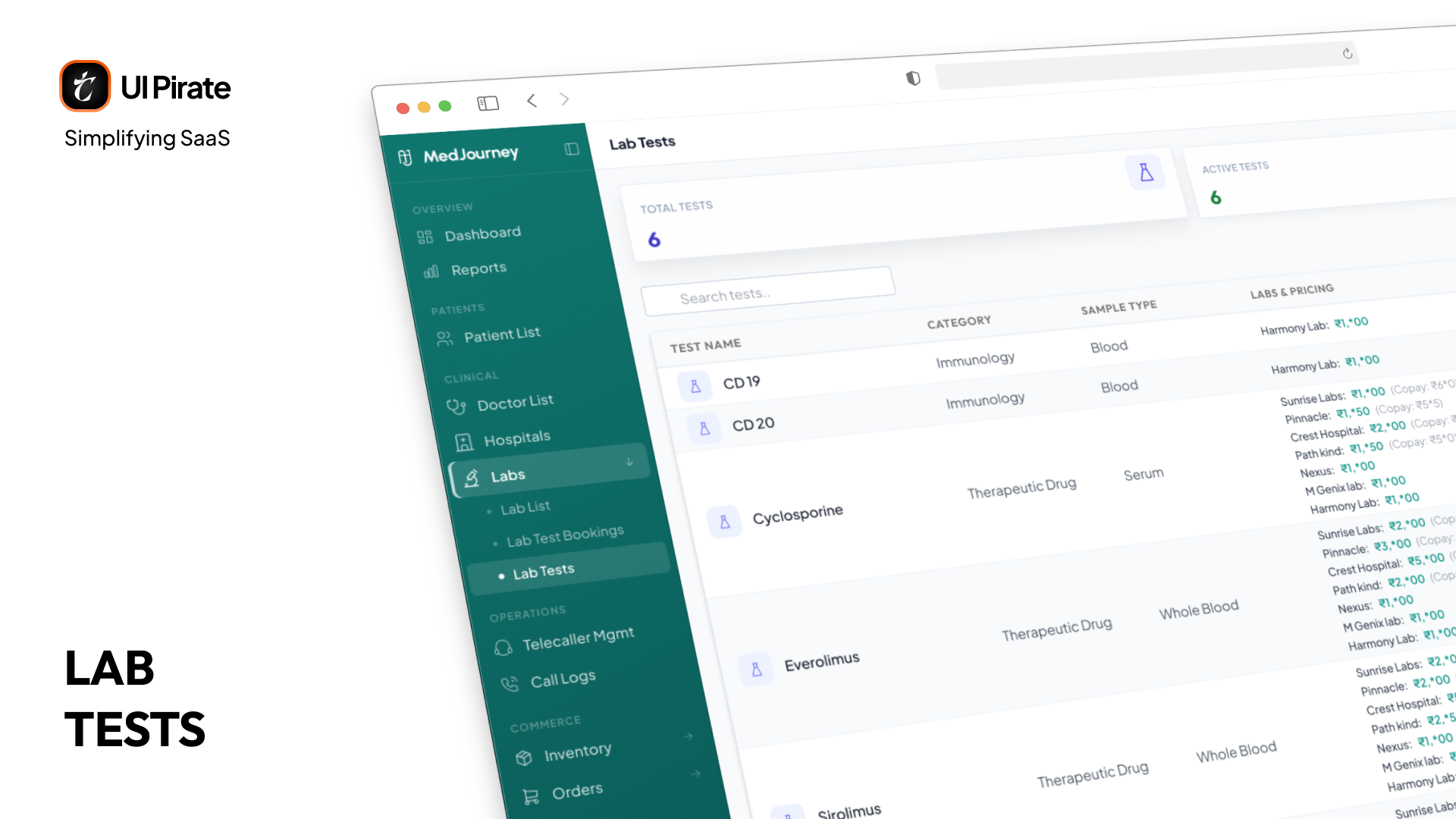
This is the layer that keeps the Lab List and Lab Test Bookings pages honest. A test can't be booked if it isn't defined here first, priced, categorized, and tied to a real lab.
Inside Inventory: Command Center to Special Pricing
Most people look at an inventory module and see logistics. Honestly, we underestimated it at first too.
Here's why it matters to a patient support platform. If you're enrolled in an adherence program but your medication is out of stock at the local pharmacy, the entire program fails. Not because of telecaller quality. Because of supply. So inventory is designed around treatment continuity, not warehouse operations. It's also one of the largest modules on this patient support platform, with seven distinct pages behind it.
"Inventory in a patient support platform isn't about stock levels. It's about whether patients can continue their treatment tomorrow."
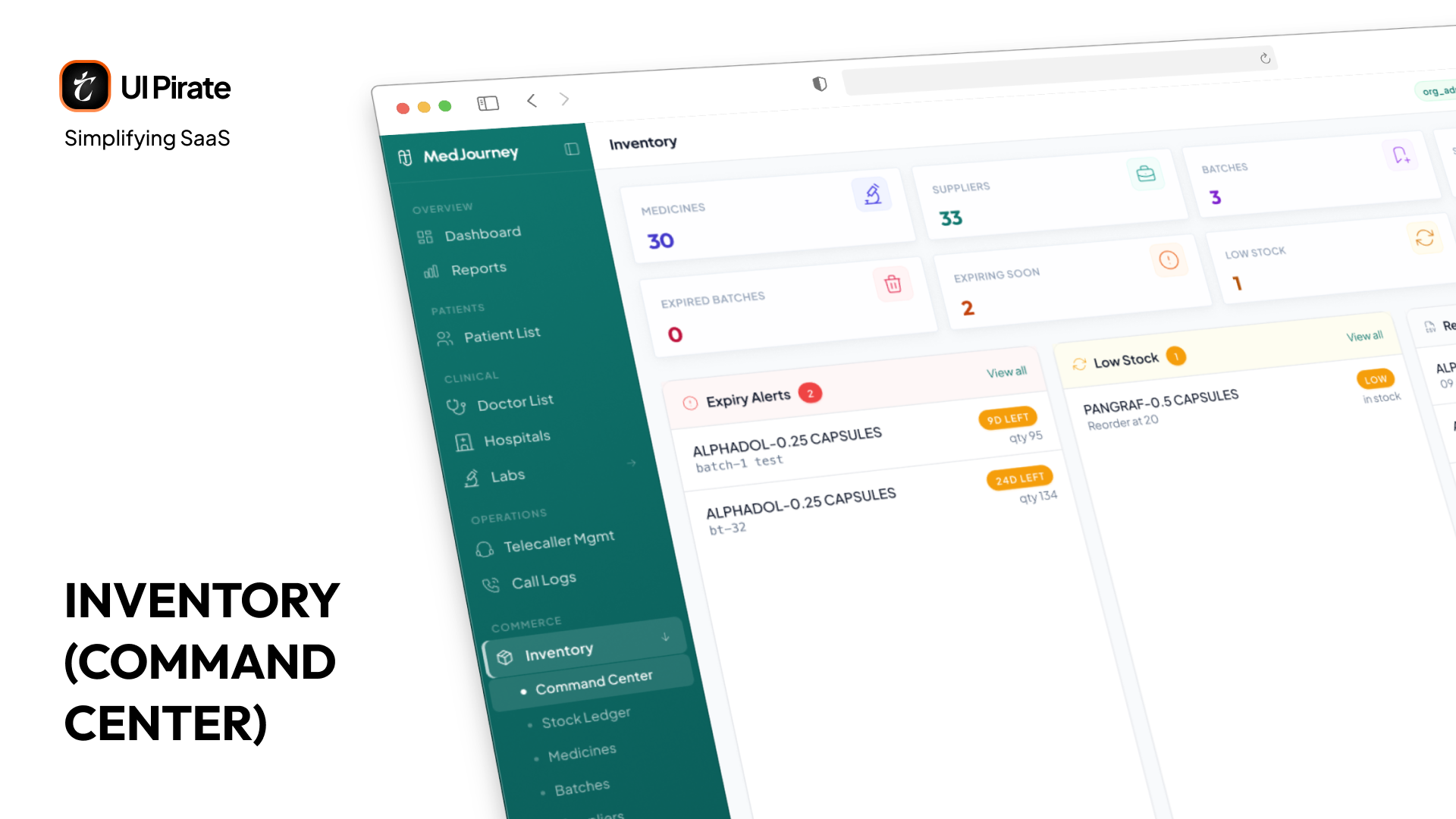
Command Center
This is the inventory landing page of the patient support platform, and it's called the Command Center rather than a dashboard for a reason. It's built for action, not just observation. As an inventory manager, you get immediate visibility into total stock, batch health, inventory value, and everything expiring or running low. They're the same numbers you'd expect from a dashboard, but framed as things to act on rather than just read.
Stock Ledger
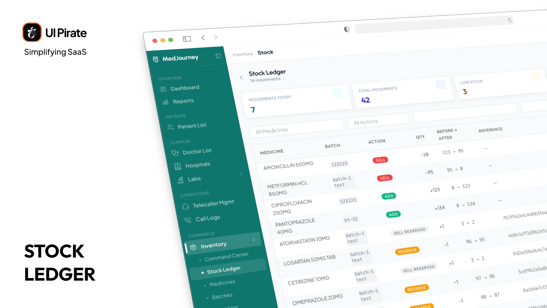
Every stock movement on this patient support platform, additions, deductions, reservations, and releases, gets logged here. It's the audit trail for inventory specifically: if a batch's numbers don't add up, the Stock Ledger is where you trace exactly what happened and when.
Medicines and Batches
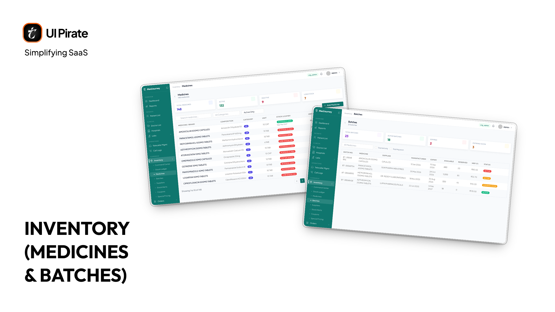
Medicines is the catalogue itself: every medicine on the platform, with the ability to add new ones as the organization's formulary grows. Batches sits right behind it, tracking every batch of stock with expiry dates, so a batch nearing its end-of-life gets flagged before it becomes unusable inventory.
Suppliers and Stock Alerts
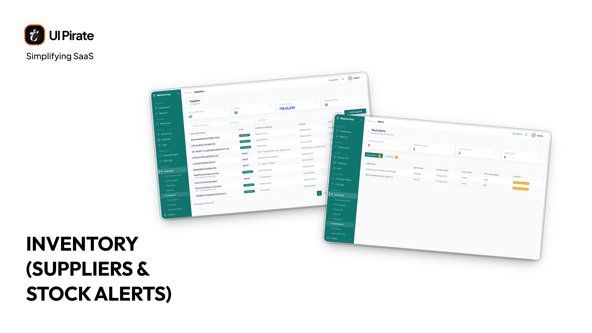
Suppliers is the record of everyone the organization sources medicine from, with the ability to add a new supplier as the network grows. Stock Alerts is where low-stock and expiry thresholds get configured and surfaced, so the alerts you see on the Command Center have somewhere they're actually defined and managed.
Coupons and Special Pricing
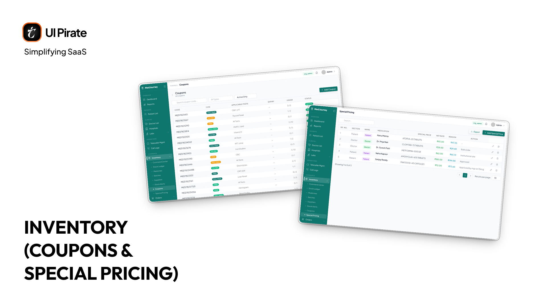
Coupons is a table of every discount code available, with an Add Coupon action for creating new ones. Special Pricing works the same way, a table of pricing rules you've set up, with the ability to add a new one, so specific patients, programs, or partners can get pricing outside the standard catalogue rate.
Medicine Orders and Lab Test Bookings, Linked by Patient
Product planning for the patient support platform surfaced two order types that traditional systems treat as unrelated: medicine purchases and lab test bookings. Each one shows up in two places: inside a single patient's record, and as its own consolidated list across the whole organization.
Medicine orders: patients purchasing medication, tracked from creation through delivery, with prescription uploads and invoices attached
Lab test bookings: patients booking diagnostics, each moving through its own multi-stage lifecycle from request through to completed results
Inside the Patient Record
They live as two distinct sub-tabs inside a patient's Purchases tab, not merged into one generic list. That distinction matters. A medicine order and a lab booking move through different stages and involve different people, so collapsing them into one table would have hidden more than it revealed. What connects them instead is the patient. Every order, whichever type, rolls back up to the same patient record, so you still get the full purchase picture without losing the detail each order type needs.
The Org-Wide Orders View
Zoom out from a single patient and Medicine Orders becomes its own page under this patient support platform's Commerce, Orders section. Four stats sit up top: Distinct Patients, Total Orders, Revenue, and Total (Excl. Tax), giving you the shape of demand across the entire organization before you look at a single row.
Below that sits search and filtering, name, phone, or patient ID, a status dropdown, a date range, and a city filter, plus Export and Book Medicine actions. The table itself carries the order or invoice number, patient, item count, status (Pending, Delivered, Ready to Dispatch, and others), date, and amount.
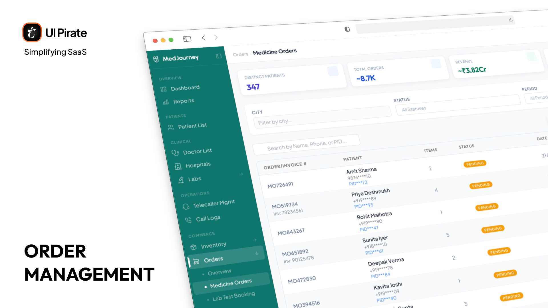
The same pattern holds for Lab Test Bookings, covered earlier in this case study: a per-patient view inside the record, and its own consolidated page with organization-wide stats and filtering. Neither view replaces the other. The patient record answers "what has this person ordered," and the consolidated page answers "how is the whole organization doing this week."
Overview: The Daily Pulse of the Organization
Overview is the first thing you see in this patient support platform's Organisation console, and it's deliberately just two pages, matching the sidebar exactly, not a sprawl of tabs.
Dashboard
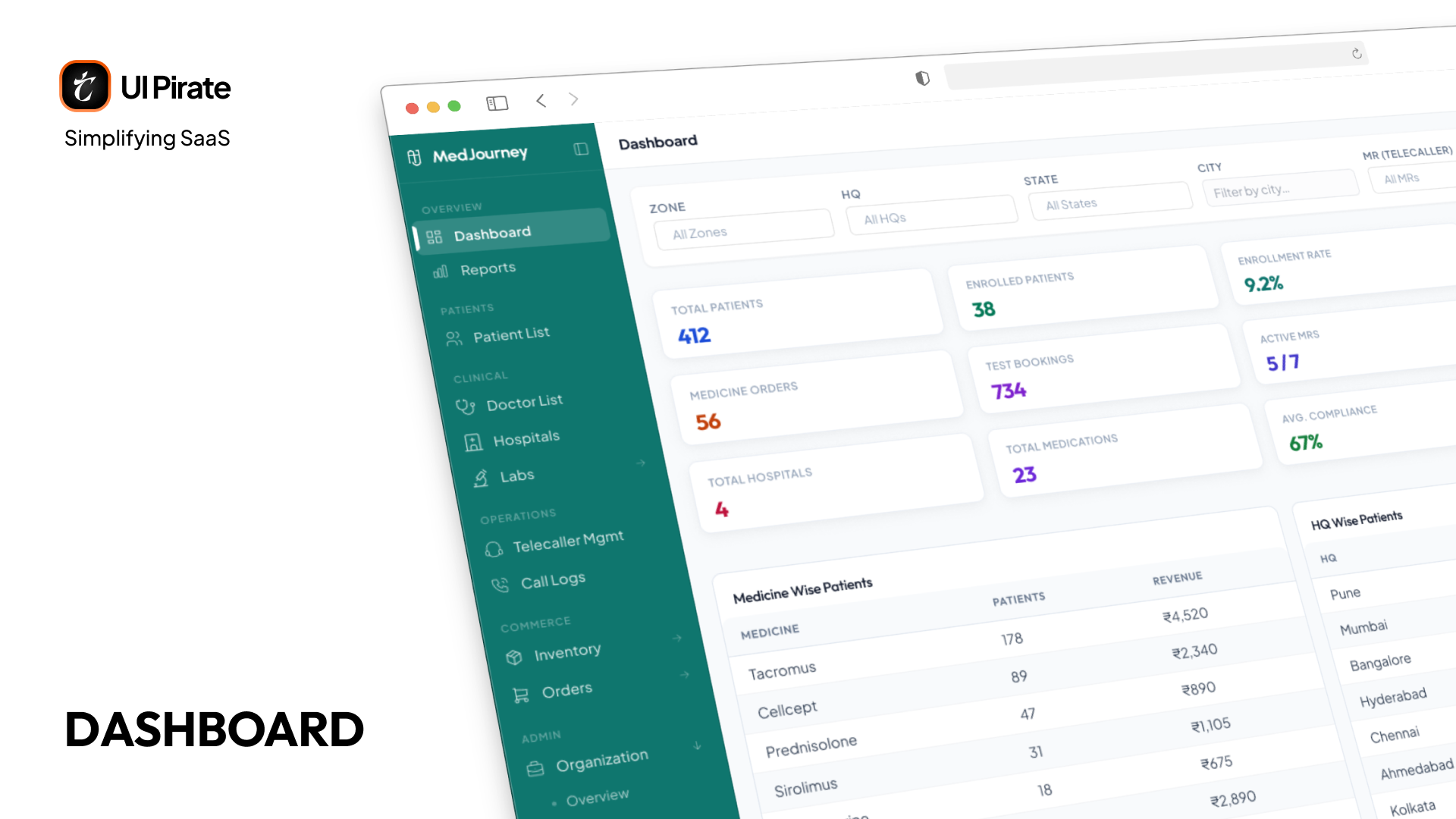
Dashboard carries the total stats: patients, and the other top-line numbers that tell you how the organization is doing right now. It's the daily-glance view, answering "how are we doing today" in one screen, before you go anywhere else to find out why.
Reports
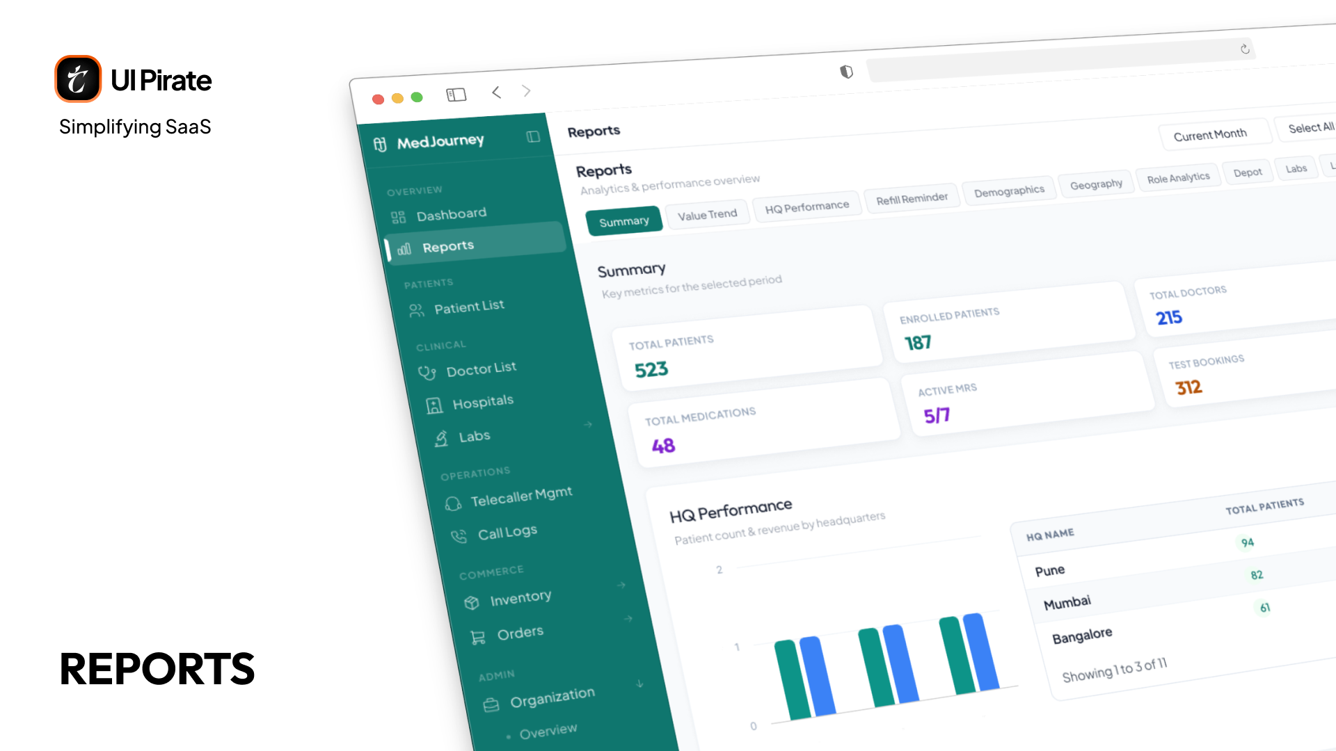
Reports is a single page, not a set of separate screens. Tabs across the top jump you to a section further down the same page, rather than navigating away. The sections are:
Summary
Value Trend
HQ Performance
Refill Reminder
Demographics
Geography
Role Analytics
Depot
Lab
Lab-wise Cost
Every one of these answers a specific question someone on the team needs answered that week, not a number for a slide.
Organization: The Settings Everything Else Depends On
Under Admin, one Organisation section holds the settings that shape everything else in this patient support platform's console.
Overview
The organization's own profile and configuration, name, branding details, and the top-level settings everything else in this section builds on.
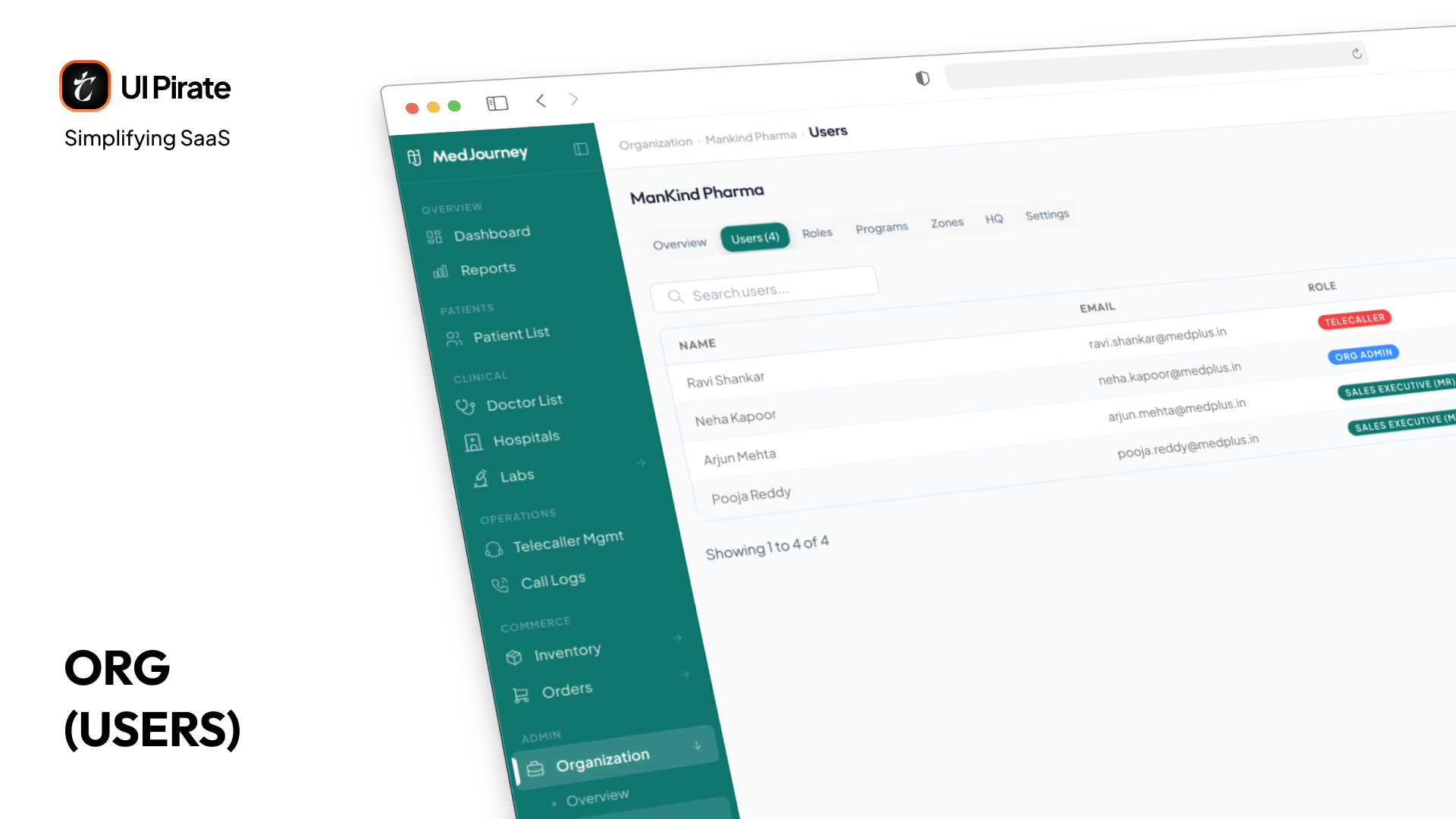
Users and Roles
Users is every person with access to the organization, with the ability to add new ones. Roles sits right beside it, a lighter view into the same role and privilege system covered earlier in this case study, kept here since it lives in the sidebar under Organization too. The two are closely enough related that they share one mockup.
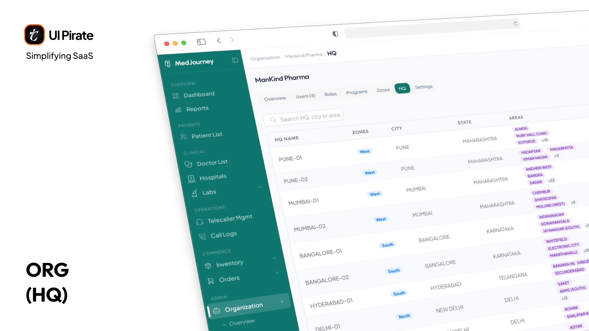
Zones and HQ
Zones is the geographic hierarchy that lets telecallers, reports, and performance metrics all be filtered by area. HQ sits above it, headquarters records for organizations with a multi-region structure. The two are directly related, HQs contain zones, so they're shown together.
Compliance Is the Foundation, Not a Feature
MedJourney handles Protected Health Information: real medical records, treatment histories, diagnostic results. That brings design constraints most patient support platform products never face.
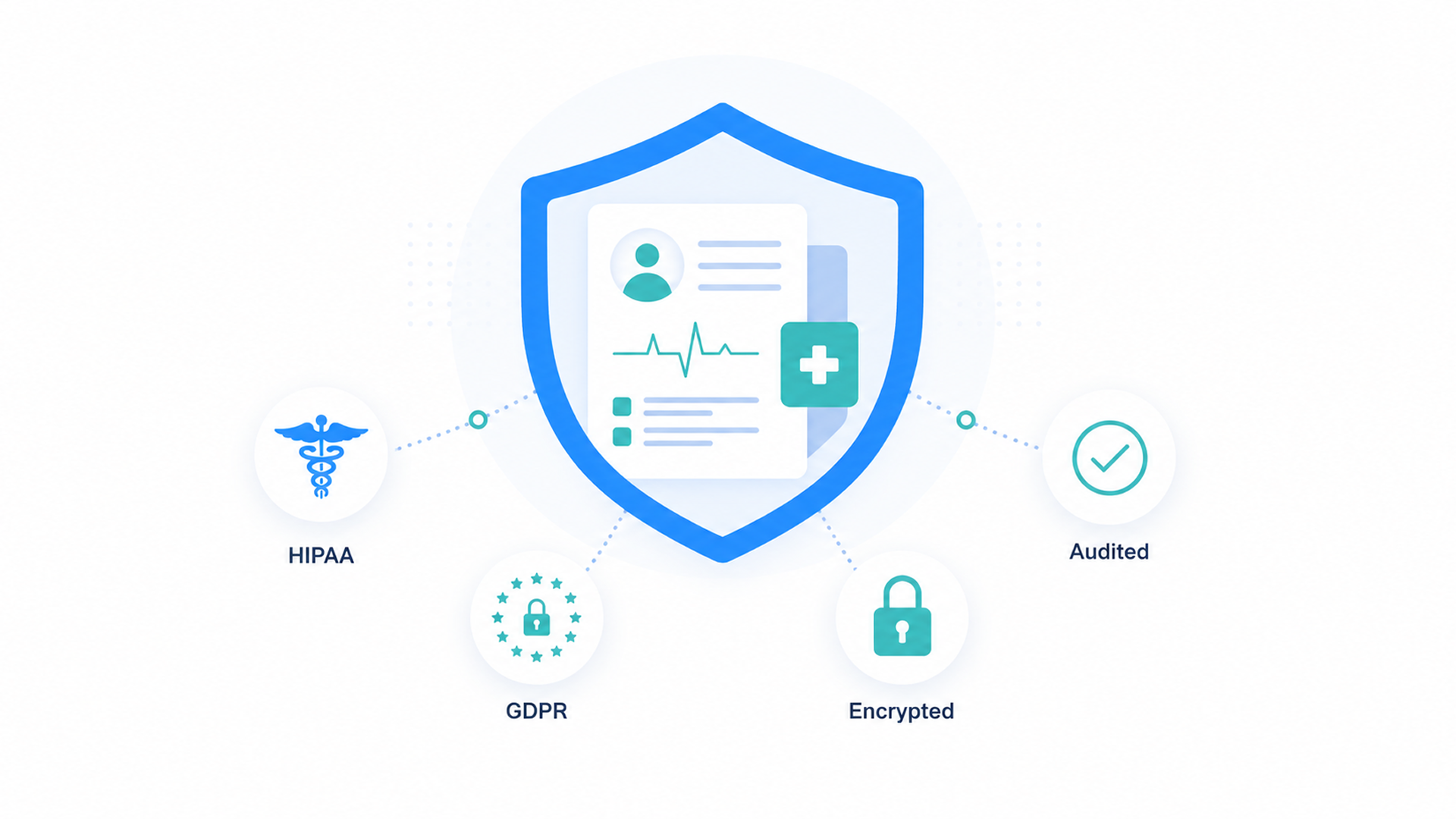
The platform had to be built around:
HIPAA and GDPR data protection
Consent management with documented patient authorization
A full audit trail, logging every action against the resource it touched, with a dedicated history view per record
Encryption at rest and in transit
None of this could be added later. Consent isn't a checkbox in settings. It's a workflow: visible during onboarding, documented in the timeline, and answered before every call. "Does this patient have active consent for contact?" is a question the system resolves before you pick up the phone.
Every screen you touch is auditable: who accessed the record, when, and what changed. Even the fine-grained privilege system is compliance architecture, not over-engineering. In healthcare, who can see what isn't a preference. It's a legal requirement working quietly to protect you and your patients. It's also a core part of what makes this a patient support platform you can trust with real medical data.
"In most SaaS products, compliance is a section in settings. In healthcare, compliance is the soil everything else grows from."
We deliberately studied the regulations before studying the users. It sounds backwards, but designing an ideal workflow and retrofitting consent checks would have meant redesigning everything twice.
Telecaller Workspace and Telecaller Management
Telecallers are the operational heart of a patient support platform. They're on the phone all day, keeping patients engaged with treatment. Getting this right meant designing two different views of the same work. One is what a telecaller sees when they log in. The other is what an admin or manager sees when they're overseeing the whole team.
Telecaller Workspace
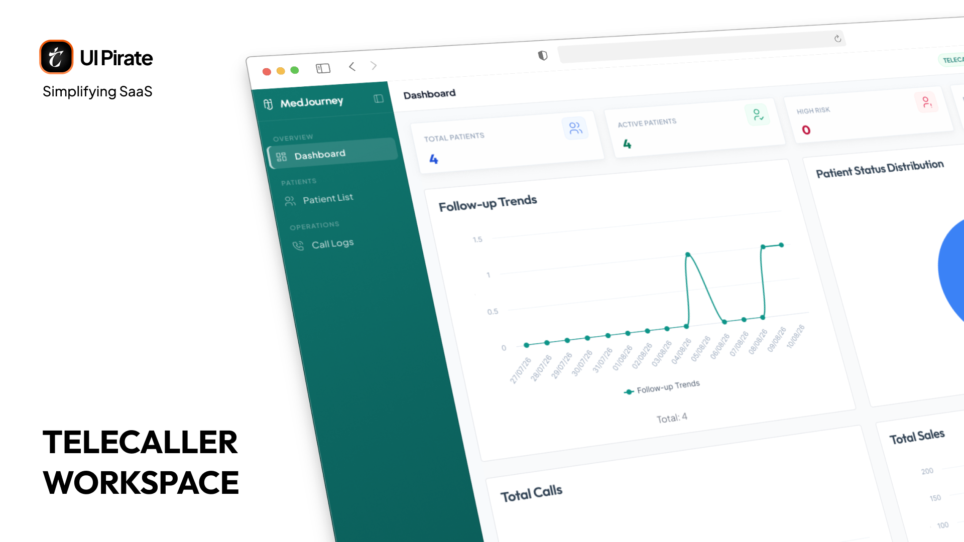
When you log in as a telecaller, you land on your own dashboard, built around the day ahead of you:
KPI cards up top: Calls Made Today, Conversions, Sales Revenue, Pending Follow-ups
An Upcoming Follow-ups list with risk badges, so you know which patients need attention first
Call analytics charts: calls over time and outcomes distribution, so you can see your own patterns
A daily/weekly/monthly toggle, letting you zoom out from today's queue to your broader performance
This is your workspace. Everything you need to start the day, who to call, how you're tracking, is visible the moment you log in.
Telecaller Management
As an admin or manager, you need one place to see how every telecaller is actually performing, not just a headcount on a spreadsheet. Click into any telecaller from the org side and you land on a detail view with five tabs:
Overview: KPI cards and a performance chart over time, so you can see one telecaller's trajectory at a glance
Call Log: every call this telecaller made, with playback, so quality is never a guess
Sales: a monthly sales chart alongside the detailed order table behind it
Patients: the full list of patients assigned to this telecaller
Programs: every program this telecaller works with, along with the patient count in each
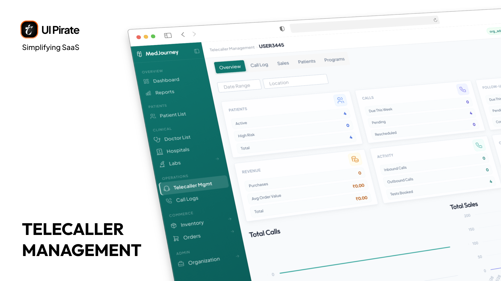
The Overview tab is the one you land on first, so it had to carry the most weight. It's where the daily stats live: calls made, conversions, follow-ups completed, and the patients currently sitting in this telecaller's queue. You get a snapshot of workload and outcome side by side, not two separate reports you have to mentally merge.
Follow-Ups as Alerts, Not Data
A missed follow-up isn't just a missed call. It's a signal that a patient may be disengaging from treatment. Miss enough of them and the program fails, not because the medicine doesn't work, but because the support system lost contact.
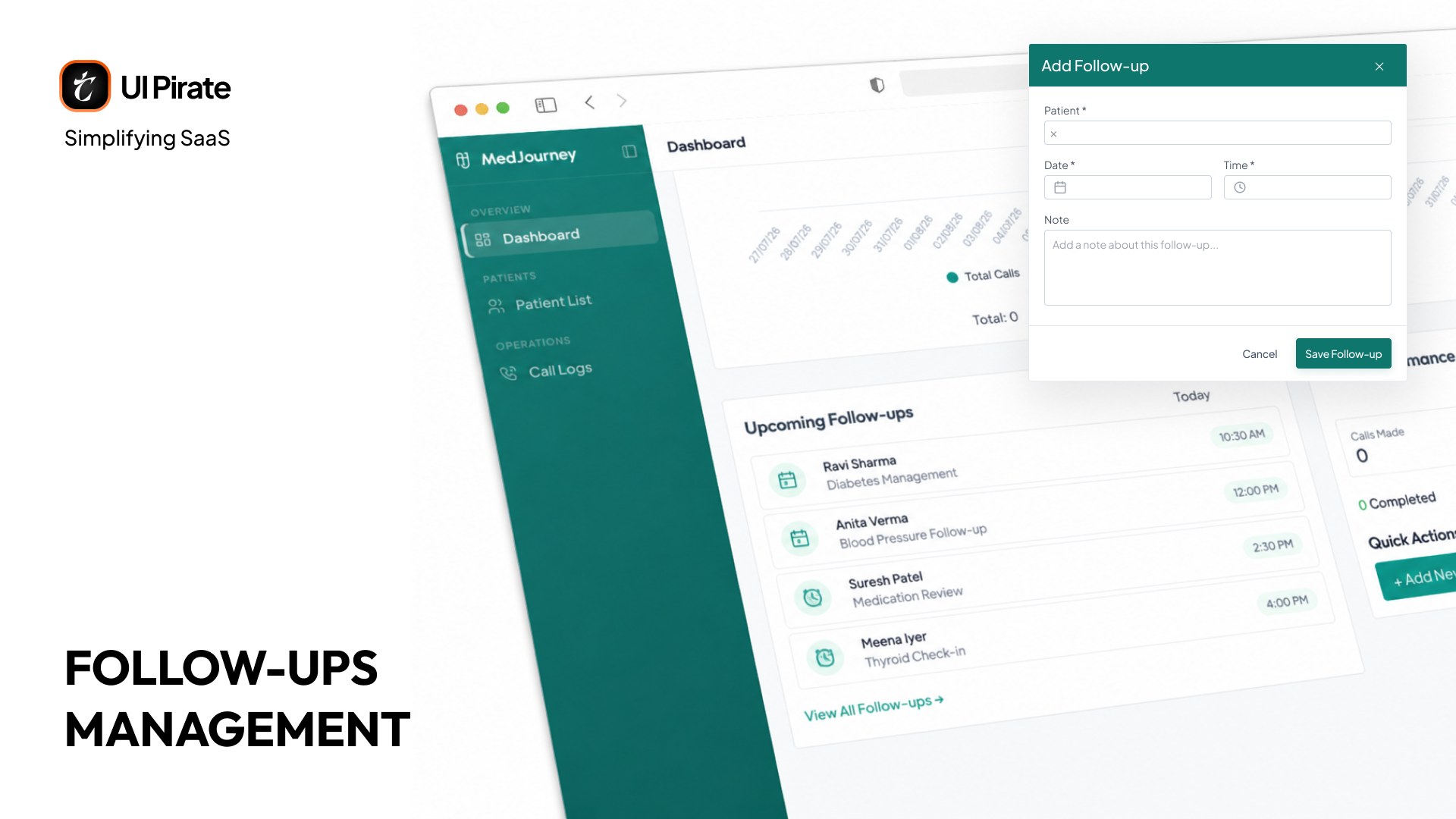
That's why follow-ups get their own dedicated space on the telecaller dashboard rather than living buried in a call log. You get:
An Upcoming Follow-ups widget showing patients due today or this week, filterable, with each patient's name, program, scheduled time, and a one-click call button
A performance panel showing aggregate completed and missed call counts for the selected period, so you can see your standing at a glance
An Add Follow-up modal for creating a new follow-up manually, with patient selection, date, time, and a note field
The decision that mattered most was giving follow-ups their own visible home on the dashboard instead of leaving them to surface only inside a patient's record. Because in healthcare, silence isn't neutral. Silence is a risk signal, and a follow-up you have to go looking for is a follow-up you're more likely to miss.
A Design System Built for Long Shifts
You spend hours a day inside this patient support platform, and misreading a data point can affect patient care. The design system had to protect you against both fatigue and error.
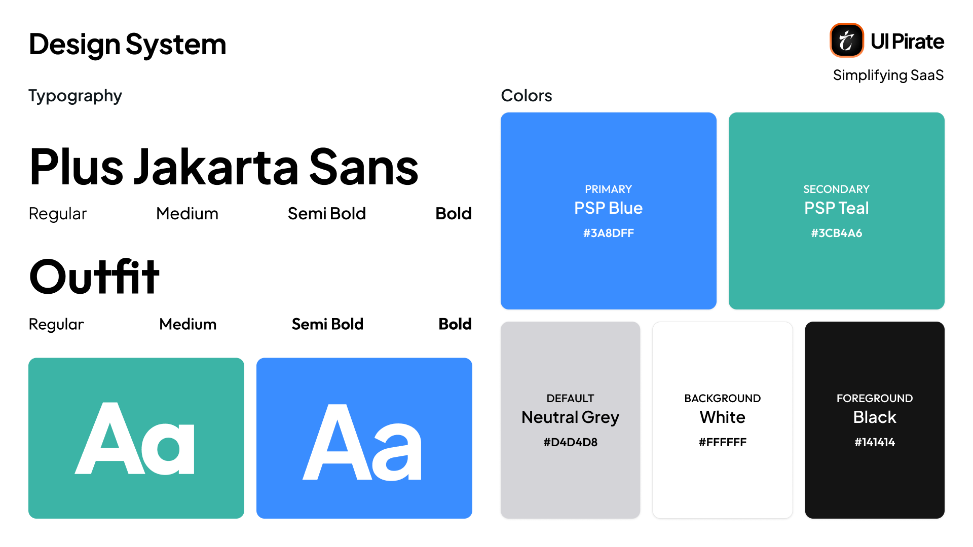
Color with Purpose
Primary Blue (
#3A8DFF): trust and clarity. Used for primary actions, navigation, and data emphasis.Secondary Teal (
#3CB4A6): warmth and patient-centricity. Used for patient-facing elements, success states, and wellness indicators.
The split created a quiet visual language: blue means system, teal means person. You never think about it consciously, but your eyes learn it fast.
Typography
Typography runs on a pair of fonts: Plus Jakarta Sans and Outfit. When you're scanning a dense dashboard between calls, the text has to absorb in seconds. No flourishes, just clarity.
Components for a Patient Support Platform
Patient cards: name, program, adherence status, last interaction, next action
Timeline entries: consistent event components with distinct treatments per type
Status chips: one status language everywhere, active, pending, missed, at-risk
Data tables: sortable, filterable, bulk-actionable, built for the hundreds of records you manage daily
Dashboard cards: number, label, trend, action link, each a miniature decision tool
Form components: tab ordering, inline validation, smart defaults for fast entry
The Tech Stack Behind MedJourney
Every technology choice here solved a specific problem this platform has. None of it was picked because it's trendy.
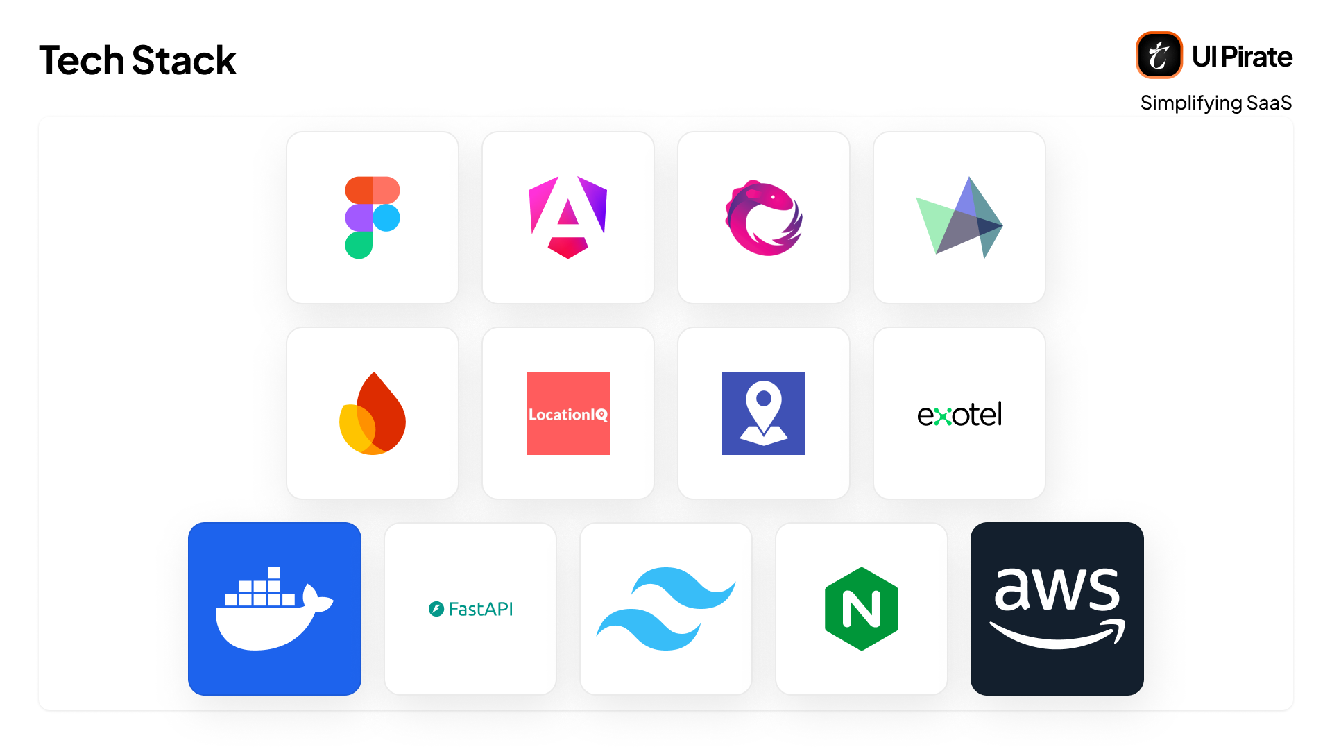
Technology | Why We Used It |
|---|---|
Figma | The design system and every mockup in this platform live here first, kept as the single source of truth so design and engineering never drift apart. |
Angular 20.3 | Chosen for its opinionated structure, which matters when you're building a console with dozens of modules and need consistency enforced by the framework, not just convention. |
Angular Signals | Fine-grained reactivity for dashboards that update constantly, call stats, follow-up counts, inventory alerts, without the overhead of a heavier state library. |
RxJS | Handles the async data streams underneath: API calls, notification feeds, and live call status updates from Exotel. |
Highcharts | Every trend line, performance ranking, and demographic breakdown in the Reports module runs through Highcharts, chosen for how cleanly it handles dense healthcare data. |
Firebase Cloud Messaging | Pushes follow-up reminders and alerts to telecallers and admins in real time, so a missed follow-up doesn't sit unnoticed. |
Exotel API | Powers click-to-call, call recording, and call status tracking, the backbone of the patient outreach this whole platform is built around. |
Geoapify and LocationIQ | Geocoding and address lookups for zones, HQs, patient addresses, and lab collection locations, run through two providers for coverage. |
TailwindCSS | Utility-first styling that keeps the design system's spacing, color, and typography rules enforced at the code level, not just in Figma. |
Python (FastAPI) | The backend API framework, chosen for async performance under load and for how quickly it lets us ship well-typed, validated endpoints across a system with this many modules. |
Docker | Every service ships in containers, so the environment that passed testing is the exact environment running in production. |
AWS | Hosts the platform's infrastructure, chosen for the compliance certifications and regional data residency options a healthcare deployment needs. |
Nginx | Sits in front of the application, routing traffic and serving the frontend efficiently. |
Designing and Building at the Same Time
MedJourney wasn't a design project that ended with a handoff. We designed the patient support platform and built both the Angular frontend and the FastAPI backend as one continuous process, and it changed everything:
Decisions were tested in code, not just prototypes. When timeline scrolling struggled with 200+ entries, the rendering was redesigned in days, not weeks.
Edge cases surfaced during development. What does the telecaller dashboard look like with zero patients? What happens when a batch expires mid-count? The same team that designed the interaction answered it.
The design system was born from real components. Every element exists in both Figma and Angular. Consistency isn't aspirational. It's enforced by shared code.
Frontend and backend evolved together. A frontend team designing against a fixed API spec has to wait for changes. Here, the API and the interface that consumed it were shaped by the same conversations, in the same sprints.
"You can't hide complexity in a mockup when you're the one writing the code."
What Was Harder Than We Expected
Regulations Shaped More Decisions Than Research
In most projects, user research drives direction. Here, compliance had equal and sometimes greater influence. Regulations weren't constraints on the design. They were the design requirements.
One Console Had to Feel Tailored to Everyone
Telecallers get their own login and their own first impression. Everyone else, nine default roles and counting, shares one Organisation console. Making that console feel purpose-built for a pharmacist and for a zone manager, using the same screens with different privileges, was a calibration exercise that ran the entire project.
Naming Things in Healthcare Is a Minefield
"Patient" vs. "customer." "Adherence" vs. "compliance." Words that sound natural in tech, like "user" or "conversion," can feel wrong in a clinical context. We spent more time on nomenclature than expected, and it mattered.
What MedJourney Became
MedJourney became a connected healthcare ecosystem: a patient support platform where pharma companies, telecallers, hospitals, labs, pharmacists, inventory teams, and program managers all work from one system. Each of them sees the parts of the journey that matter to their work.
Not a call center tool. Not a patient database. Not a pharmacy system. An ecosystem, built from a problem and named around a philosophy. Designed for two very different logins and the range of roles inside them, and developed into production, frontend, backend, and infrastructure, under regulations we'd never worked with before.
Underneath it all sits one principle: the best healthcare design is invisible. If you're a telecaller, you should think about patients. If you manage inventory, you should think about stock. The design succeeds when it disappears, when the platform helps you protect patients, save time, and improve outcomes without ever demanding attention for itself.
Building a platform where the stakes are measured in health outcomes, not just metrics?
We design products that carry that weight.