
How NxVoy Replaced 8 Browser Tabs With One AI Conversation: An AI Flight Booking UX Case Study
uipirate
400 views · 18 min read
18 min read | 4 months ago
Watch someone plan a trip: eight tabs, five sites, an entire lost afternoon. NxVoy turns that AI flight booking research into a single, effortless conversation.
How many tabs does it take to book one flight?
Nobody plans a trip in one tab. You open five. One for flights. One for a second opinion on flights. One for the weather. One for "do I need a visa." And one that's somehow just a Reddit thread about airport lounges. An hour disappears before a single flight gets booked. You still aren't confident you found the right one.
NxVoy set out to fix that. Tell its AI flight booking assistant where you're going, in one sentence, and it handles the rest.
"Travel planning had quietly turned into a research project. We wanted to turn it back into a conversation."
Why We Started With Flights
NxVoy's long-term vision is an AI that runs your whole trip: flights, hotels, activities, group logistics, translation, itinerary management, all of it. Our engagement was narrower and more deliberate. We designed the foundation: the AI flight booking experience the rest of the platform would eventually be built on.
That scope wasn't caution, it was strategy. Flights are the hardest booking problem in travel. Pricing shifts by the hour. Routes combine multiple airlines. Layovers carry real logistical risk, and cabin classes change what's actually being sold. Get flights right, and the rest of the roadmap inherits a system that already works. Get flights wrong, and nothing downstream matters.
As the design partner on this, that's also how we scoped the engagement. We pushed to prove the AI flight booking interaction model on the hardest module first, so every future team building on this foundation inherits patterns that already survived the worst case.
Inside the Platform
Before getting into any single feature, it's worth seeing the AI flight booking product as a whole.
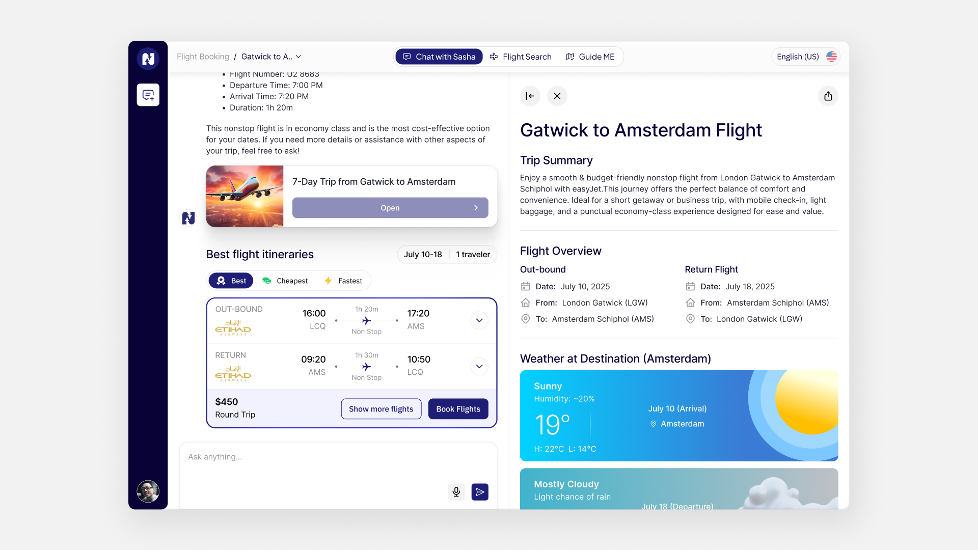
NxVoy's interface is built around two coexisting entry points on the same canvas: a conversational panel on one side, and a full traditional booking flow underneath it. Neither is a stripped-down version of the other. You can start a search by typing a sentence to Sasha. You can switch to manual filters halfway through. Either way, you land on the exact same flight cards.
That architectural decision, one product with two front doors sharing every downstream screen, is what let the team design conversational AI without gutting the search experience power users expect from any serious travel platform.
Meet Sasha
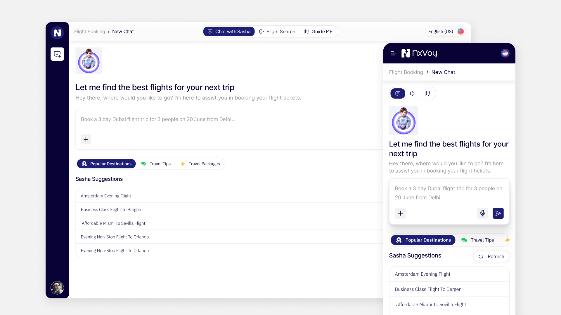
Sasha isn't a chatbot bolted onto a booking engine. It's the front door to NxVoy's AI flight booking experience.
You type one line: "Book a 3-day Dubai trip for 3 people on June 20 from Delhi." Sasha parses your intent (destination, dates, traveler count, origin) and searches available flights across airlines and routes. It ranks recommendations by priority, assembles a full trip overview, and returns bookable options with pricing and routing, all from that single sentence. No dropdown menus. No "origin / destination / dates / passengers / cabin class" form standing between you and an answer.
The distinction that matters here isn't speed. It's what Sasha volunteers without being asked. A chatbot answers the question you typed. Sasha answers that question, plus the several you didn't think to ask. "3-day trip" implies specific return dates. "3 people" implies group-booking considerations. "Dubai in June" quietly triggers a heat warning nobody requested but everybody needed.
We treated that distinction as the actual design brief for this AI flight booking product. Anyone can wire a chat window to a flights API. The harder, more valuable problem was deciding what Sasha volunteers unprompted, and building the logic to make every response feel like a briefing instead of a query result.
"A chatbot waits for the right question. Sasha assumes you don't know all the right questions yet, and answers them anyway."
The Conversation Itself
What the chat interface actually looks like matters as much as what it does. On both web and mobile, the Sasha screen was designed to read as a conversation, not an AI flight booking form disguised as one. Message bubbles. A persistent input at the bottom. Sasha's replies structured so that flight options, trip context, and follow-up questions stay visually distinct, instead of dumped into one wall of text.
This is also where the product had to hold its nerve. It would have been easy to add quick-reply buttons and dropdown pickers to make the AI feel more "controllable." Instead, the interface trusts the input field, with structure coming from how Sasha organizes its response rather than from constraining what the user can type.
That was a deliberate bet on our end: safety nets like quick-reply buttons are the easy sell in a stakeholder review, but they also quietly turn a conversation back into a form. We argued for trusting the input field because the whole premise of the feature depended on it.
AI Flight Booking, Built for Two Very Different Travelers
Maybe you want to describe a trip and let the AI sort it out. Or maybe you already know exactly what you want, down to the airline and departure window, and just need a fast, filterable search form. Designing exclusively for either group would have meant losing the other, so NxVoy didn't choose.
Conversational planning
The default entry point: natural-language planning for anyone who's unsure, is juggling something complicated (multi-city, group, flexible dates), or would simply rather be guided than filter sixty results themselves.
Traditional search
The deliberate alternative if you already have opinions, covered in more detail next.
The design decision tying both together is that they lead to the same results. Whether your flight surfaces through Sasha or through manual search, it's the same card, the same comparison view, the same booking flow. The AI is an alternative entry point into the product, not a separate product bolted on the side.
The Search Form, Taken Seriously
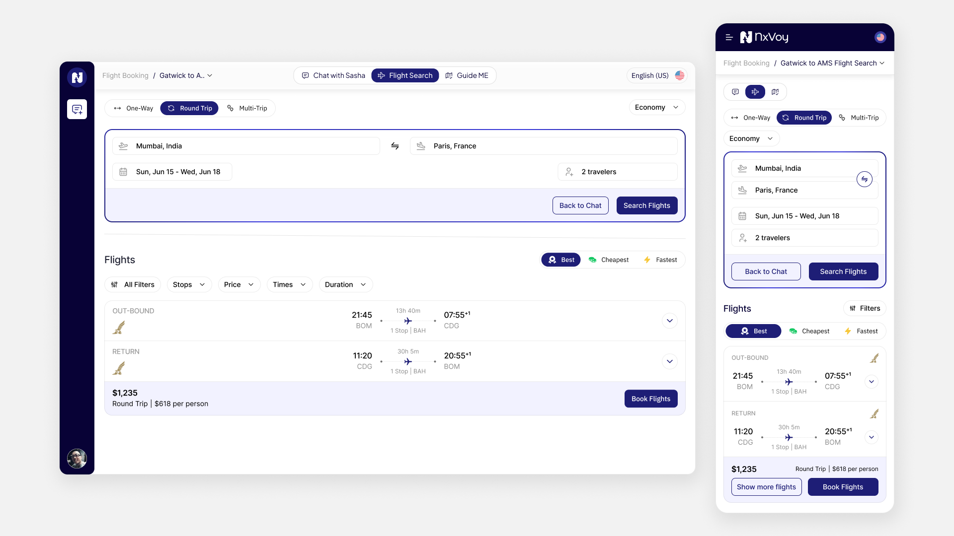
If you want manual control, NxVoy supports the full range of traditional AI flight booking. One-way trips, round trips, and multi-city itineraries with multiple legs. Flexible traveler counts from solo to group, cabin class selection from economy through first, and real filtering by airline, time, stops, duration, and price.
This wasn't treated as a fallback tucked into a settings menu. It was built to the same standard as any dedicated flight-search platform. A portion of NxVoy's audience will never touch the AI at all, and the product had to earn their trust on its own terms.
The Flight Card: One Component, Every Scenario
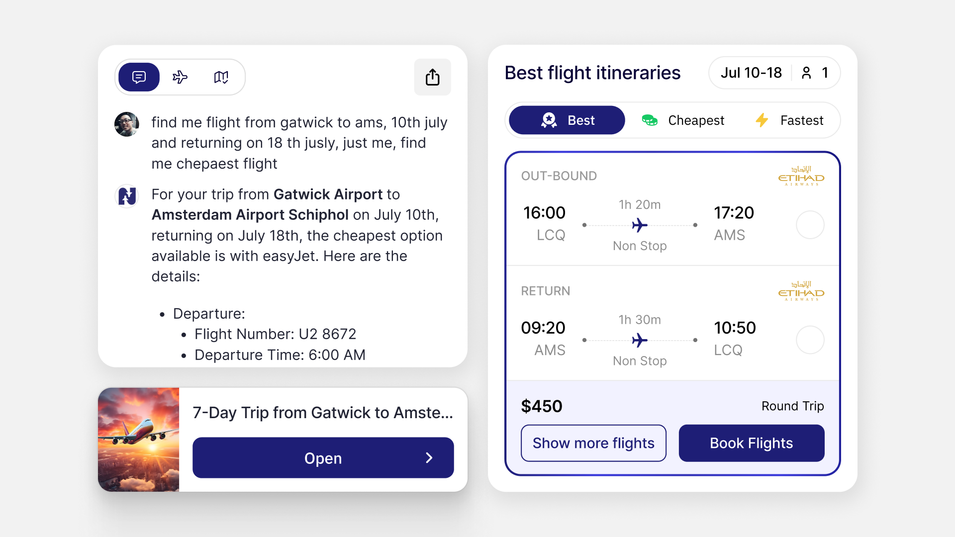
Every AI flight booking result in NxVoy, whether it arrives through Sasha or through manual search, lives inside the same card component. That card had to flex across a wide range of itinerary shapes: a simple outbound-and-return pair, a multi-leg trip, or a single one-way flight.
Each card surfaces the outbound and return legs with their timings, the round-trip price and per-person breakdown, and a clear path to see more flights or book. Consistency here wasn't a nice-to-have. It's what lets you compare options confidently instead of re-learning the layout every time a result looks slightly different.
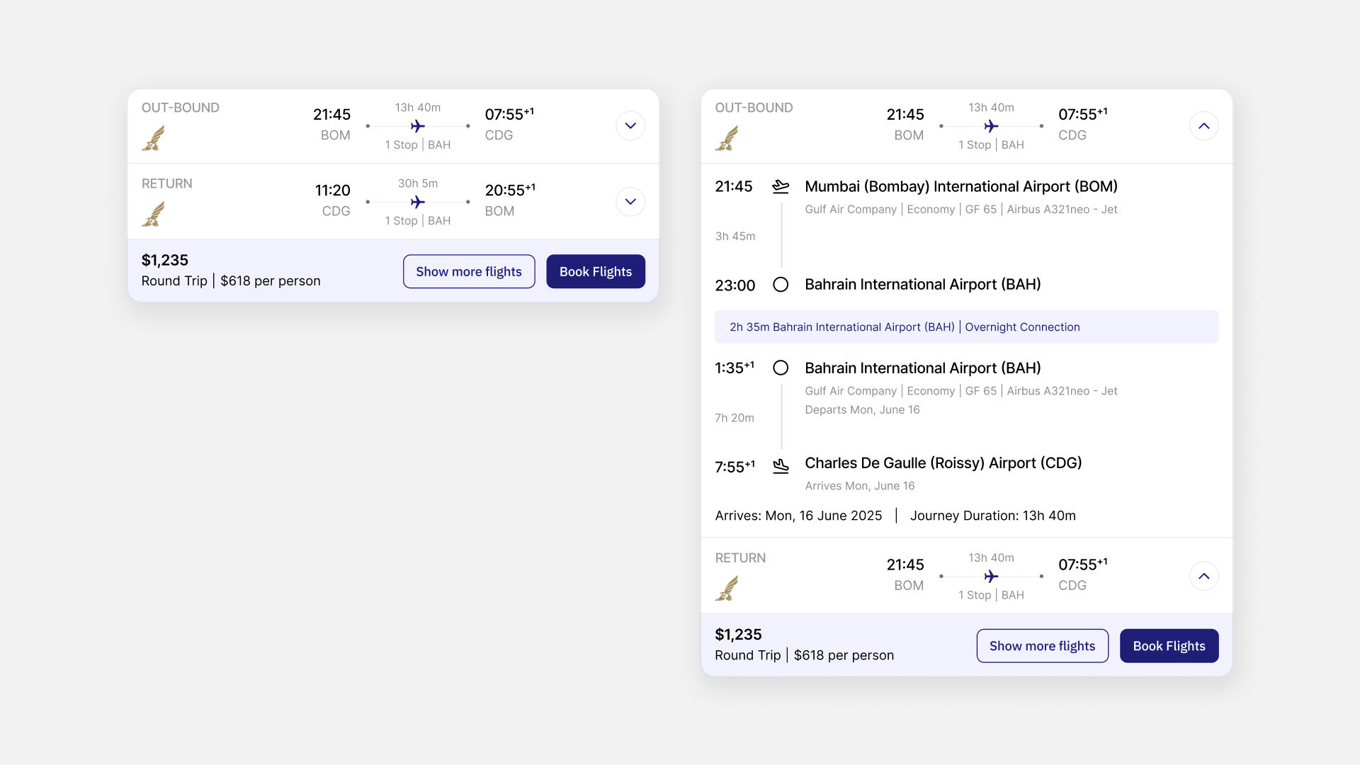
Progressive Disclosure: Simple First, Details on Request
A flight card showing every detail at once, airport codes, connection times, operating carriers per leg, would be unreadable. NxVoy's AI flight booking cards default to the essentials: times, price, airline, stops. Expanding a card (a collapsible accordion) reveals the operational detail underneath: which airport a connection happens at, which airport you land in, and whether a connecting leg involves a day change.
This pattern, summary first, detail on demand, shows up throughout the product. It's a small interaction decision that does a lot of work. If you're scanning quickly, you aren't punished with clutter. If you need the specifics, you never have to leave the card to find them.
It's also a pattern we push for on most data-dense products we design, not just this one. Progressive disclosure is cheap to skip under deadline pressure and expensive to retrofit later, so we treat it as a non-negotiable early decision rather than a polish pass at the end.
When There's No Return Flight
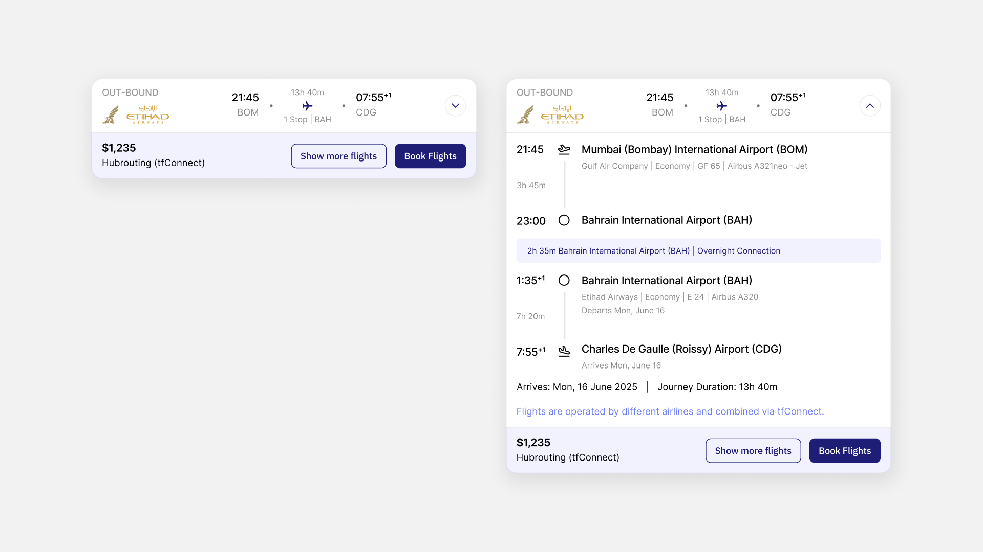
Not every AI flight booking search is a round trip.
NxVoy had to support itineraries with only an outbound leg cleanly, without the interface implying a return exists when it doesn't. The card layout adjusts to show a single-leg journey with the same clarity as a round trip: no empty "return flight" placeholder, no visual gap suggesting something is missing.
One-way search is a first-class case, not an edge case the design happened to survive.
A Trip, Not Just a Ticket
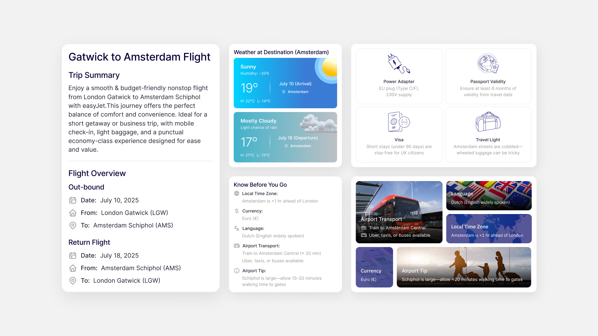
This is where NxVoy differentiates itself most clearly from a standard booking site. When Sasha (or manual search) returns flights, it attaches a full trip overview alongside them, consolidating research you'd normally do across five separate websites:
Destination overview: a practical orientation to the place itself, not just a marketing blurb
Weather forecasts: actual conditions for your specific travel dates, not seasonal generalities
Visa guidance: whether you need a visa, what the process involves, and whether visa-on-arrival applies. This single piece of information can change whether your trip is feasible at all. It's usually discovered too late, after booking, on most platforms
Currency information: exchange rates, payment norms, tipping expectations
Local transportation: how to get from the airport to the city, typical taxi costs, public transit options
Practical "know before you go" details: local time zone, what power adapter your destination uses, passport validity requirements, and other logistics experienced travelers already know and first-timers need
Every one of these fields exists because it's something you'd otherwise open a new tab to check. Consolidating them turns your AI flight booking moment from "here are your flights" into "here's your trip."
This list also came from us sitting with the actual research behavior, not from a generic "what do travelers care about" workshop. Each field maps to a specific tab in that eight-tab habit from the opening of this case study, which is why the list stops where it stops instead of growing indefinitely.
"Traditional booking sites show flights. NxVoy shows trips."
Sixty Flights Is a Wall. Three Is a Decision.

A single route search can return sixty individual flight results: different airlines, different times, different layovers, different prices. Asking you to evaluate all sixty against your own priorities, price versus convenience versus duration versus airline preference, is genuinely exhausting. It's the point at which most travel sites lose people to decision fatigue.
NxVoy's AI flight booking search organizes every result into three labeled categories, presented as a simple chip you can tap between:
Best: the balanced pick across price, duration, and convenience. The answer for "I don't want to think about this."
Cheapest: the lowest fare available, regardless of convenience. For anyone who'll take a 4 AM departure to save money.
Fastest: the shortest total travel time. For business travelers and anyone who values time over price.
This isn't just sorting, it's curation. The platform makes a confident judgment call about what "best" means, states it plainly, and still lets you override it with manual filters.
Committing to a labeled "Best" was actually the more contested decision internally. It's more defensible, from a pure engineering standpoint, to just show a sortable table and let the user decide. We pushed for the opinionated version anyway, because a confident recommendation is what turns sixty rows into a decision instead of a research task.
The Routing Problem Nobody Sees Until It Costs Them
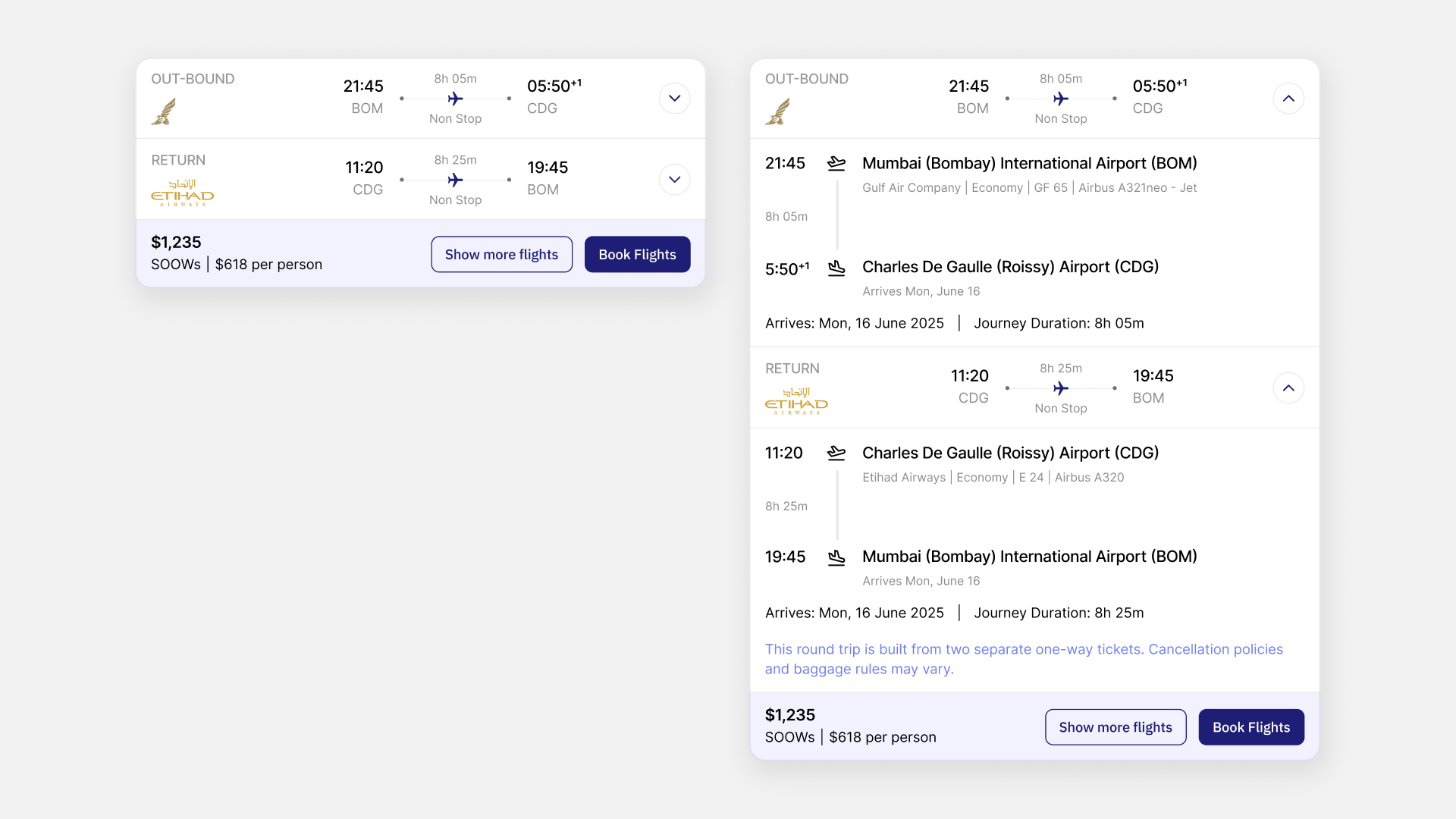
You probably assume a round-trip flight is simple: one airline, out and back, one ticket. In practice, the airline routing ecosystem behind AI flight booking is considerably more complex. NxVoy had to make that complexity legible without making it alarming.
Standard round trips
The simple case: same airline, outbound and return, a single ticket with one baggage policy and one cancellation rule. The design challenge here is minimal. Present the flights clearly, and move you toward checkout.
Hub routing
Connects two flights, possibly on two different airlines, through an intermediary airport. A Delhi-to-Dubai search might return a result flying Delhi to Mumbai on one carrier and Mumbai to Dubai on another. The interface has to answer, without you asking: which airlines are involved at each leg, and how long is the connection at the hub. Does your baggage transfer automatically, or do you need to recheck it? Is that connection protected if the first flight is delayed?
SOOWs (Sum of One-Ways)
The most complex case, and the most misunderstood. A SOOW looks like a round trip but is actually two separate one-way tickets, priced and ticketed independently. That structure matters in practice. Pricing can be lower than a traditional round trip. Baggage allowances can differ between the two legs. Cancelling your outbound doesn't automatically cancel your return, and the two legs can be operated by entirely different airlines.
You've probably never heard the term "SOOW," and you don't need to. What you need is a clear, plain-language flag the moment one appears: this itinerary is priced as two separate tickets, and here's what that means for your baggage and your refund. NxVoy surfaces that explanation inline, focused on practical consequences rather than industry terminology.
"Airline routing is genuinely complex. Our job wasn't to simplify it. It was to translate it."
Comparing Flights Without Losing the Trip
Once you have a shortlist, you need to weigh options against each other. Total duration including layovers. Number of stops. Airline and loyalty considerations. How comfortable or rushed a given connection is. Total cost including fees, and what's included at each cabin class. Departure and arrival times matter too; the cheapest flight is not always the 6 AM flight you actually want.
The comparison view keeps trip context visible throughout every AI flight booking decision. If you're comparing three flight options, you never lose sight of the overall journey you're evaluating them against. That was a deliberate choice: flight comparison should feel like part of planning a trip, not like reading a spreadsheet that happens to be about one.
Designed for a Thumb, Not a Mouse
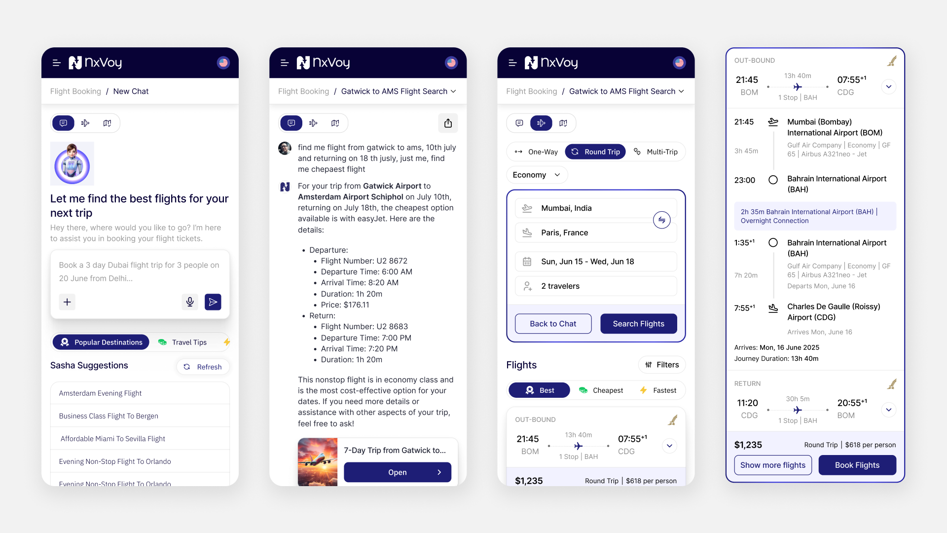
Travel planning doesn't only happen at a desk. You check flights on a commute. You compare prices in a checkout line. You confirm visa requirements from a café table, and modify bookings from an airport lounge. NxVoy needed to be fully capable on mobile, not a responsive shrink of the desktop layout, but an AI flight booking experience designed for how you actually use a phone.
Concretely, that meant: Sasha reading as a messaging conversation rather than a squeezed desktop panel, with chat bubbles and a bottom-anchored input; search built step-by-step across focused screens instead of one cramped form; flight comparisons as swipeable cards instead of scrollable tables; trip summaries that collapse and expand vertically instead of spreading out horizontally; and checkout built for minimal typing and thumb-friendly input.
Several mobile concepts were explored across the project, refining the balance between information density and one-handed usability. We treated mobile as its own design track from kickoff, with its own review cycles, rather than a conversion pass done after desktop was approved, which is the more common (and weaker) approach we've seen on other travel products.
"We didn't shrink the desktop experience. We redesigned travel planning for a screen you hold in one hand, standing on a train."
Earning Trust When the Stakes Are Real
A wrong hotel pick wastes a few hundred dollars. A wrong flight recommendation, a missed visa requirement, or a misread layover can wreck your entire trip. That gap in consequence made trust the actual design problem underneath every feature in the platform.
This is where we pushed back on the instinct, common on AI products, to solve trust with copywriting: reassuring microcopy, a friendly avatar, a disclaimer in the footer. None of that holds up the first time a recommendation is wrong. We approached trust as an interaction design problem instead.
Four Ways NxVoy Earns Your Trust
Show the reasoning, not just the result. When Sasha calls a flight "Best," the interface shows why: balanced price, reasonable duration, a well-reviewed airline, a comfortable layover. You get to evaluate the criteria yourself rather than simply trusting a label.
Source information visibly. Weather, visa, and currency data carry attribution and freshness indicators. "Visa information last updated 3 days ago" tells you the data is actively maintained, not stale.
Always offer manual verification. Every AI-generated result can be checked against the traditional search interface. Sasha is a faster path to the same results you could find on your own, never a black box you're asked to simply trust.
Be honest about limitations. If your request falls outside Sasha's capabilities, complex multi-destination routing, niche airline partnerships, corporate booking requirements, it tells you so plainly and routes you to manual search rather than guessing. Admitting a limit builds more trust than pretending to have none.
A Design System Built to Outlast Flights
Flights were the first AI flight booking module NxVoy shipped. But the platform's long-term ambition (hotels, attractions, group planning, full itinerary management) meant the design system couldn't be flight-specific. It had to be travel-generic from day one.
The Five Components That Make It Reusable
Travel cards: the core display component, generic enough to hold a flight today and a hotel, activity, or attraction in a future module, with a consistent structure of primary information, key metrics, expandable detail, and a clear action
AI conversation patterns: standardized structures for how Sasha presents different types of information, extendable to hotel recommendations or itinerary changes later
Search modules: form components and filter systems designed to flex across travel content types, so a future hotel search inherits the same date pickers and traveler configuration patterns as flight search
Flight result components: specialized pieces for routing, layovers, cabin class, and pricing, built on top of the generic card and comparison frameworks rather than as one-off screens
Comparison frameworks: the same side-by-side evaluation pattern that works for flights today is built to extend to hotels and activities later
What Was Genuinely Hard
Translating natural language into a bookable flight
"Book a 3-day Dubai trip" reads as clear, but does "3-day" mean three nights or three calendar days? Do you want to depart on June 20 or arrive on June 20? Natural language is inherently ambiguous; AI flight booking systems require precision. Sasha's responses confirm the interpretation before presenting results: "I found flights departing Delhi on June 20 and returning June 22 (2 nights). Is that right?" That single confirmation step prevents the most common frustration with AI travel tools: getting a confident, well-formatted answer to the wrong trip.
Making "Best" mean something defensible
Once a category is labeled "Best," you hold the product to that word. It isn't simply "cheapest plus a little more." Explaining the actual evaluation behind it, without burying you in algorithm detail, required constant calibration.
Keeping routing complexity invisible until it matters
Most travelers never think about hub routing or SOOWs until a connection is missed or a baggage fee is unexpected. The challenge was surfacing that information at exactly the right moment: prominent enough to be noticed, restrained enough not to create anxiety around a simple, uncomplicated booking.
Making mobile and desktop equally capable
Mobile travel planning isn't a simplified version of desktop planning. It's a genuinely different context: different input methods, different attention spans, different environmental distractions. Feature parity was the requirement; identical interaction patterns were not.
Giving Sasha a personality without making it a character
Helpful without being patronizing. Conversational without being chatty. Knowledgeable without lecturing. Getting that voice right took more iteration, and more conversation design work, than any single visual screen in the product.
What This Project Taught Us
The best AI interfaces don't announce themselves as AI
Sasha reads like texting a knowledgeable friend who happens to have access to every airline's inventory, not like operating a system. The technology stays invisible; the helpfulness stays visible. That's the ratio worth aiming for.
Conversational UI is harder to design than a form, not easier
A form constrains what you can input. A conversation doesn't. You can say anything, in any order, with any level of specificity. Designing for that openness, handling ambiguity, confirming interpretations, managing expectations, is more demanding than designing even a sophisticated filter panel.
Travel is emotional before it's transactional
A flight search result is a purchase. A trip overview with weather, visa status, local tips, and destination context is the beginning of an experience. NxVoy's trip overview reframed the booking moment from "purchasing a ticket" to "imagining a journey." That emotional shift was the product's primary differentiator, not a decorative layer on top of it.
Building the foundation matters more than building everything
We designed flights. Not hotels, not attractions, not full itineraries. That scope was deliberate. Getting the AI flight booking interaction model right on the hardest, most complex travel product first meant every simpler module afterward could inherit a pattern that already worked, instead of solving the same problems again from scratch.
Trust in AI is earned through transparency, not polish
Sasha earned trust by showing its reasoning, citing its sources, confirming its interpretations, and admitting its limitations. No amount of visual refinement or clever conversation design substitutes for that basic transparency. You trust AI that helps you make better decisions. You distrust AI that tries to make decisions for you.
The Takeaway
NxVoy proved that AI flight booking can start with a sentence instead of a search form. What happens next can be richer, more contextual, and more genuinely useful than anything a traditional travel platform offers. Not a chatbot added to a booking engine. Not a search engine with an AI feature bolted on for the marketing page. A new way to plan travel, where the AI understands your intent, supplies context, absorbs complexity, and lets you focus on what actually matters: where you're going, and why.
The flights were the foundation. The conversation was the product. The trip was the experience.
Designing an AI product people can actually trust?
We build the interaction models that make AI feel like a feature, not a gimmick.