
Xperiti: Building a Market Research Enterprise SaaS Platform for Four Different Users
uipirate
239 views · 19 min read
19 min read | 4 months ago
Xperiti needed a market research enterprise SaaS platform serving researchers, coordinators, clients, and experts, without anyone feeling completely overlooked.
What does it take to build one platform for four people who barely agree on what the product even is?
A researcher wants control. A coordinator wants a task list. A client wants a status update without asking anyone for it. An expert just wants to get paid on time. A market research enterprise SaaS platform like Xperiti had to serve all four at once, inside a single interface.

That's the real story behind Xperiti's redesign. It's not a survey tool. It's not a scheduling tool. It's a market research enterprise SaaS platform built to hold an entire operating model together without buckling under its own scope.
"Every screen in this platform answers to a different job title. Get that wrong, and someone always feels like a guest in their own tool."
The Problem This Platform Had to Solve
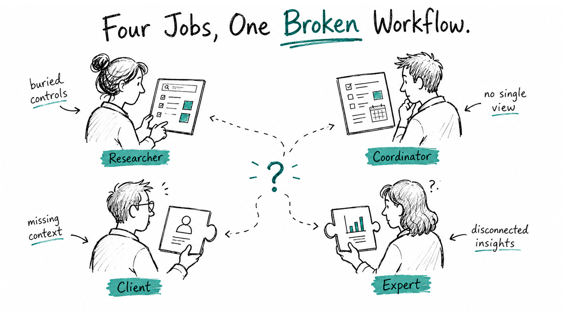
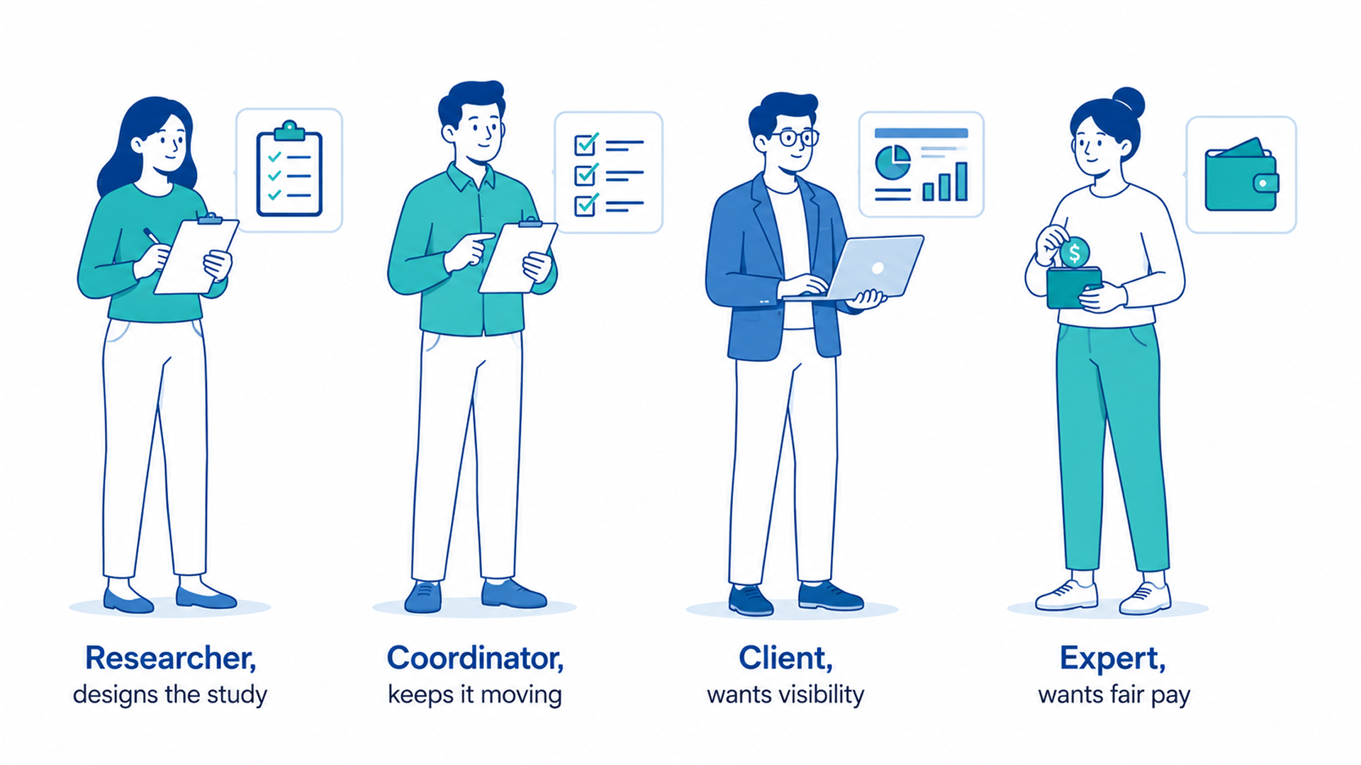
Market research runs on four jobs pretending to be one workflow. Researchers design studies. Coordinators keep them moving. Clients want visibility without becoming project managers themselves. Experts just want fair pay for their time.
Here's what breaks in most research tools:
Researchers get powerful controls buried behind screens built for someone else's job
Coordinators have no single view of what needs attention across active studies
Clients have to ask a person for status instead of checking it themselves
Experts get treated as data rows, not people moving through a real journey
The plan was never to build a smarter survey tool. It was to build a platform that could grow with a research team's operations, protect each user's context, and still feel like it belongs to whoever is using it in that moment.
Key Features at a Glance
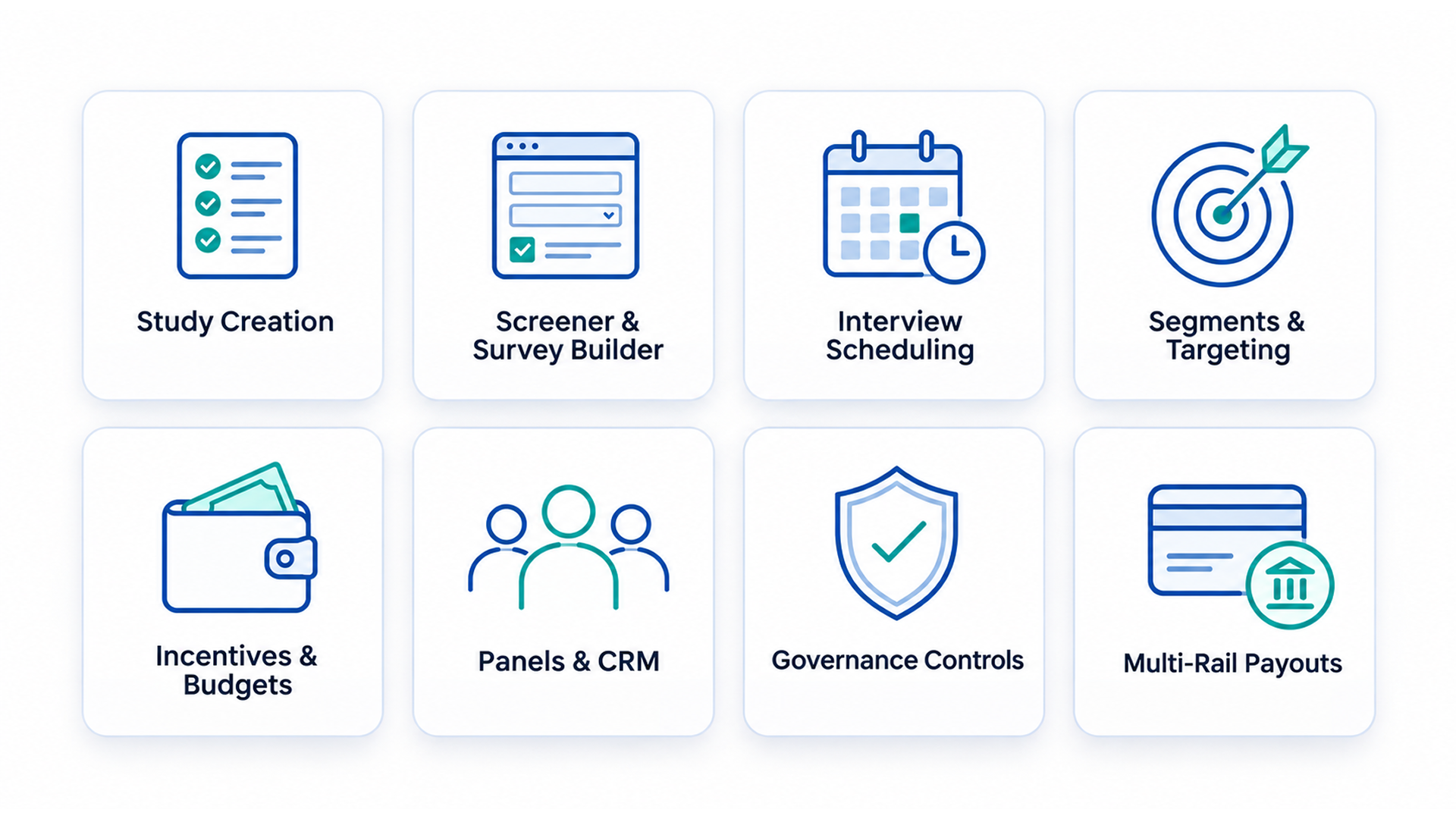
Before the deep dive, here's what this market research enterprise SaaS platform actually does in one pass:
Study creation, for both qualitative and quantitative research, in one guided stepper
Screener and survey building, with ten question formats and built-in drop-off logic
Interview scheduling, with standard, collective, and round-robin hosting
Segments and targeting, built on include and exclude rules with live forecasting
Incentives and budgets, split by team, project, or study
Panels and a participant CRM, so relationships outlive any single study
Governance controls, to protect participants from invitation fatigue
Multi-rail payouts, covering PayPal, Stripe, ACH, and wire transfers
One Platform, Four Kinds of Users
Xperiti splits cleanly into two experiences that share almost nothing visually and almost everything structurally.
The client side, where research teams create studies, manage segments, and run the operational engine. This is where researchers and coordinators both work, under one shared login with role-based access.
The expert side, where the people being researched sign up, complete surveys, sit for interviews, and get paid.
Both sides share the same top-navigation-plus-contextual-sidebar pattern. Both organize themselves around a central object: the study. But the density, the language, and the stakes are completely different depending on which door you walked through.
On the client side, the study is a project to manage. On the expert side, the study is an opportunity to evaluate.
Two Doors, Two Onboardings
Before either side of this market research enterprise SaaS platform opens up, you have to sign up. Xperiti treats these two audiences as different products from the very first screen.
Signing Up as an Expert
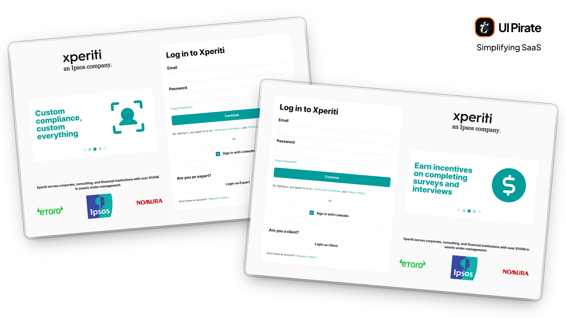
The expert entry point into this market research enterprise SaaS platform keeps things light. You can sign in with email and password, or with LinkedIn. A carousel of quick benefits runs alongside: faster onboarding, and getting paid for your time.
Signing up goes a step further. It asks for your LinkedIn profile URL. You create a password and verify with an OTP.
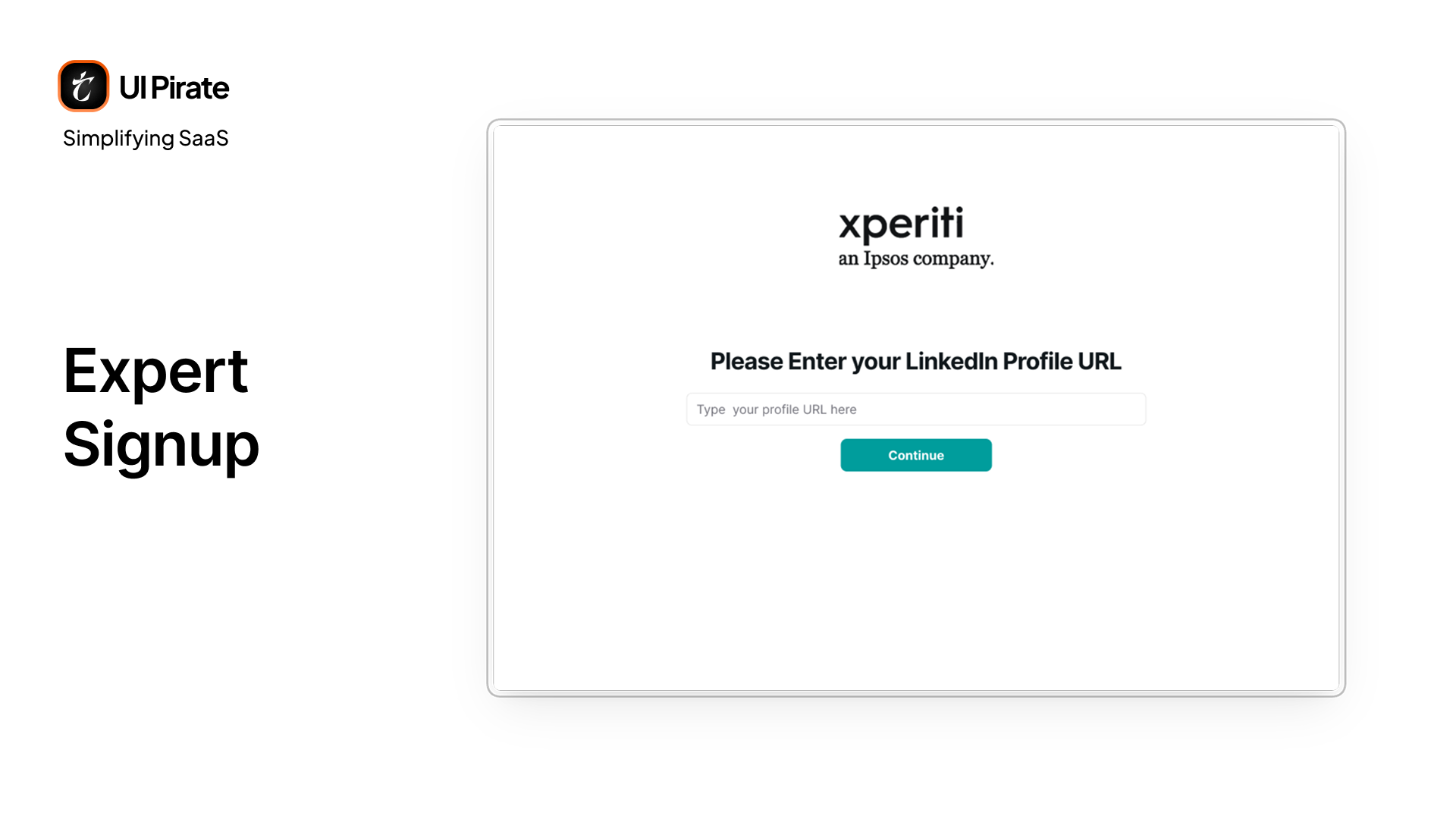
That LinkedIn-first sequencing matters. It lets Xperiti pre-fill your professional context before you've typed a single sentence about yourself.
Signing Up as a Client
The client onboarding into this market research enterprise SaaS platform is a longer commitment. A client isn't just creating an account. They're setting up a workspace. After basic details and a profile photo, you connect the tools you already use: Google, LinkedIn, Zoom, Slack, and Calendly.
Then you configure your availability. You choose between main hours, no fixed hours, or temporary unavailability. You can set specific time blocks per day, plus special exceptions like holiday periods.
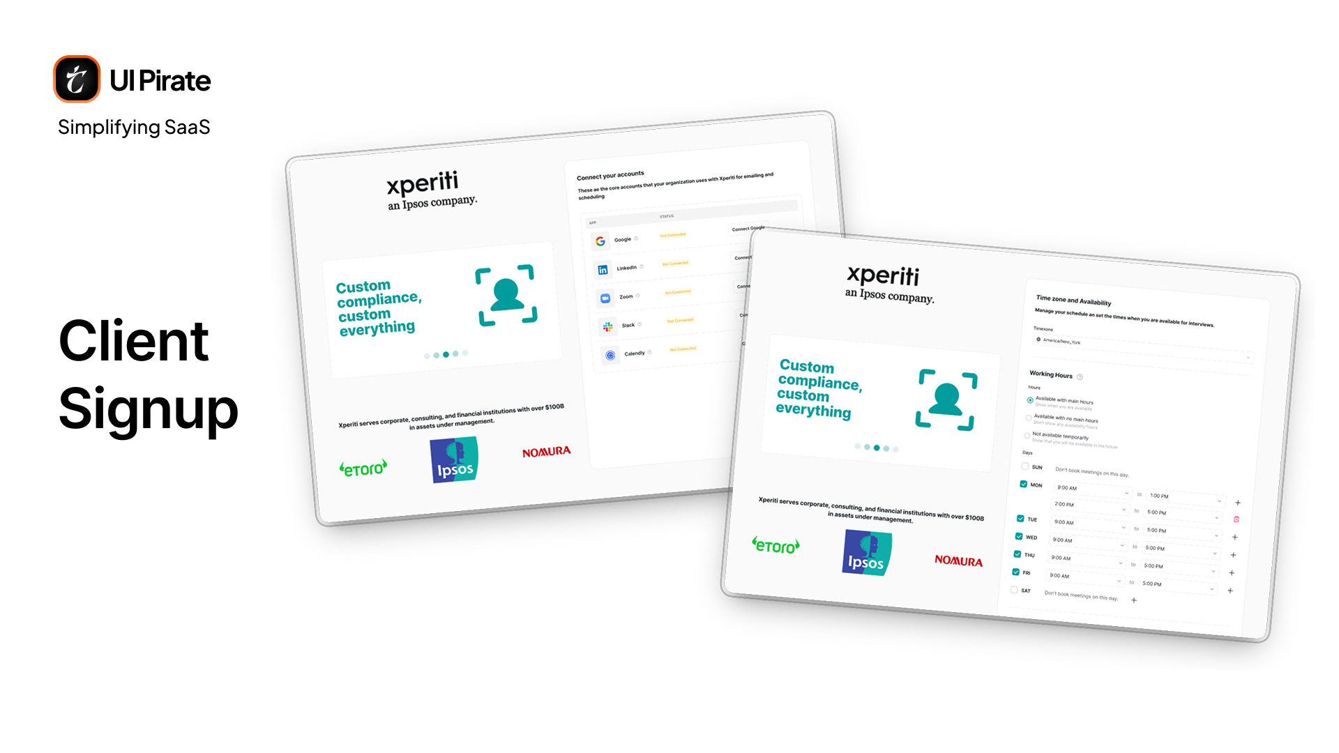
This is the moment the platform stops feeling like a form. It starts feeling like infrastructure you're going to live inside.
The Expert Side: A Home Base for People Getting Paid to Share What They Know
Once you're in, the expert side of this market research enterprise SaaS platform organizes itself around four top-level destinations: Home, Study, Interview, and Panels. Your incentive balance stays visible in the header at all times.
Home: Dashboard, Calendar, Chats, and Incentives
The Home tab alone contains four distinct pages behind its left sidebar.
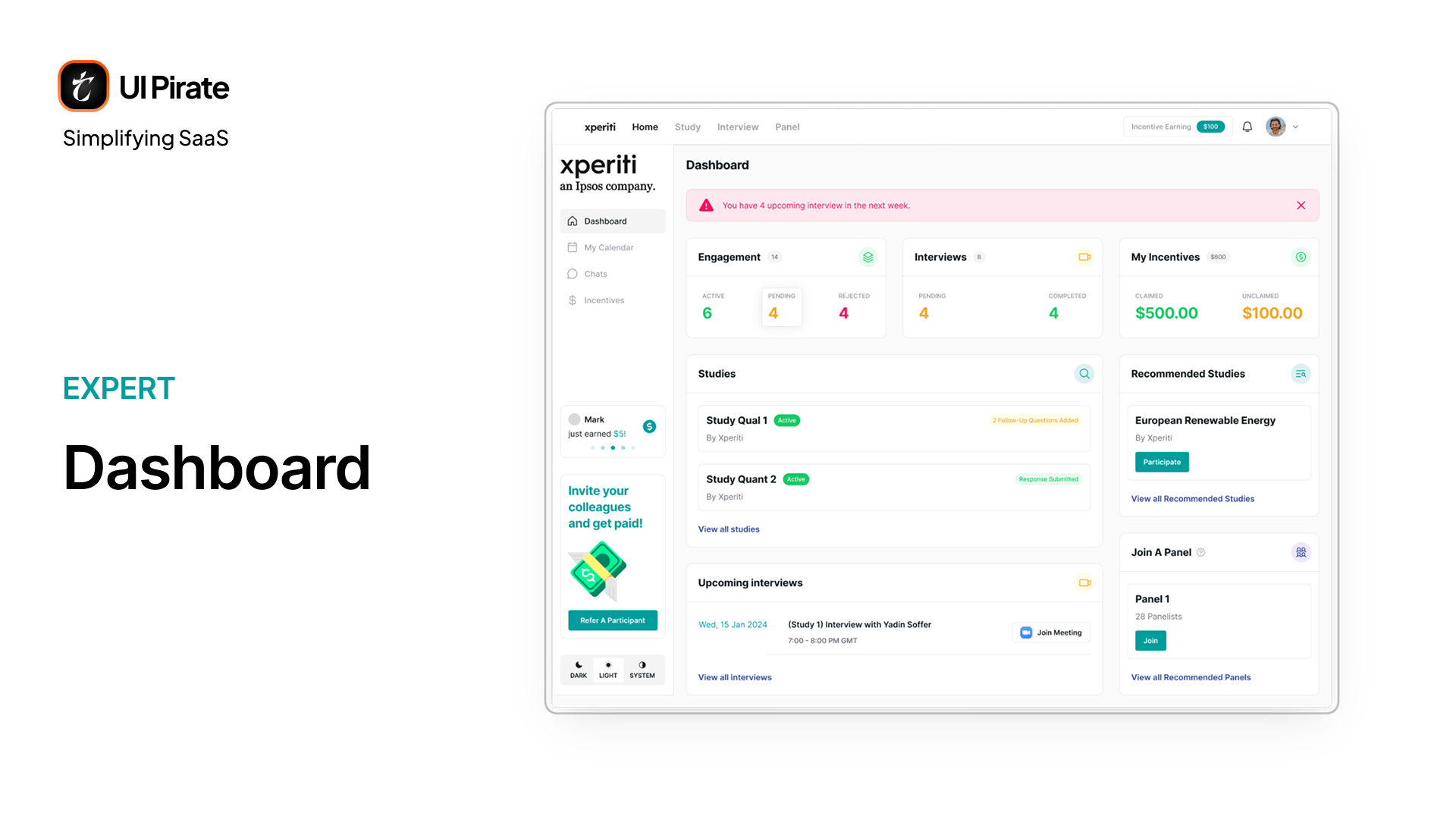
The dashboard surfaces:
Relevant stats like engagement, interviews and incentives
Your active studies
Upcoming interviews, with a one-click join button
Recommended studies
Open panel invitations and recommendations
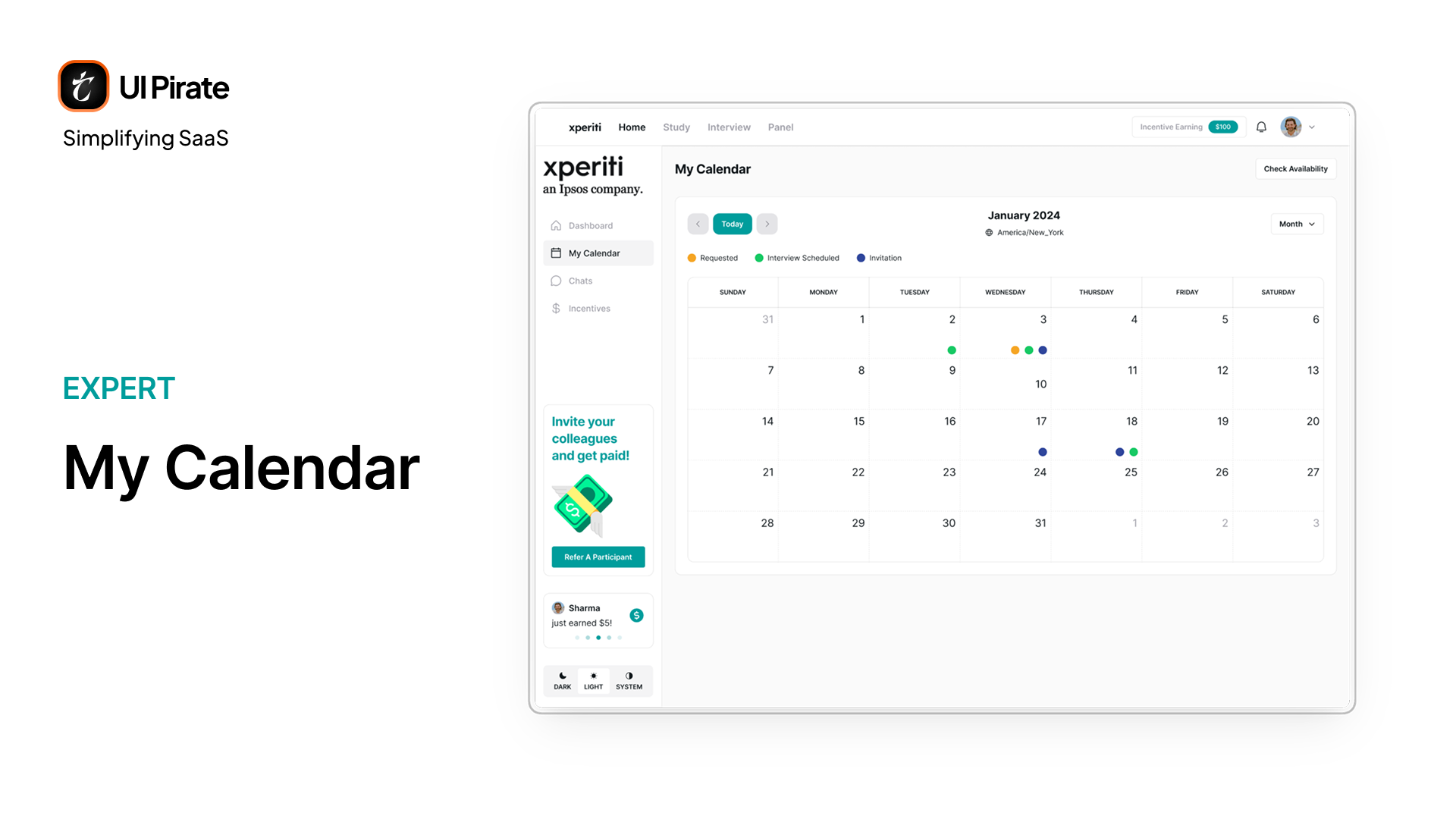
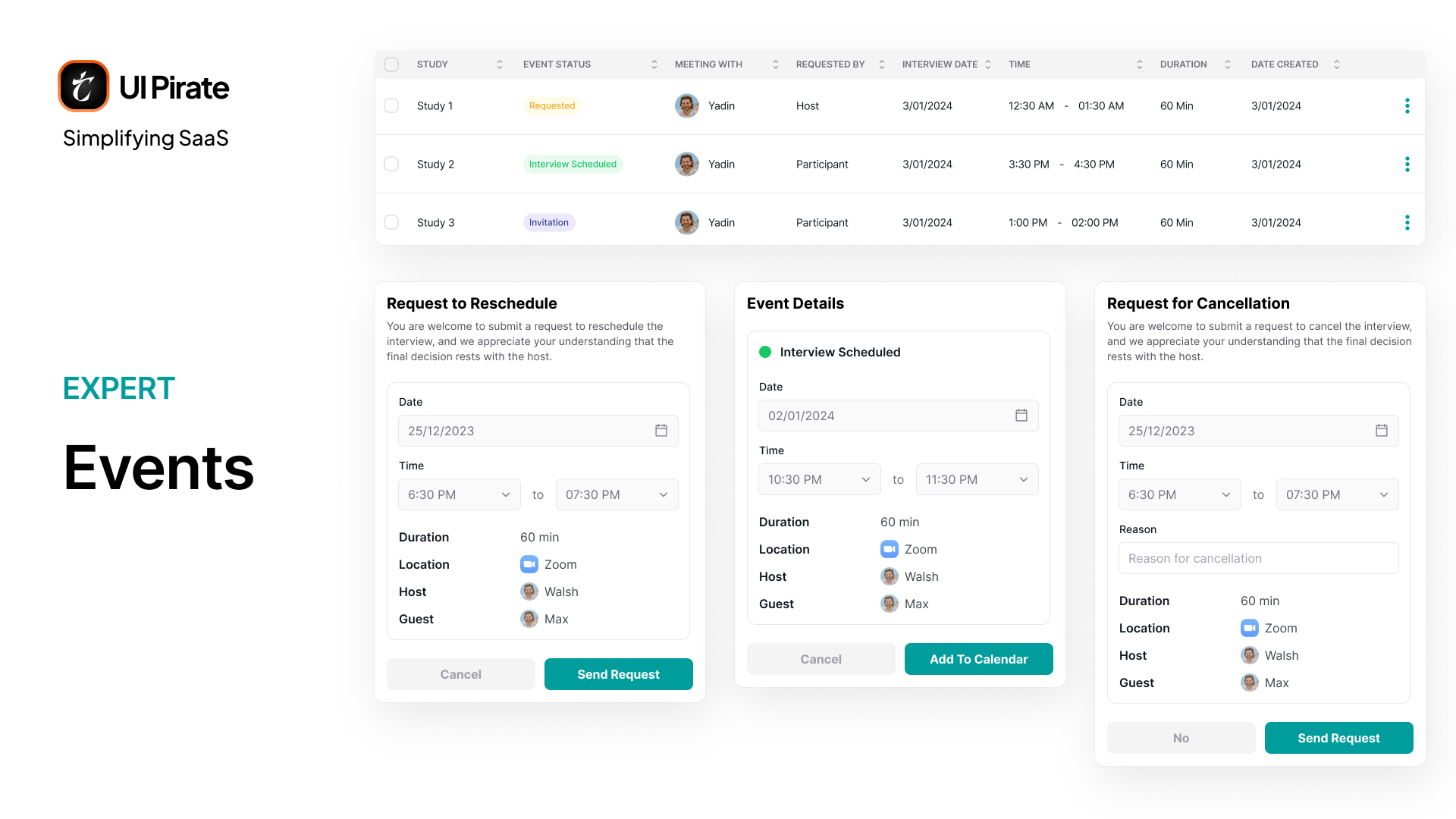
My Calendar shows every scheduled or requested interview. You can reschedule, cancel, or confirm depending on the event type.
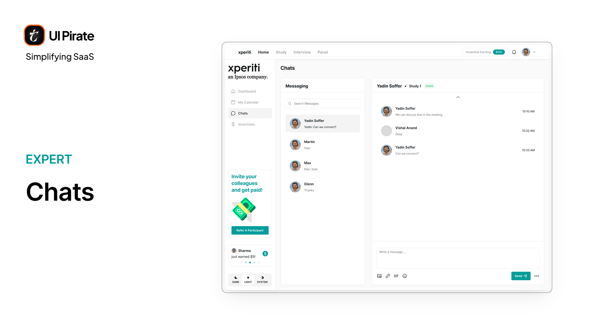
Chats runs as simple conversations tied to specific studies.
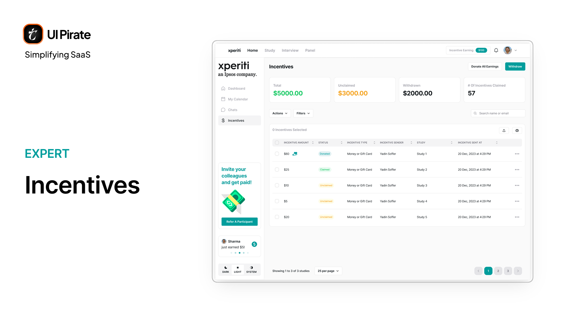
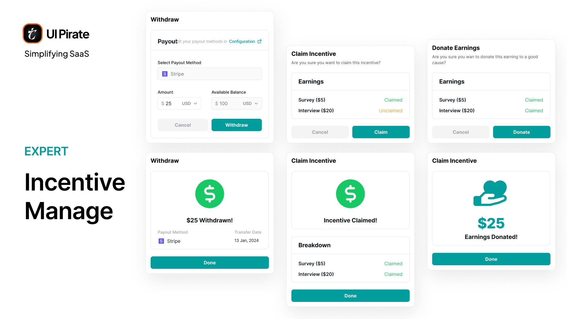
Incentives is where your earnings actually live. Incentives had to answer one question instantly: is my money mine yet? The page separates total earnings from unclaimed and withdrawn amounts. A table logs every incentive by status, source study, and type. You can withdraw, donate to a cause, or leave it pending. Every row makes clear which of those is currently possible.
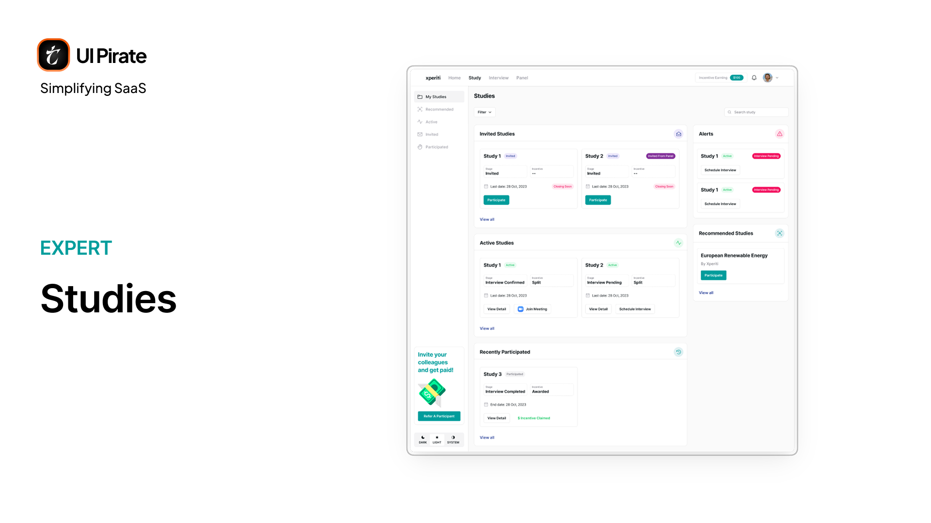
Studies: Qualified, Recommended, Active, and Participated
The Study tab separates your work into My Studies, Recommended, Active, Invited, and Participated. Two study types run through everything here: QUAL, which includes interviews, and QUANT, which is survey-only.
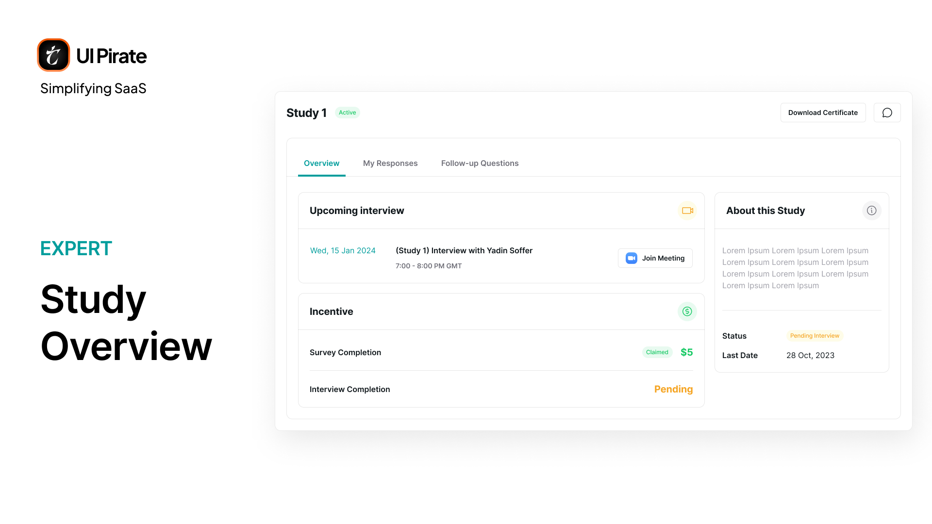
Opening any study surfaces it as a full-screen overlay with three tabs: Overview, My Responses, and Follow-Up Questions. Overview shows status, deadlines, and incentive breakdowns.
My Responses shows exactly how you answered, across formats like linear scale, matrix grid, and multi-select.

Qual studies show a scheduling prompt here if your interview isn't booked yet. Quant studies never show one at all, because there's no interview to book.
Onboarding for Studies
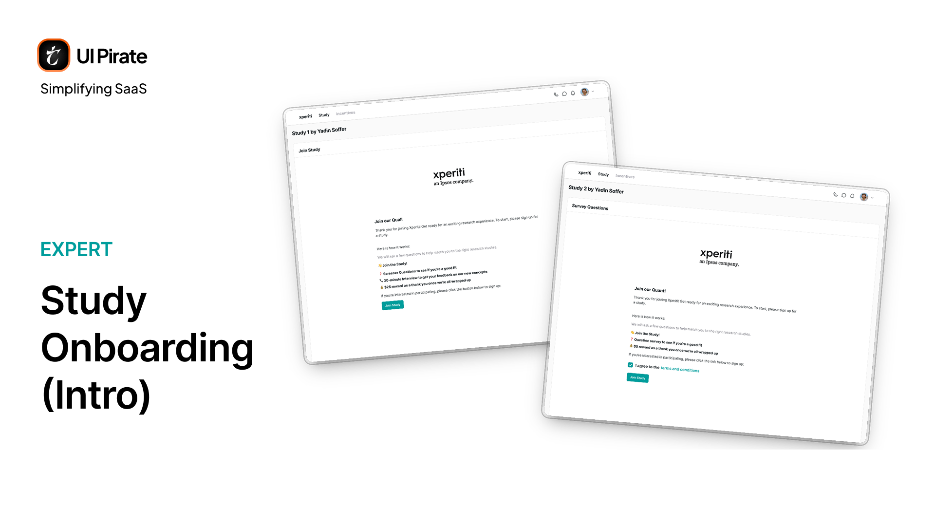
The onboarding flow is mostly unified across both study types. Every participant enters the same way, regardless of whether the study ahead is qual or quant.
It starts with an intro screen. A short welcome message sets expectations: what the study is about, roughly how long it takes, and what the incentive looks like.
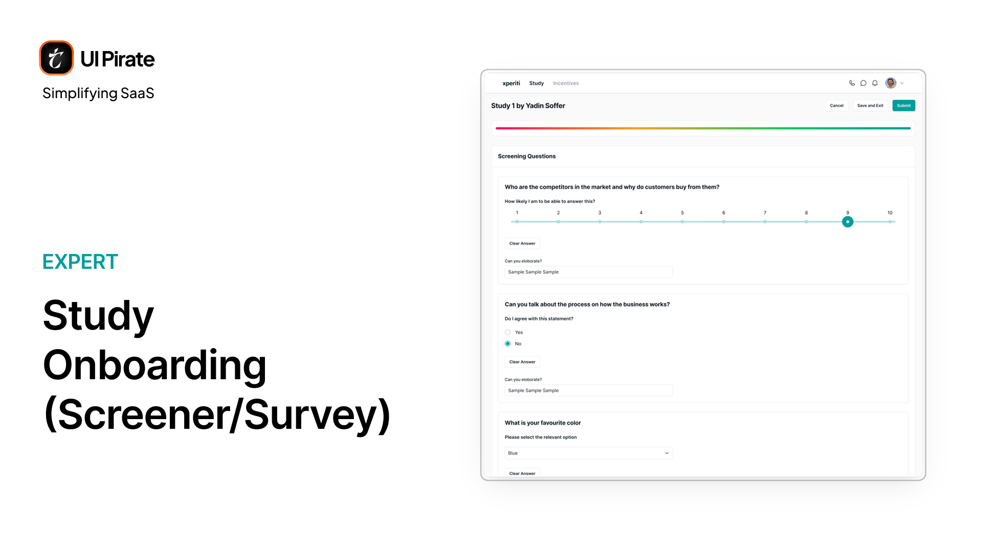
From there, the participant moves into the questions. This is the same question-and-response interface used throughout the platform, covering formats like single-select, multi-select, and linear scale, one question building on the last.
Once the last question is submitted, the platform scores the response and lands the participant in one of three states:
Auto-qualified, with a visible match score
Qualified, pending manual review
Disqualified, with a match rate that fell short this time
"We wanted rejection to still feel like an invitation to come back, not a dead end."
Where Qual and Quant Differ After Completion
The two flows only really diverge at the very last step: the modal a participant sees once they qualify.
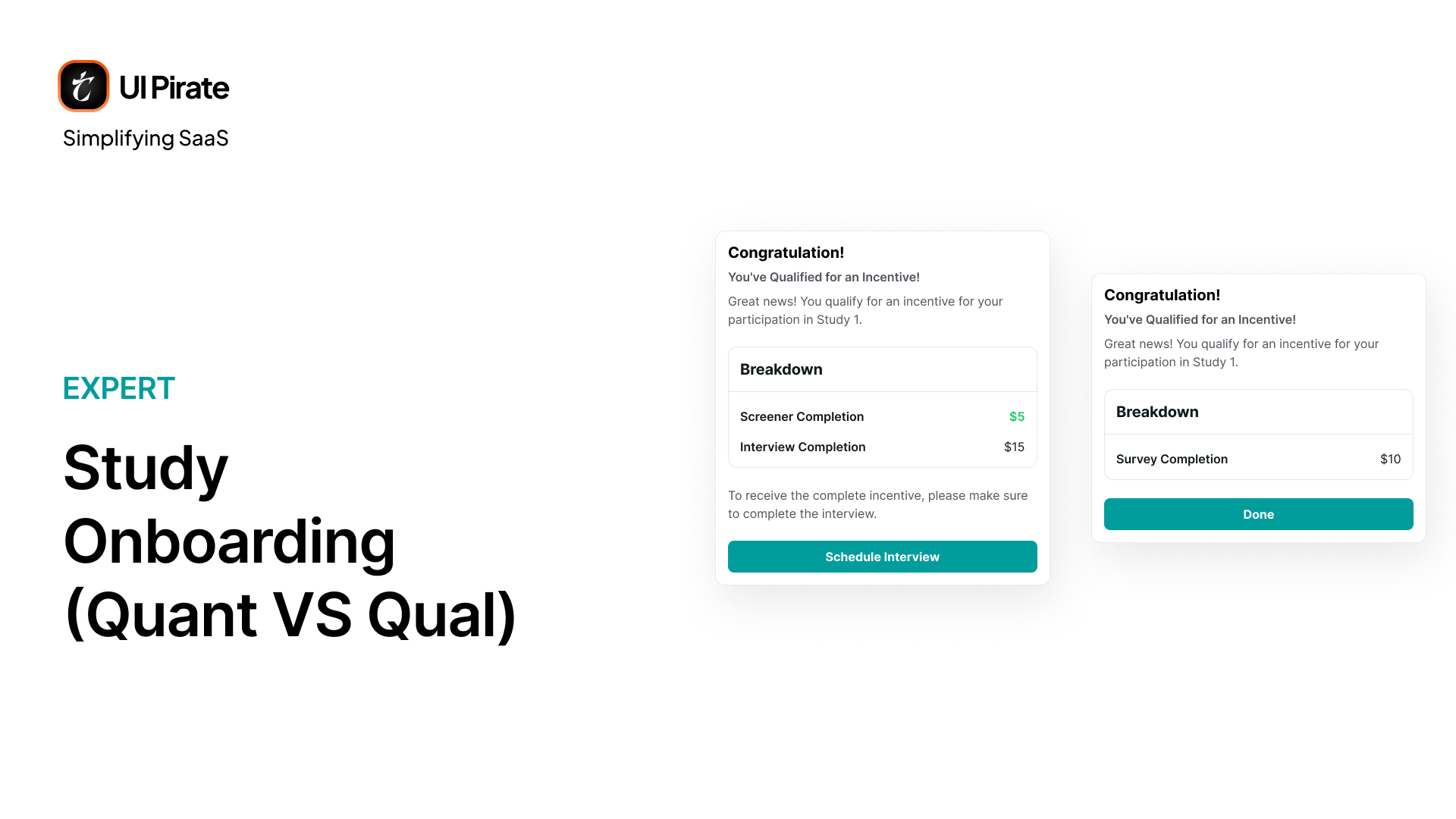
For a quant study, that modal is simple. It reads, "Congratulations, you're qualified for the incentive." Below that sits a breakdown of the survey completion and the incentive earned. Since there's no interview to schedule, the button here reads Done.
For a qual study, the same modal carries more weight. It still opens with "Congratulations, you're qualified for the incentive," but the breakdown now splits into two parts, for example $5 for screener completion and $15 for interview completion. Because an interview still needs to be booked, the button changes from Done to Schedule Interview, moving the participant straight into scheduling instead of ending the flow.
Interviews, Segmented by Status
The Interviews tab exists because a QUAL study only tells half the story from inside the study modal. Here, everything scheduled across every study lives in one place, split into Scheduled, Invited, Requested, and Passed.
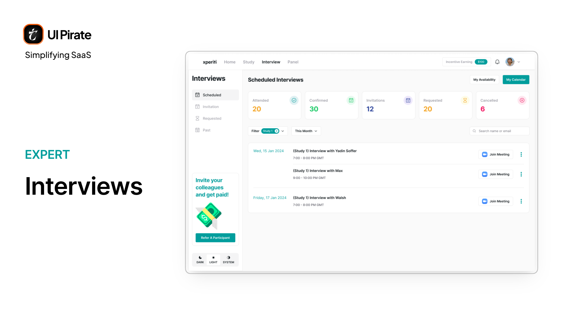
Each state carries its own actions:
Scheduled: reschedule, cancel, or join
Invited: confirm, reschedule, or decline
Requested: cancel only, since it's waiting on the other side to respond
Passed: read-only, unless one was missed, in which case rescheduling stays open
Panels: Communities Built Around a Shared Interest
Inside this market research enterprise SaaS platform, a panel is a standing group of experts who've opted in to a recurring research relationship. Think of a pool of renewable-energy professionals, available across many studies instead of just one.
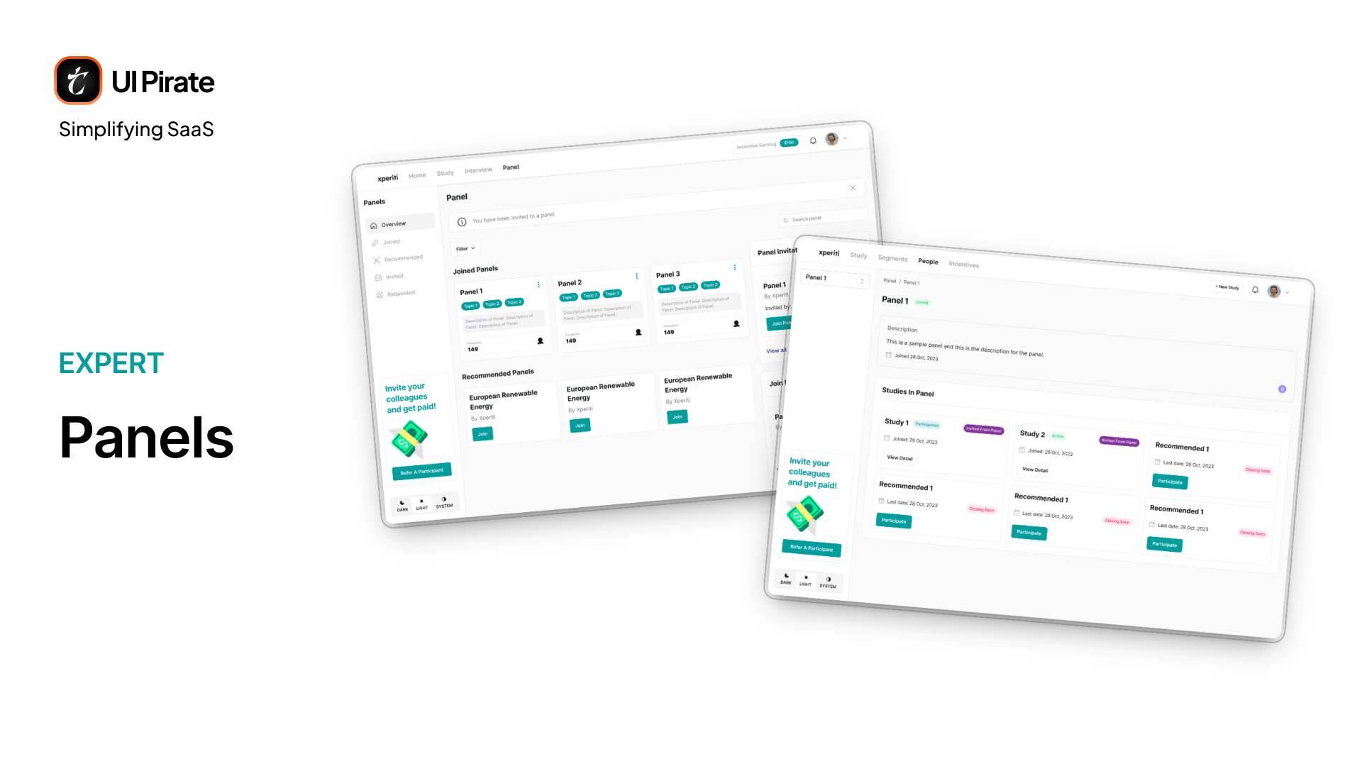
The expert side breaks this into Overview, Joined, Recommended, Invited, and Requested. Opening any single panel shows its studies, alongside a join or exit action.
Account and Payouts
Settings splits into two areas. Your personal account covers profile, availability, notifications, and downloadable consent forms.
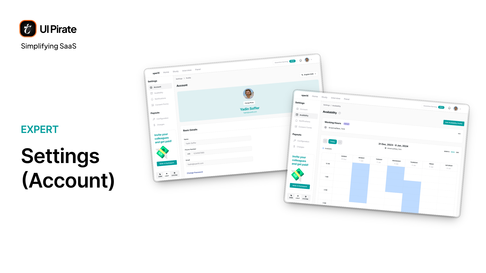
Your Payouts cover:
Billing information
Saved payment methods across PayPal, Stripe, ACH, wire, and international wire
A full withdrawal history
Your per-survey or per-hour rate configuration
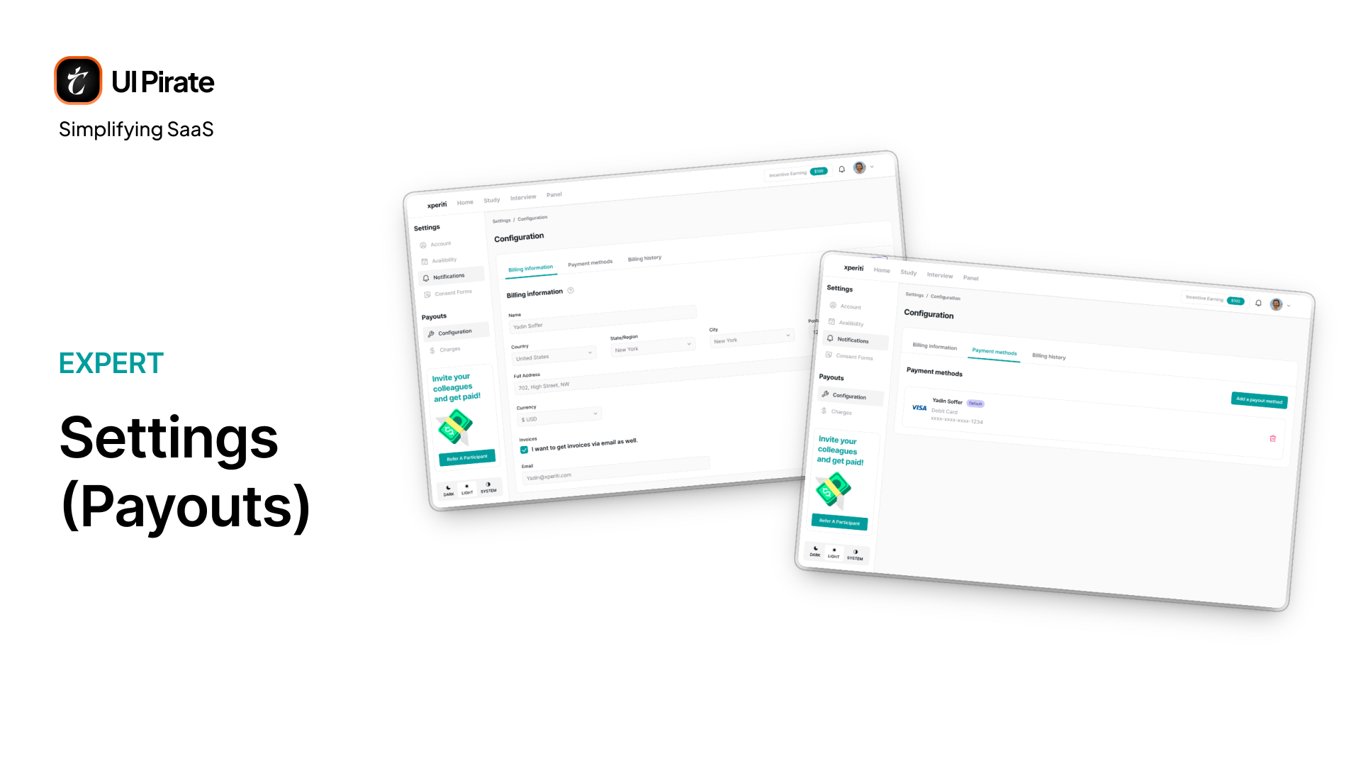
Getting paid across five different rails is harder than it sounds. Nothing here can feel like the "supported" option while the rest feel like afterthoughts. Every payout method gets the same visual weight and the same number of steps to configure, which strengthens trust in the payout system as a whole.
The Client Side: Running Research at Enterprise Scale
If the expert experience is a personal dashboard, the client side of this market research enterprise SaaS platform is an operations console. It runs on five top-level destinations: Home, Study, Segments, People, and Incentives. A persistent + New Study button stays available throughout.
A Dashboard Built for At-a-Glance Status
The client dashboard leads with stats. Open studies get split by qual and quant. Engagement breaks into new recruits and upcoming interviews. People get counted across segments and panels.
Below that sit three more feeds:
Trending segments, showing which roles are in demand and where
New recruits, grouped by category
New submissions, as they arrive
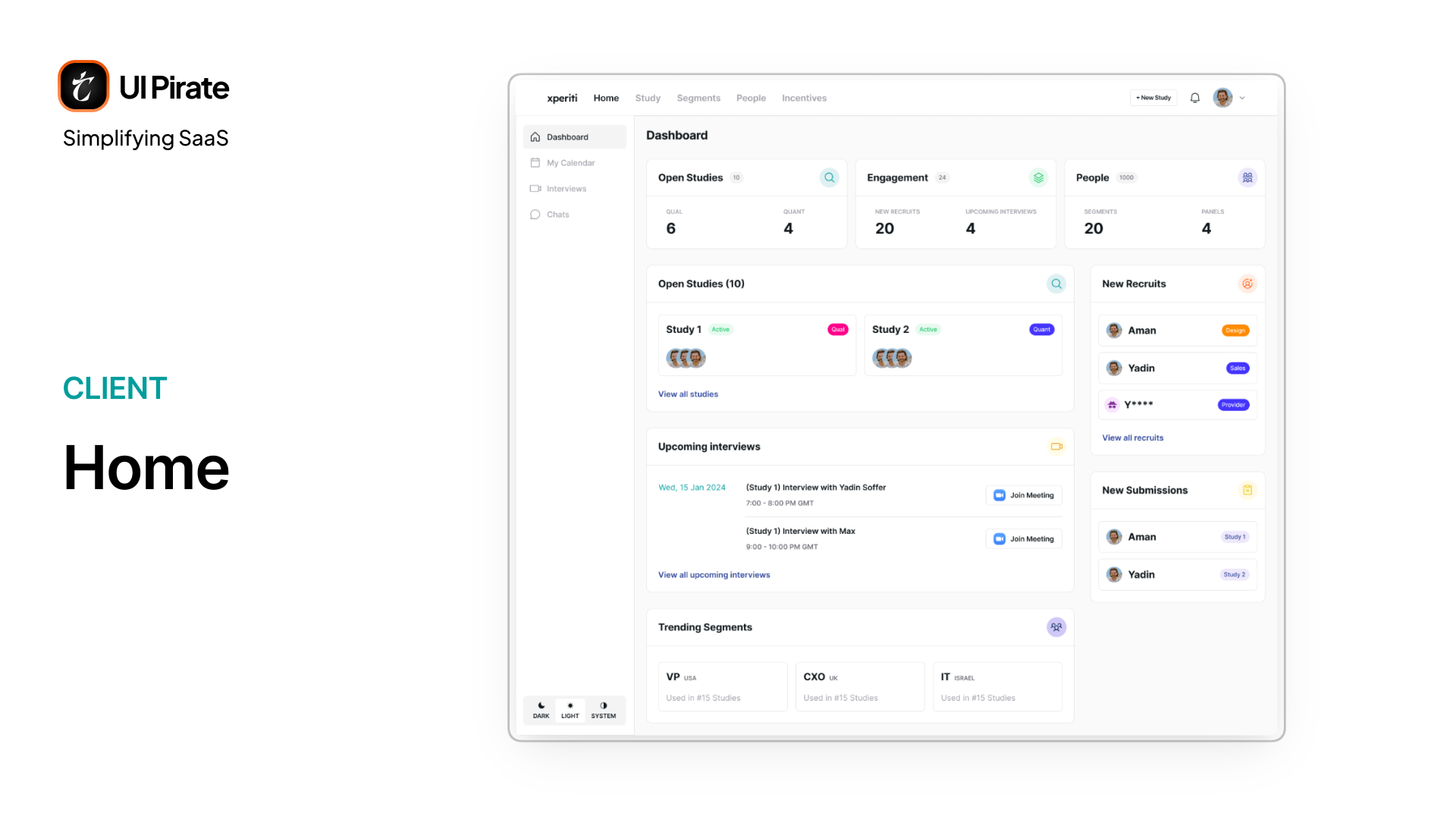
The sidebar underneath Home also holds My Calendar, Interviews, and Chats. Interviews splits into Confirmed and History. Chats runs per-study rather than as one unified inbox.
"A client checking Xperiti once a day should never have to ask their research team what happened yesterday. The dashboard has to already know."
Building a Study, Step by Step
Creating a study is the single most involved workflow in this market research enterprise SaaS platform. It's genuinely different depending on whether you're building a qualitative or quantitative study.
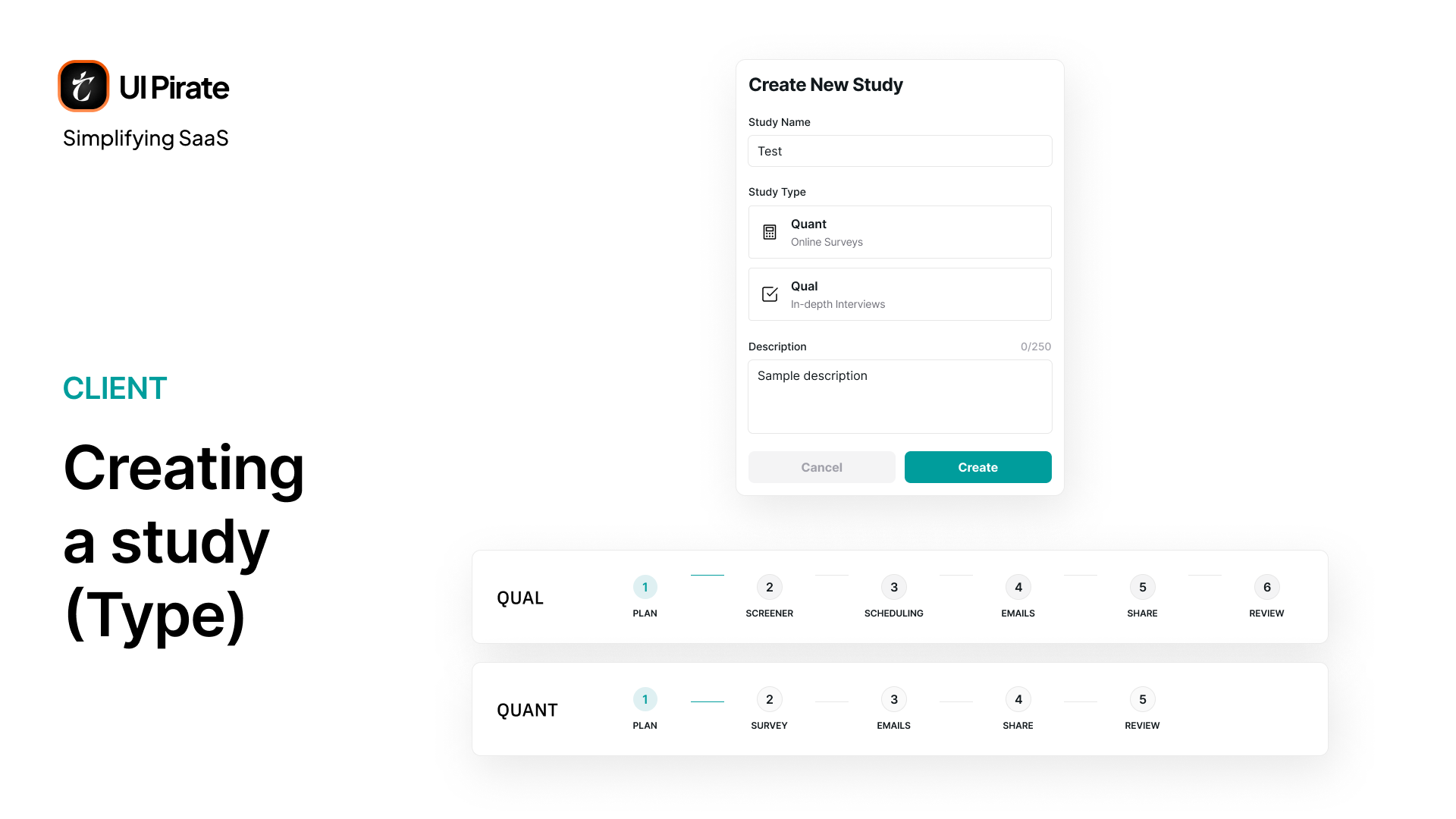
Both types share a main stepper across the top of the screen. A second, contextual stepper of sub-steps lives in the left sidebar, tied to whichever main step is active. Qual runs through Plan, Screener, Scheduling, Email, Share, and Review. Quant skips Scheduling entirely and replaces Screener with Survey, since there's no interview to arrange.
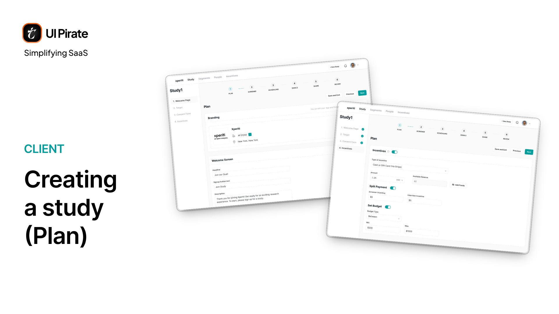
Plan: Setting the Foundation
Every study starts with four sub-steps:
Welcome Page, your branded intro screen
Target, the participant count, set as a minimum, a maximum, or a range
Consent Form, optional, uploaded fresh or pulled from a template
Incentives, where you set reward type, currency, budget, and whether screener and interview payouts should split
Screener/Survey: The Gatekeeper Before Anyone Talks to Anyone
The screener/survey has three parts:
An overview, setting qualification logic and whether qualified participants can self-schedule immediately
A question builder
Custom ending messages for qualified, pending, and disqualified outcomes
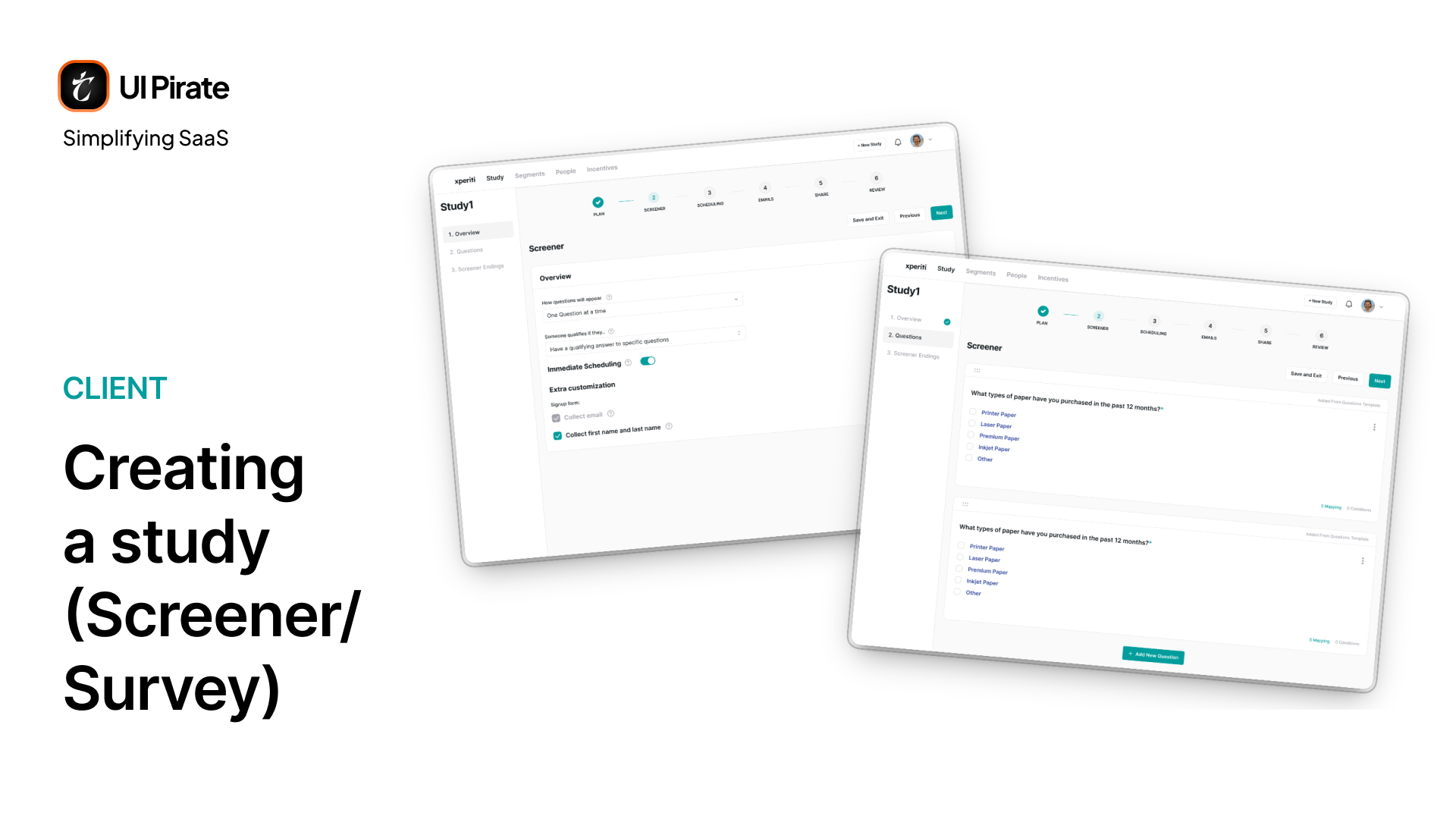
The question builder alone supports ten formats: text, number, date, single and multi-select, yes/no, linear scale, and grid-style questions. Every question type carries its own drop-off logic. That logic reduces mismatched participants before they ever reach a human.
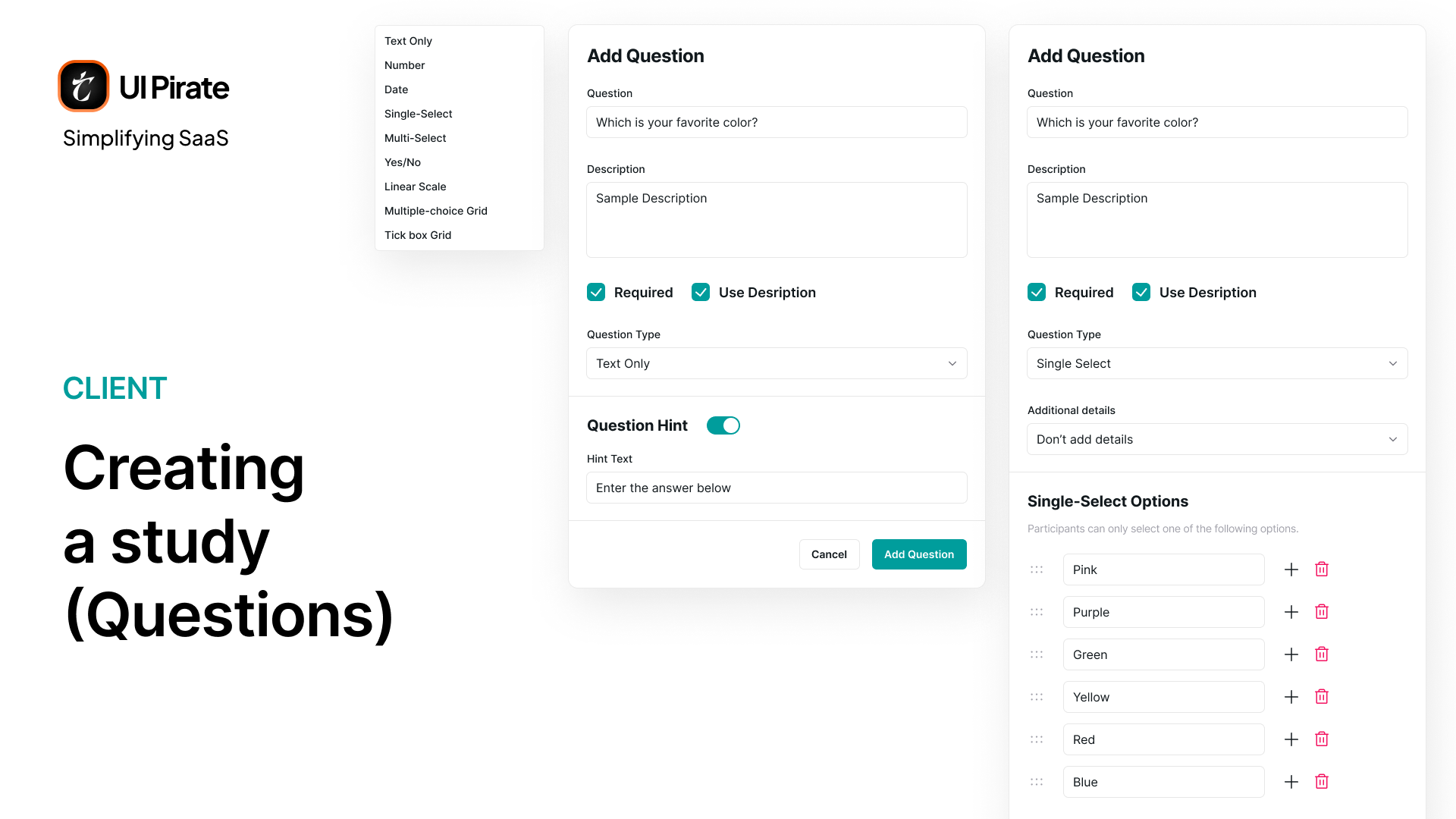
This single modal is doing more work than almost anything else in the platform. Every question type has to expose the right configuration. It can't overwhelm someone building a simple ten-question screener in five minutes.
Scheduling: The Hardest Sub-Step in the Whole App
Scheduling covers five sub-steps:
Event Setup: calendar app, duration, location or video link
Availability: rolling range, fixed range, or per-host availability
Assignment: standard, collective, or round-robin hosting
Limits: daily caps, buffer time, minimum notice
Advanced: confirmation and fully-booked messaging
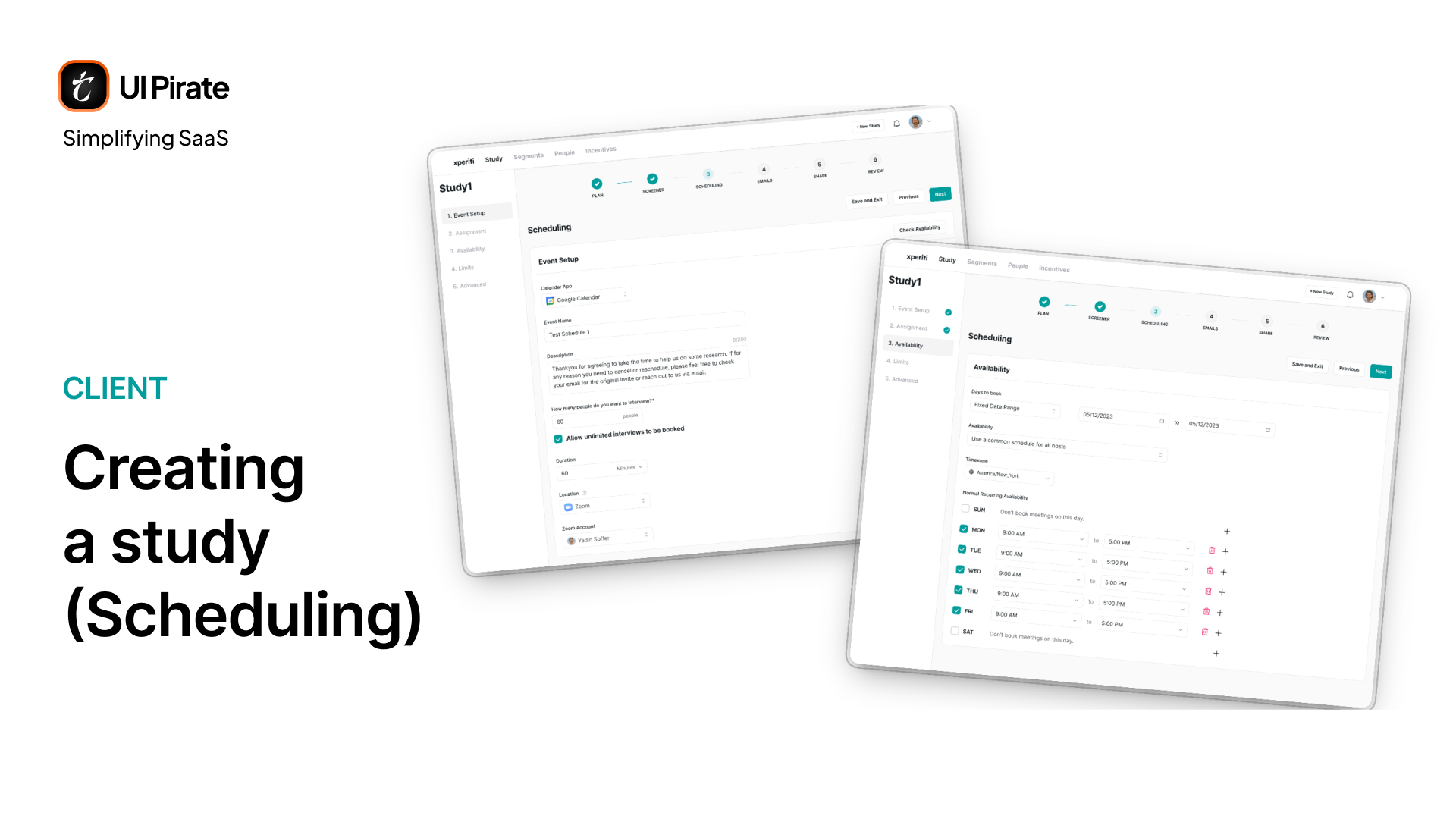
Round-robin and collective scheduling exist for a real reason. Research interviews rarely map to one interviewer and one participant. A study with five interviewers needs a system that spreads load automatically, not a calendar that assumes one person owns every slot. Good buffer-time defaults also reduce back-to-back scheduling conflicts before they happen.
Email and Sharing
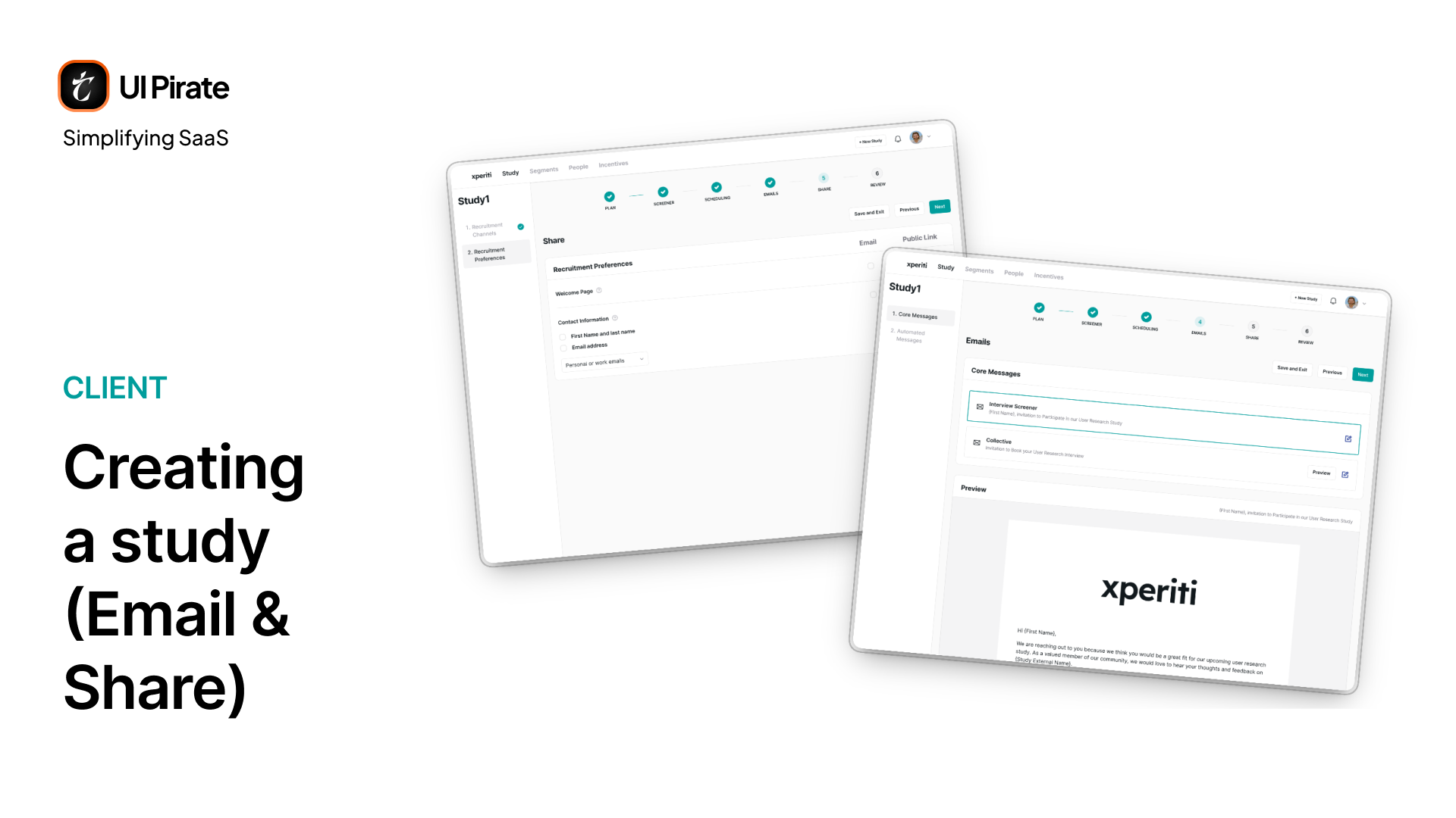
Core Messages and Automated Messages share one editable template interface for the invitation email that goes out to participants. Share splits recruitment into email invitations and public links, with checkboxes controlling exactly what information participants see before they commit.
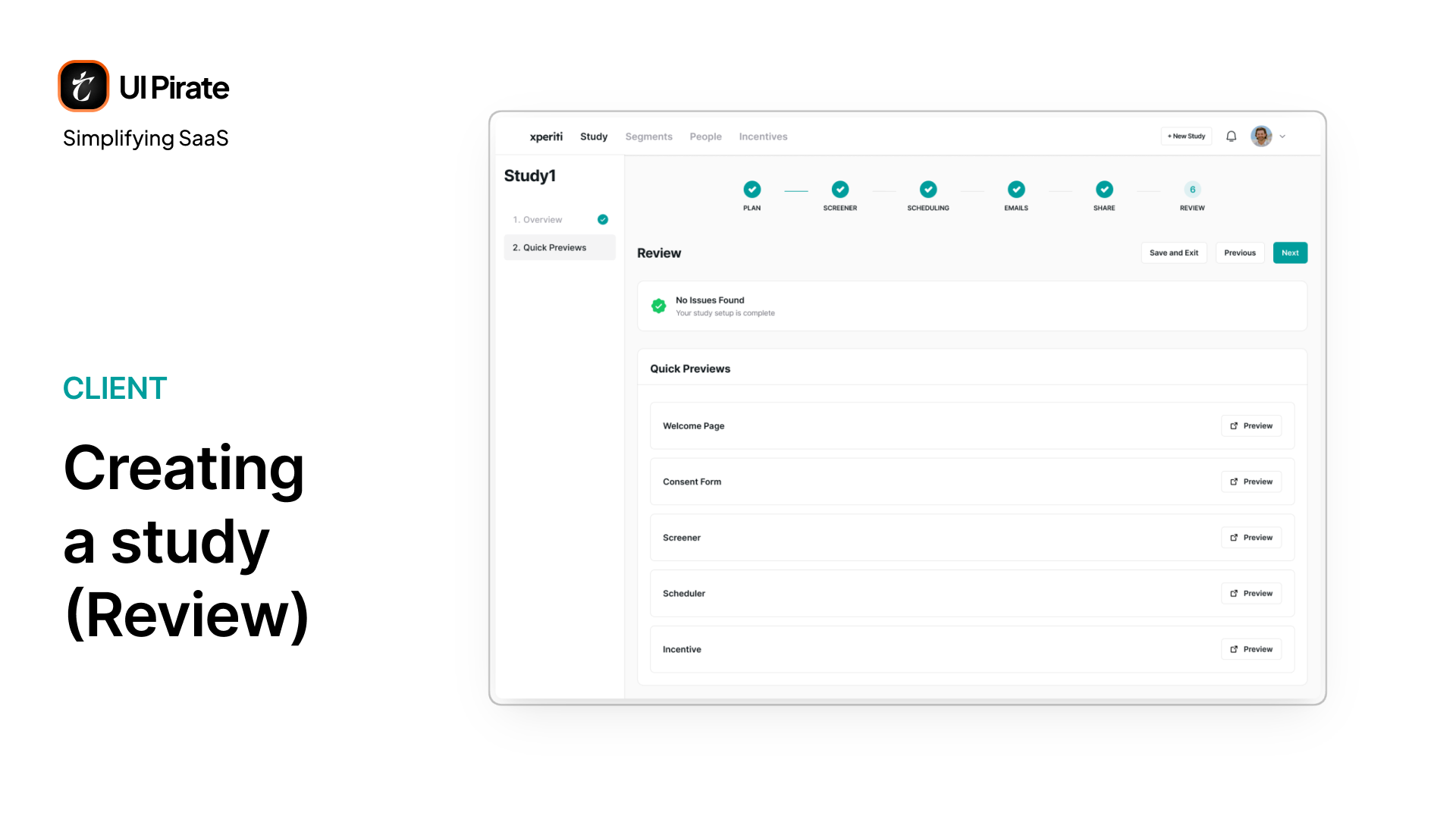
Review
Review closes the loop. It summarizes the study's length, question count, consent setup, and incentive. Then it runs a quick-preview pass through every screen before launch.
Where Quant Differs From Qual
Quant studies run the same Plan step. Then they move straight to a Survey step that mirrors the screener's question builder. Scheduling gets skipped entirely, and the flow finishes with the same Email, Share, and Review steps. No interviews means no calendar, no hosts, and no round-robin logic anywhere in the flow.
Managing a Live Study
Once a study is running inside this market research enterprise SaaS platform, it opens into sub-pages: Overview, Segments, Participants, Screener Responses (or Survey Responses for quant), Incentives, and, for qual studies only, Interviews.
Overview: Command Center for One Study
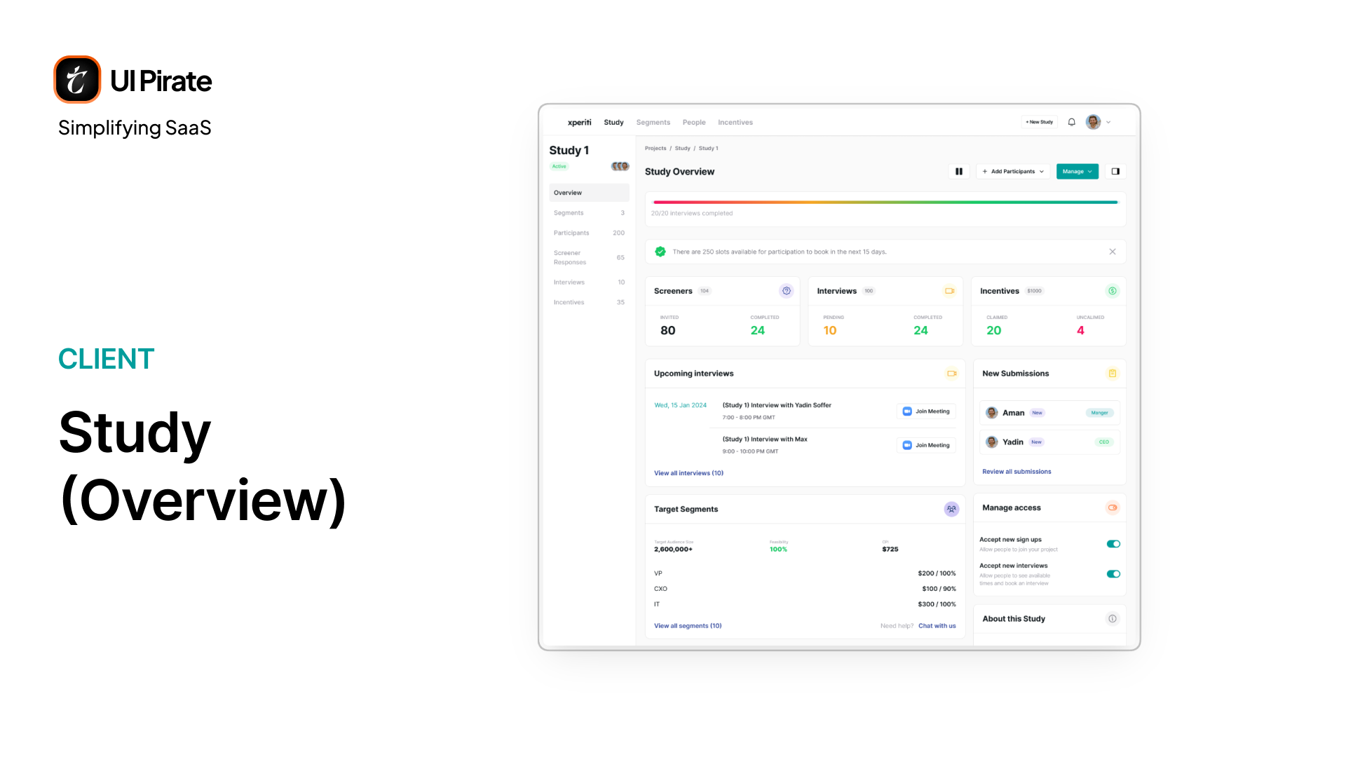
The overview page is dense by design. A progress bar tracks interviews completed against target. Stats split into three pairs:
Screeners: invited versus completed
Interviews: pending versus completed
Incentives: claimed versus unclaimed
Below that sit upcoming interviews, target segments with feasibility and cost-per-interview scoring, new submissions, and a toggle to pause or reopen new sign-ups without pausing the whole study.
"Pausing a study should stop new recruitment, not punish the participants already mid-flow. That distinction shaped how the pause control actually works."
Segments and the Targeting Engine
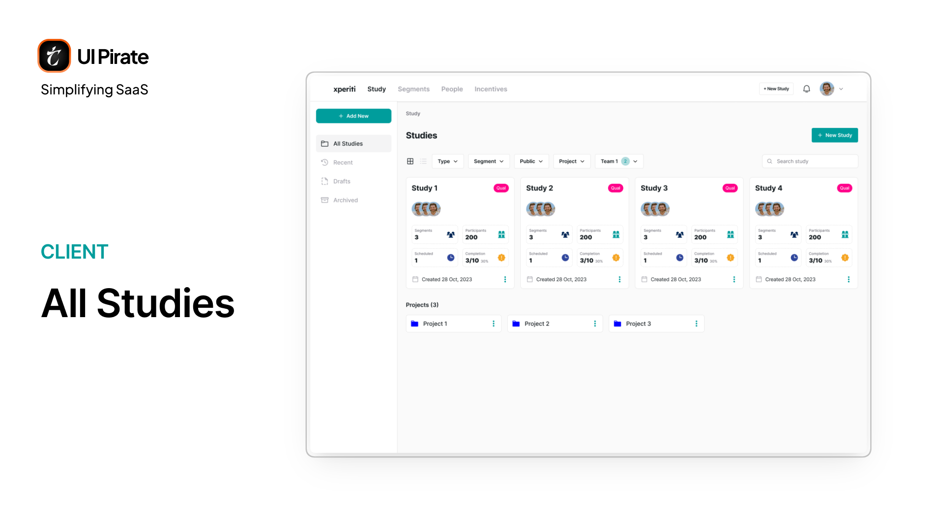
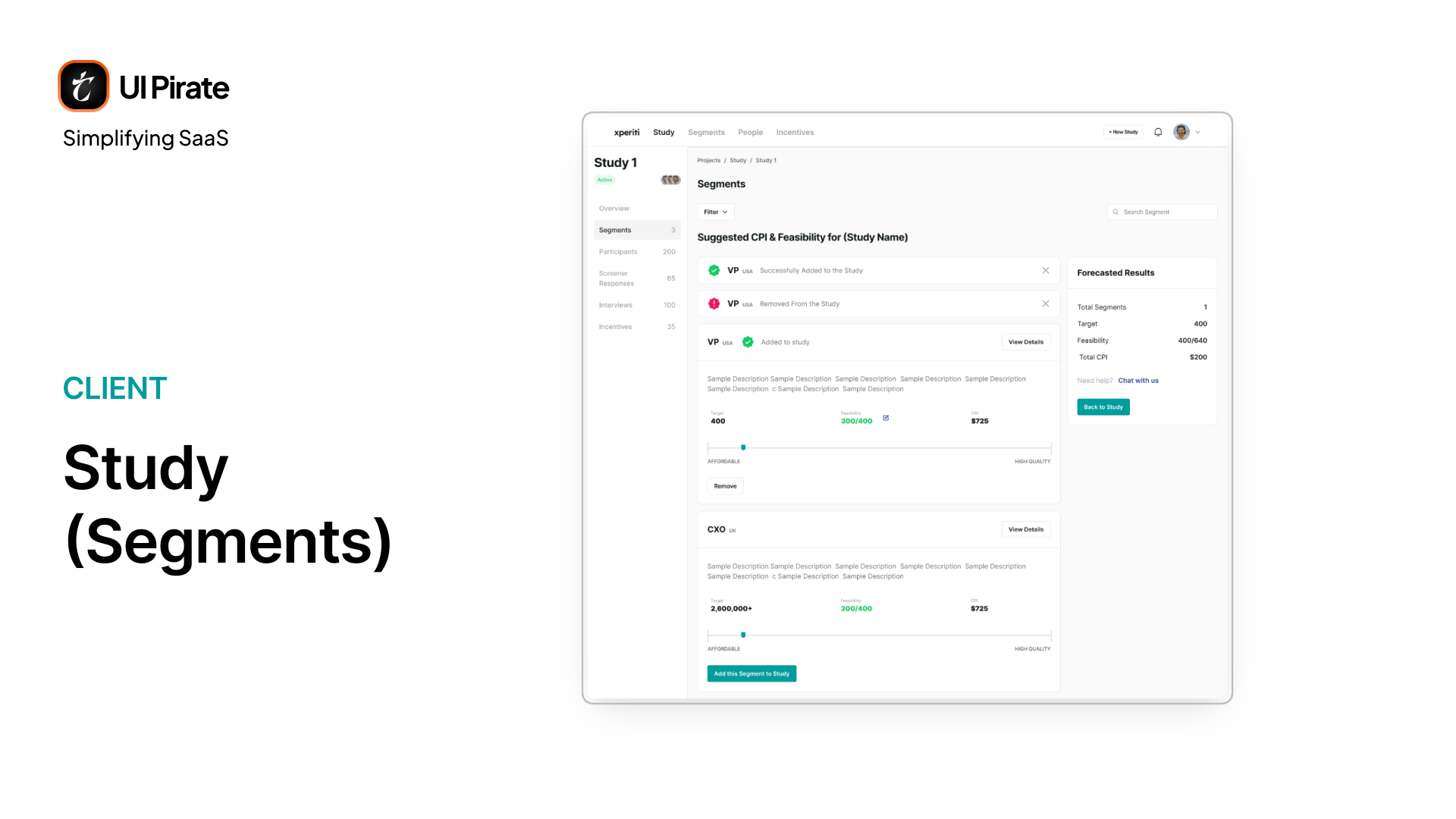
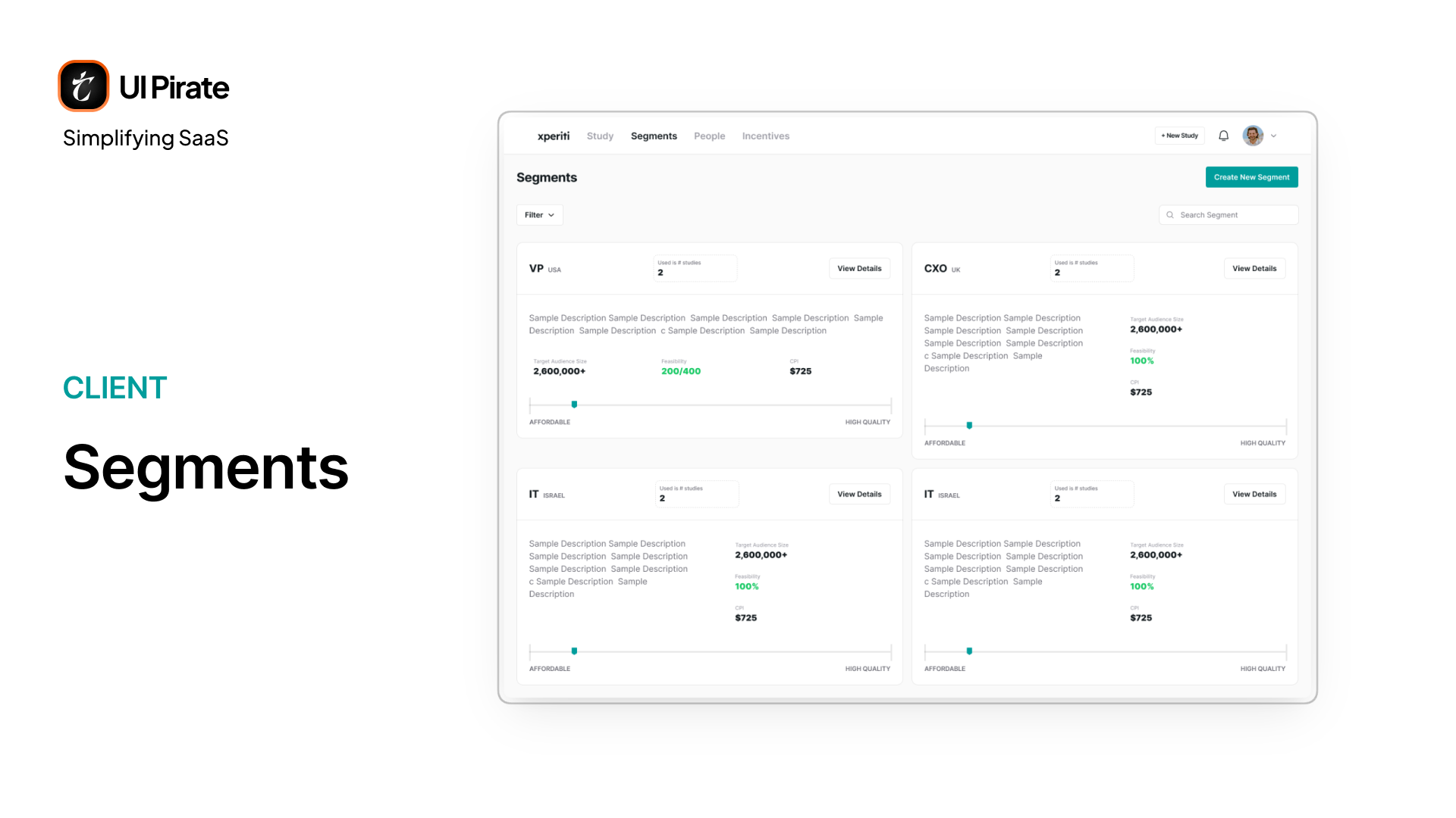
Every study has its own Segments page, accessible from the study's sidebar. It's a running list of every segment currently targeting this study. A segment is simply a defined slice of your audience, something like "VPs in the US" or "CXOs, Fortune 500 only." From this page, you can review what's already added and bring in more segments at any time.
It's the closest thing in Xperiti to a query builder. It's dressed up so a non-technical researcher never has to think of it that way.
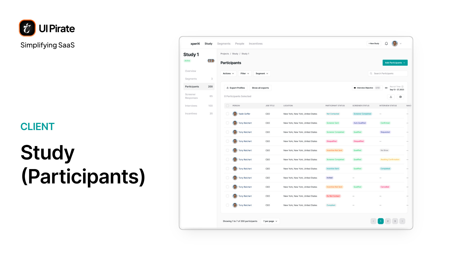
Participants
The Participants table is the densest single view in this market research enterprise SaaS platform. One row covers:
Person, job title, and location
Participant status, screener status, and interview status
ICs, tags, labels, and notes
Signed documents
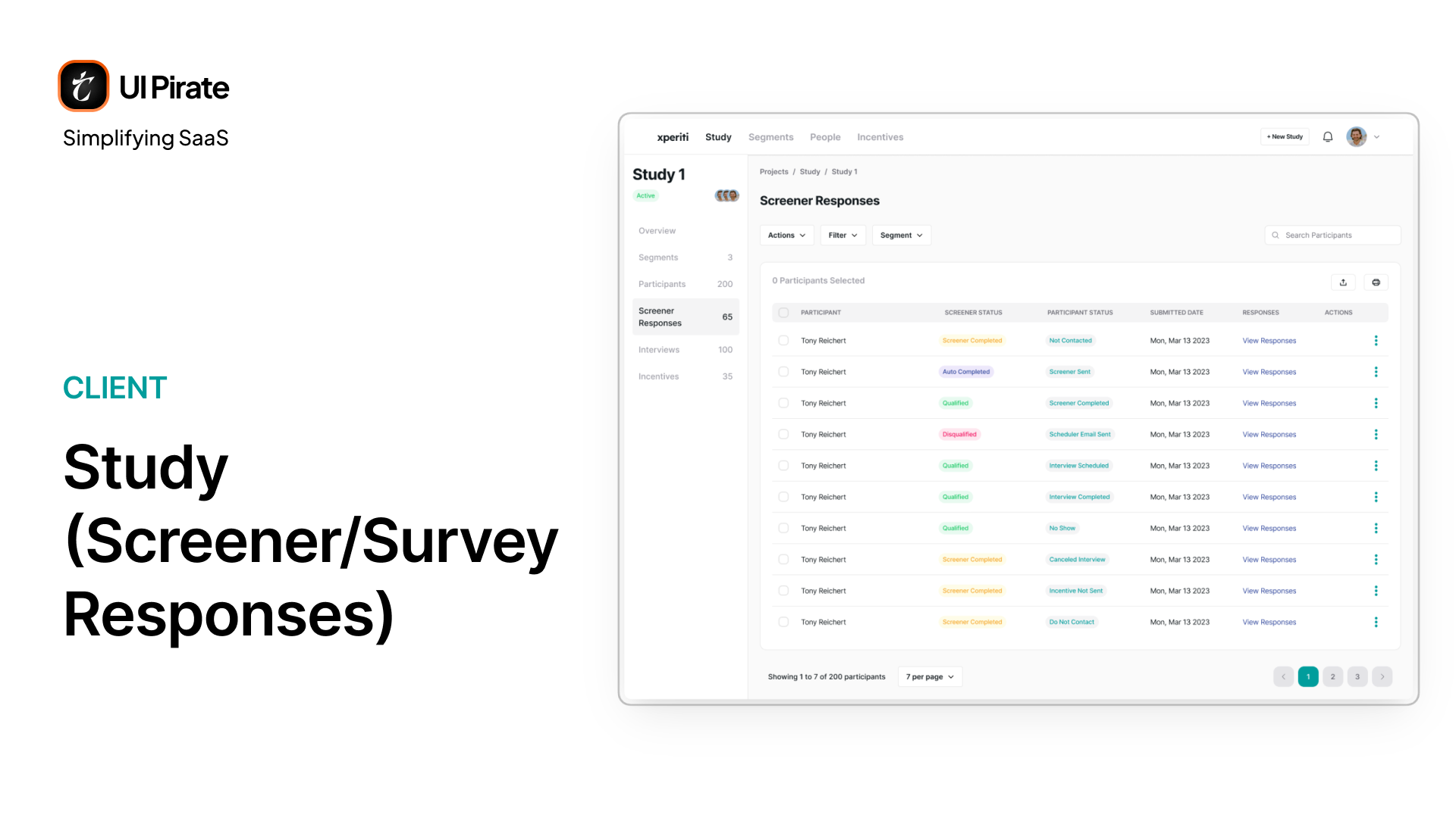
Screener Responses
Screener Responses lets you qualify or disqualify someone directly from their submitted answers.
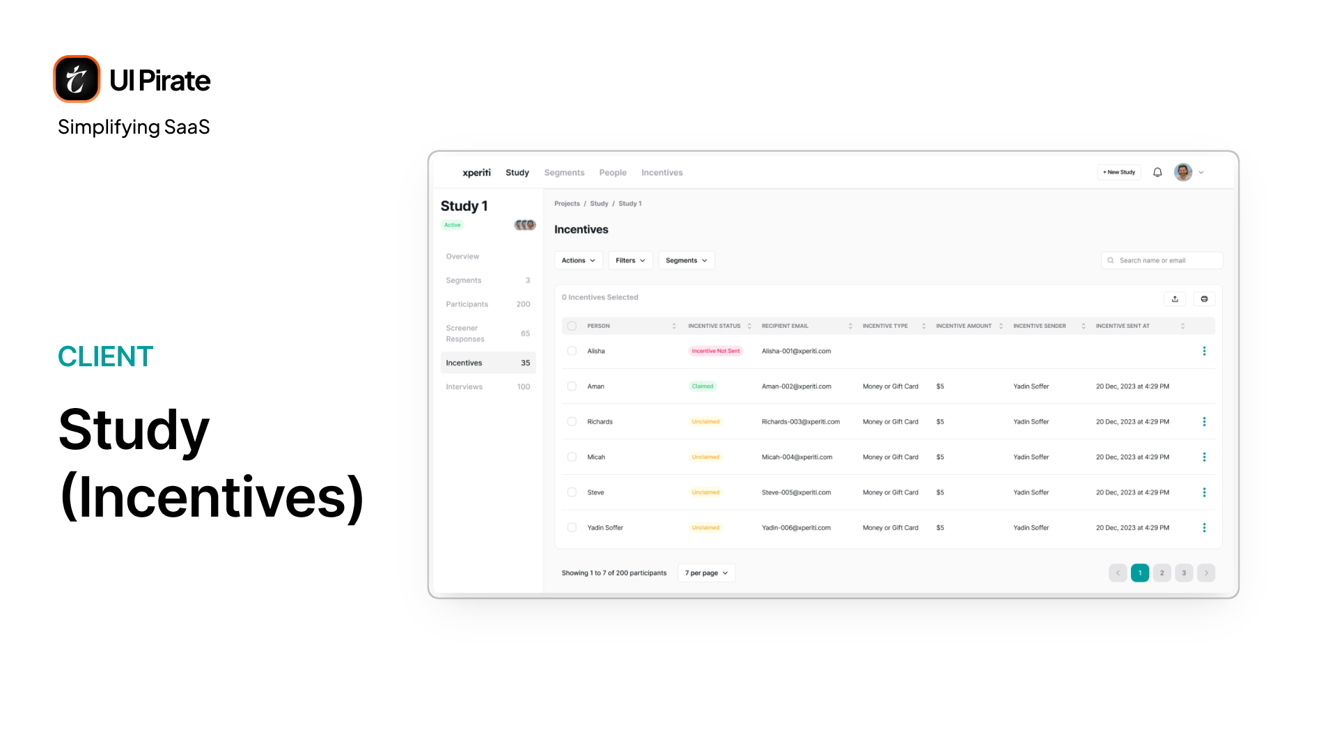
Incentives
Incentives tracks who's been paid, who hasn't, and who needs a resend, scoped to this one study rather than the platform-wide view.
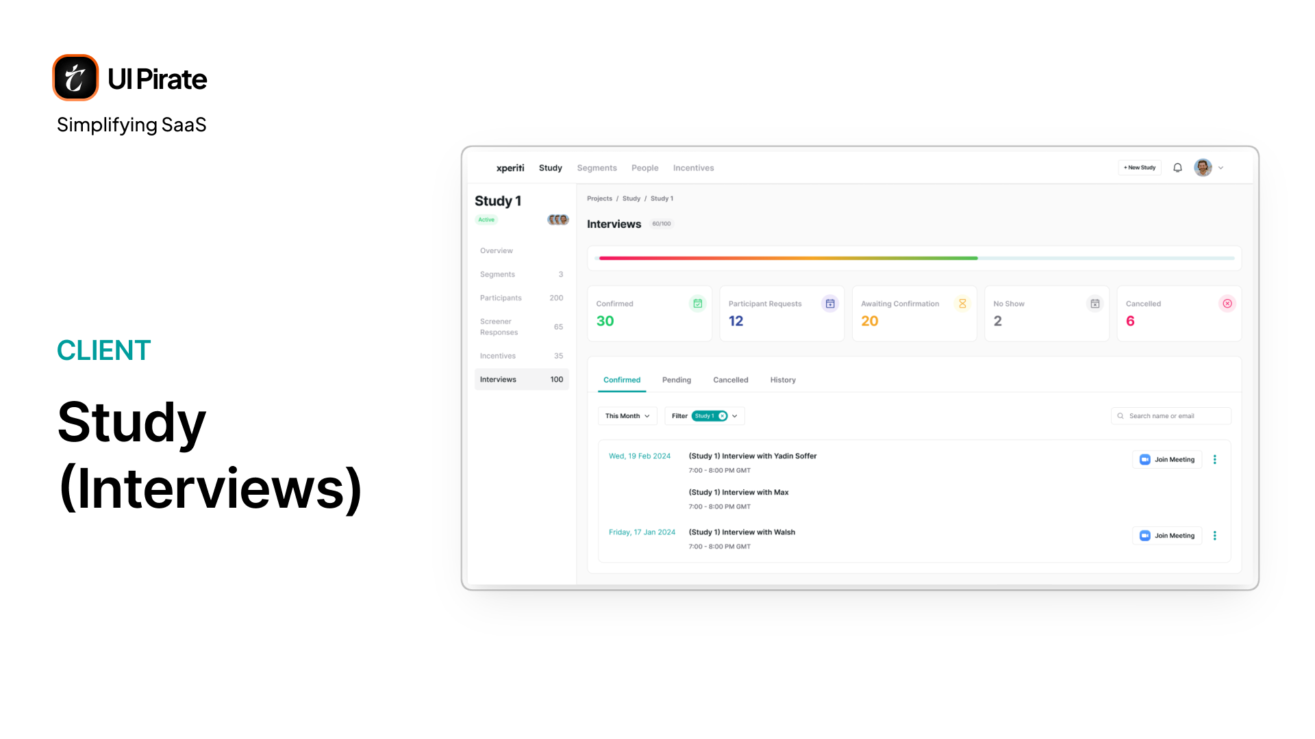
Interviews for Qual Studies
Only qualitative studies get an Interviews tab, split into Confirmed, Pending, Cancelled, and History. Pending interviews carry different actions depending on their exact state:
No-show: resend the invitation
Awaiting confirmation: reschedule or cancel
Freshly requested: confirm, reschedule, or cancel
Segments, Incentives, and Budgets at the Platform Level
Segments
Outside any single study, Segments exists as its own top-navigation destination, giving clients a platform-wide view instead of a per-study one.
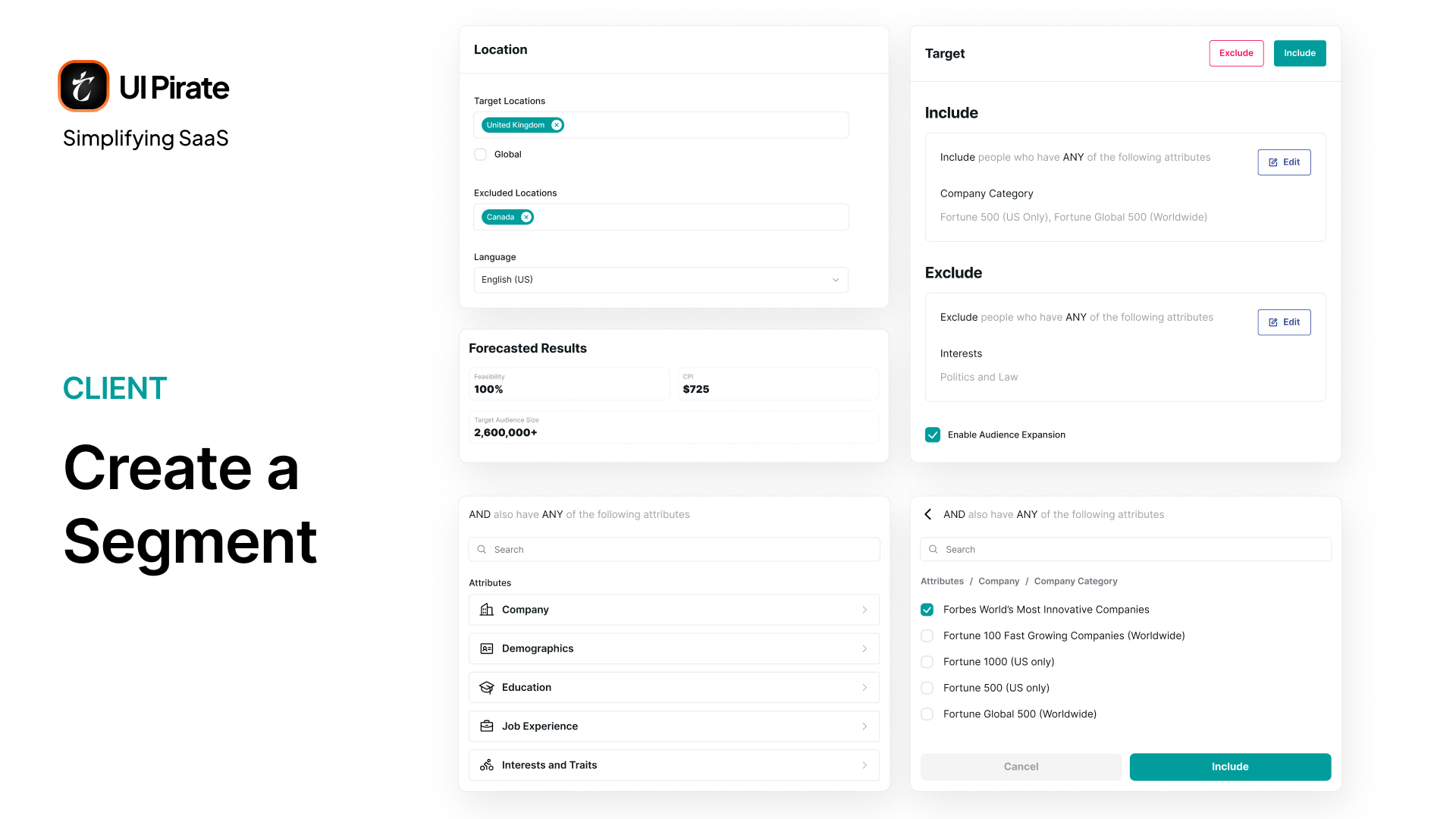
Creating a segment is where the platform's most sophisticated logic lives. You build Include and Exclude rules against attributes like company, education, and interests. You combine them with AND and OR logic. A live forecast panel updates target audience size, feasibility, and cost-per-interview as you build, which improves targeting accuracy before a single invite goes out.
Incentives & Budgets
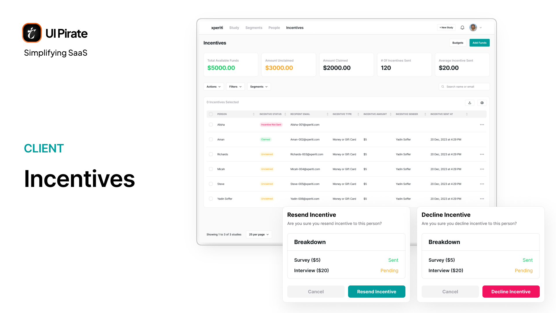
The platform-level Incentives page tracks total available funds, amount claimed, and incentives sent, giving clients a platform-wide view instead of a per-study one.
A Budgets sub-view lets teams split spend across named budgets, instead of pulling from one shared pool. Each budget then gets its own detail page with the same stats, scoped down.
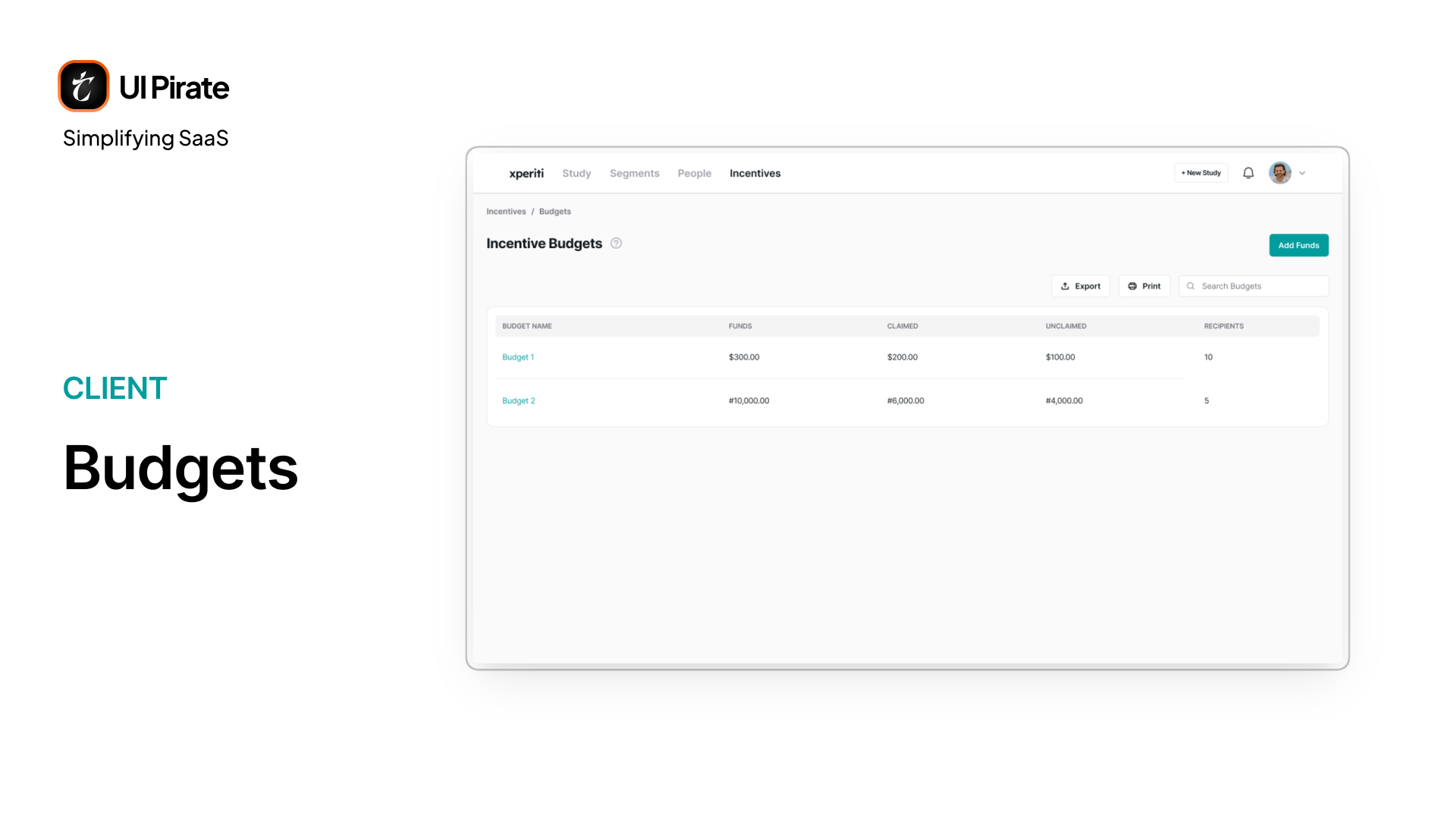
Splitting incentive budgets by team or project turned out to matter more than we expected. Finance teams needed to answer "how much did this specific initiative cost" without digging through every study individually, and named budgets reduce that guesswork to a single click.
People: The Client's Own CRM for Research Participants
The People module is where this market research enterprise SaaS platform stops behaving like a study tool. It starts behaving like a database of everyone the client has ever recruited.
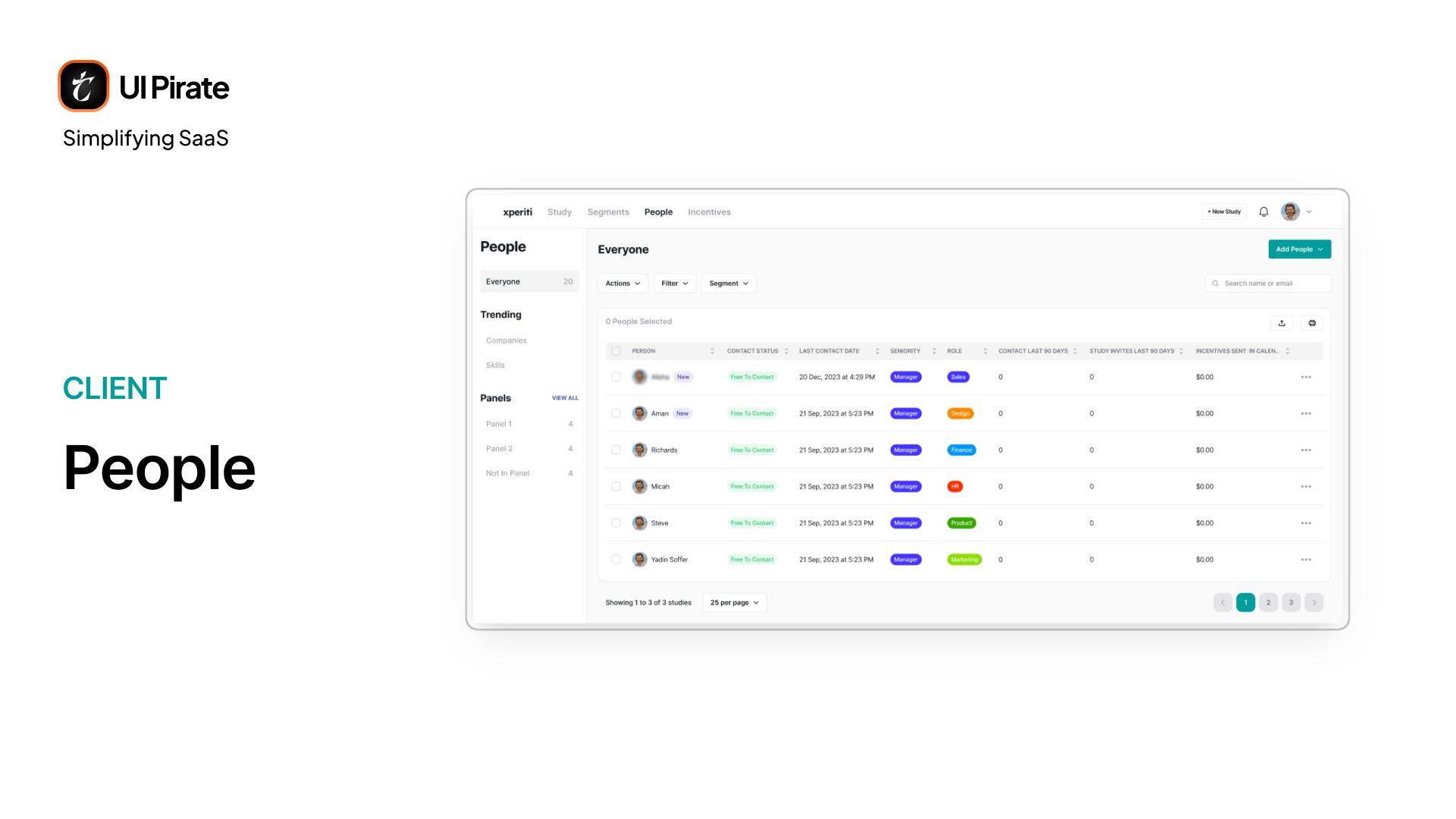
Individual Profiles Go Deep
Clicking into any person opens eight tabs: Profile, Overview, Properties, Studies, Submissions, Consent Submissions, History, and Contact Status. Between them, a client can see:
LinkedIn-style background
Every study a person has touched
Their submitted answers and consent records
Their full outreach history
Whether they're currently free to contact or opted out
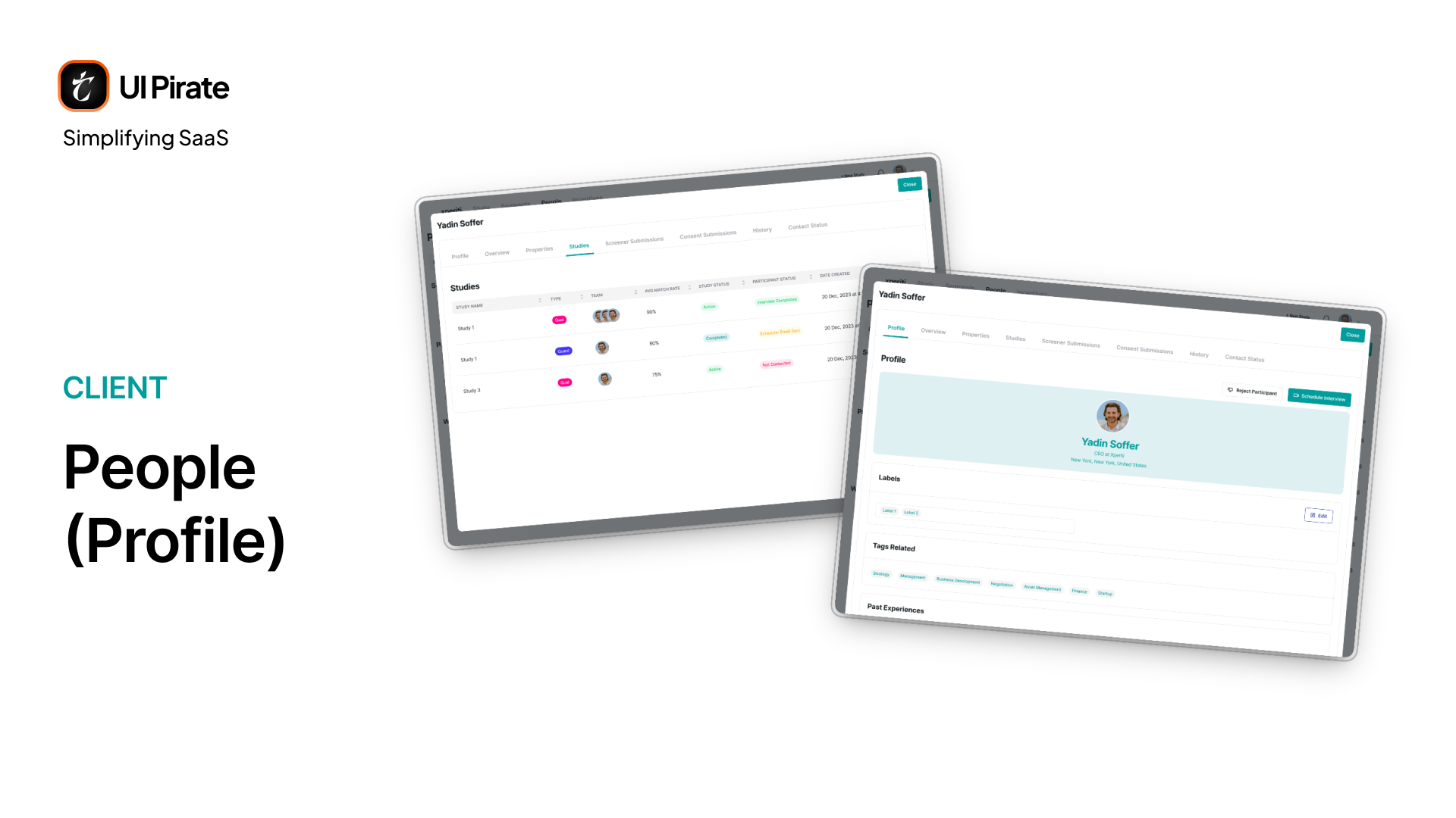
Anonymous participants get the same structure, with names and identifying details encrypted. Privacy-sensitive studies don't need a separate system to protect participant identity.
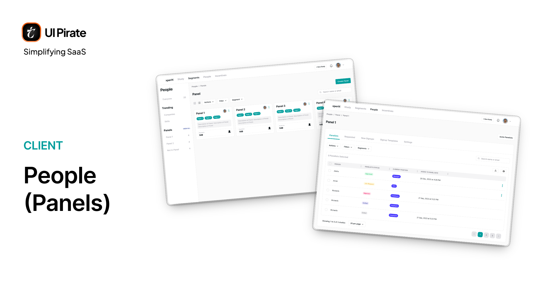
Panels Get Their Own Settings and Signup Pages
Beyond individual people, the Trending pages surface which companies and skills show up most in the client's talent pool. Panels get real administrative depth:
Block, remove, approve, or reject panellists
Review pending join requests
Configure custom signup pages, each with its own permissions, expiry rules, and team access
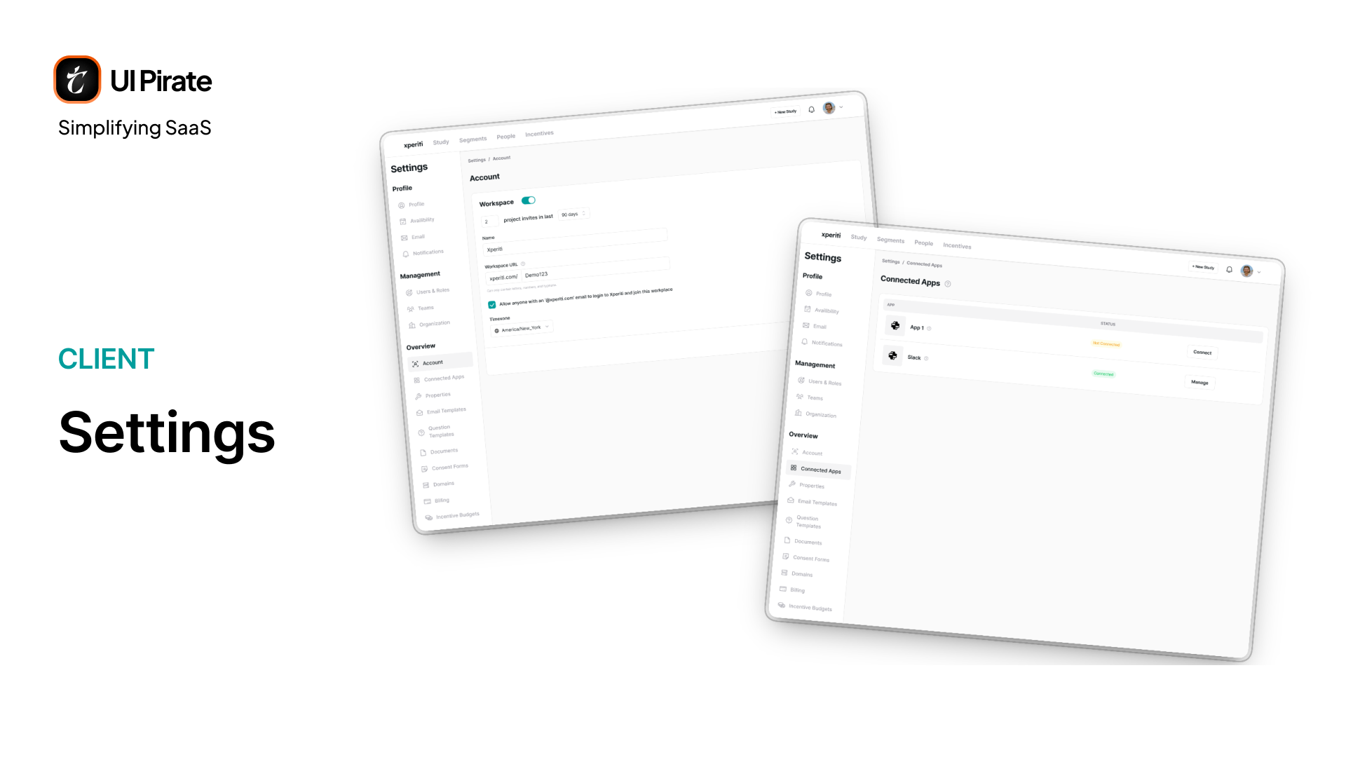
Admin Settings for a Multi-Team Organization
Admin settings for this market research enterprise SaaS platform split into three areas: Profile, Management, and Overview. Overview alone covers:
Workspace configuration and connected apps
Custom properties, templates, and documents
Consent forms and sending domains
Billing and incentive budgets
Governance
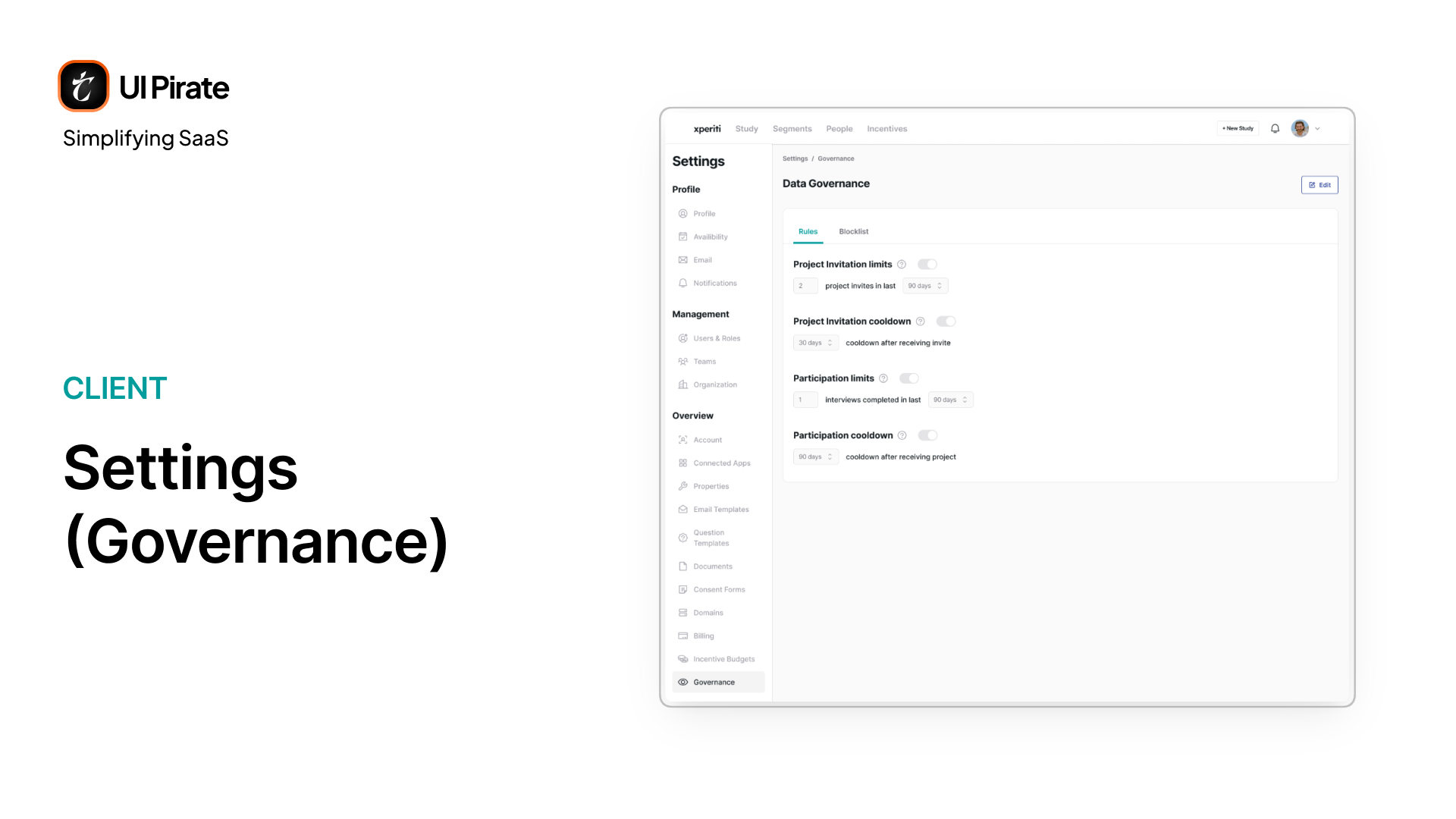
Governance is worth calling out on its own. It lets a client cap how often any single person gets invited to a study, and enforce cooldown periods between invitations. It also limits how many studies someone can participate in over time, and maintains a block list. All of it exists to protect the platform's best participants from burning out on its own recruiting power.
What Made This Platform Hard to Design
Designing a market research enterprise SaaS platform this wide in scope surfaced a few honest difficulties worth naming.
Two audiences, one visual language. The client side needed density and control. The expert side needed warmth and clarity. Sharing a navigation pattern without sharing a personality took deliberate restraint on both ends.
The stepper inside a stepper. Study creation runs a top-level stepper and a contextual sub-stepper at the same time. Getting that hierarchy legible, so a user always knows both where they are in the big picture and where they are in the current step, took real iteration.
One question builder, ten formats. Every question type shares a shell but diverges in configuration. Keeping that modal predictable across all ten, without bloating simple question types or under-serving complex ones like the grid formats, was a genuine balancing act.
Qual and quant had to feel related, not identical. They share almost every screen pattern but diverge exactly where interviews enter the picture. Forcing full parity would have broken quant. Splitting them entirely would have doubled the maintenance burden for no real benefit.
The Design Principle That Held It Together
Everything in this market research enterprise SaaS platform nests under one object: the study. Segments, participants, screeners, interviews, incentives, chats. All of it lives inside a study first, and a platform-wide view second.
That's not an accident. A researcher thinks in studies, not in tools. Once that became the organizing idea, decisions that looked unrelated (how the sidebar changes per section, how the Add Participants dropdown works, how incentives roll up to budgets) all started answering to the same logic instead of competing with each other.
"The study isn't a container for features. It's the unit everyone actually thinks in, so we made it the unit everyone actually navigates in."
A Design System Built to Hold This Much Density
A platform carrying this many roles, tables, and steppers needed a design language that stayed consistent whether the screen belonged to a client running twelve studies or an expert checking on one.
Typography
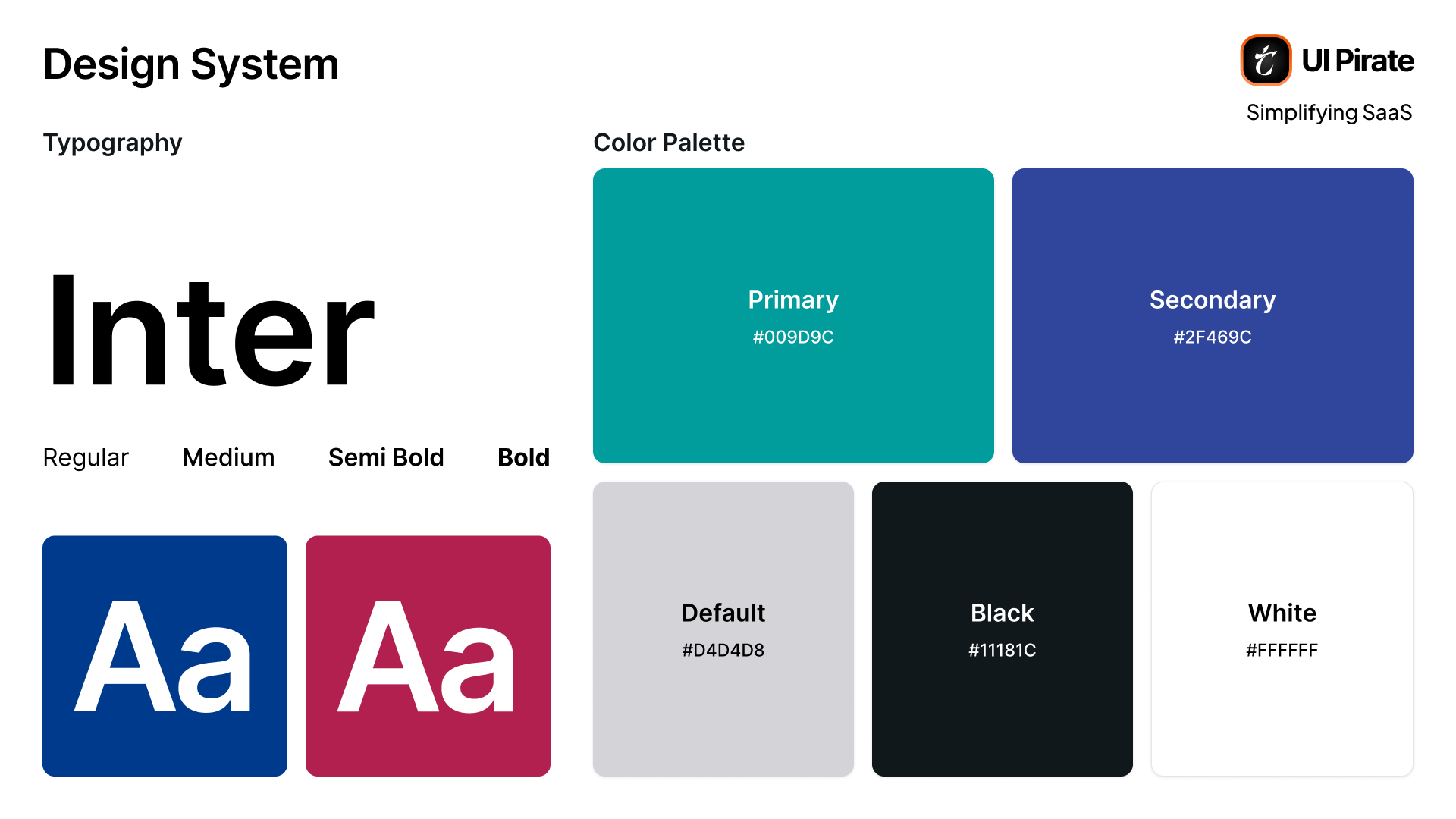
Inter, across four weights: Regular, Medium, Semi Bold, and Bold
Color Palette
Primary: Teal,
#009D9CSecondary: Blue,
#2F469CDefault: Light gray,
#D4D4D8Black:
#11181CWhite:
#FFFFFF
The Tech Stack Behind Xperiti
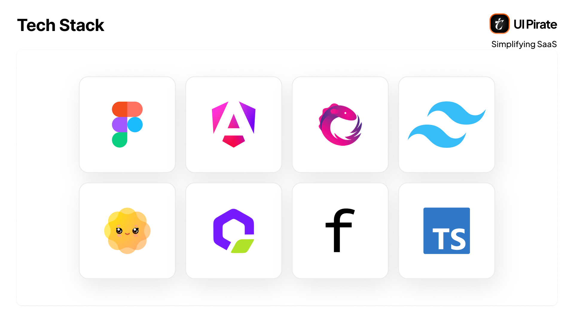
Technology | Why It Fits |
|---|---|
Figma | The primary design tool for the platform's screens, from the dense client-side tables to the branded expert-facing welcome pages. |
Angular 16 | The core framework running the entire client and expert app shell, from the multi-step study builder to the dense Participants table. |
Angular CDK | Underlying behavior for complex interactions like the drag-to-reorder screener questions and the full-screen modals used throughout study creation. |
TypeScript | Type safety across a platform with this many interdependent data shapes, studies, segments, participants, incentives, all referencing each other. |
RxJS | Handles the platform's live, reactive pieces: the segment forecast panel updating in real time, and state syncing across the dual stepper in study creation. |
Tailwind CSS | Utility-first styling for a platform with this much screen variety, without hand-rolling CSS for every table, card, and modal. |
DaisyUI | Pre-built component primitives on top of Tailwind, speeding up consistent buttons, badges, and status chips across both the client and expert sides. |
RippleUI | A second component layer supplementing DaisyUI, likely covering interaction patterns like the stepper and dropdown menus. |
CKEditor 5 | Powers the platform's rich-text areas: welcome page descriptions, consent form content, and the editable email templates in Core and Automated Messages. |
Angular Calendar | Drives the scheduling module directly, host availability views, the client's My Calendar, and the expert's interview calendar. |
ng-select | The dropdown and multi-select components used throughout the screener builder, segment attribute pickers, and study configuration forms. |
Flatpickr | Date and date-range pickers, matching the date question type and the fixed/rolling date range options in scheduling. |
ngx-slider-v2 / ng5-slider | Almost certainly the linear scale question type, and the affordability-versus-quality scale shown in segment targeting. |
ngx-drag-drop | Likely powers reordering questions inside the screener and survey builders. |
ng-otp-input | The OTP verification step in both the expert and client onboarding flows. |
Reflection
Xperiti is one of the widest-scoped market research enterprise SaaS platforms we've worked on. Not because any single screen is unusually complex, but because it's really four products (researcher, coordinator, client, expert) that all have to feel like they belong to the same platform, without feeling like the same product.
A few things this project reinforced:
Density is not the enemy of clarity, if the hierarchy inside a screen is disciplined enough. The Participants table alone proves that eleven columns can still read cleanly.
Two-sided platforms need two-sided empathy. Designing only for the client side, or only for the expert side, would have produced a lopsided product. Both had to be treated as the primary user, just never at the same time.
The organizing object matters more than any single feature. Once "the study" became the platform's spine, the rest of the information architecture followed from it instead of fighting it.
This market research enterprise SaaS platform didn't succeed by simplifying what research operations actually require. It succeeded by giving that complexity somewhere honest to live, and by helping every one of its four users save time getting there.
Ready to Design for Every Side of Your Platform?
If your product has to serve more than one kind of user without any of them feeling like an afterthought, the interface has to carry that weight from day one.