UI
Syed Musuddiq
30 views · 15 min read
15 min read | 4 days ago
The "Please Stop Using 47 Shades of Blue" Edition
By Vishal Anand (Founder) & Syed Musuddiq (Head of Design), UI Pirate
Every design system starts the same way. Like a rom-com. Everyone's happy, everyone's in love, everything is simple.
A few colors. A spacing scale. A typography style you personally hand-picked and are weirdly proud of, like it's your firstborn. A handful of reusable components. You look at your little design system and think, "wow, I have my life together."
You do not have your life together. You just haven't scaled yet.
Then the product grows up. New features get bolted on every sprint. Dark mode shows up because someone's manager saw it on a competitor's app. A second product launches. Then a third. More designers join, more engineers join, everyone's in fourteen different Figma files, and nobody's syncing on naming conventions because "we'll fix it later" (you will not fix it later).
And that is exactly when the chaos begins.
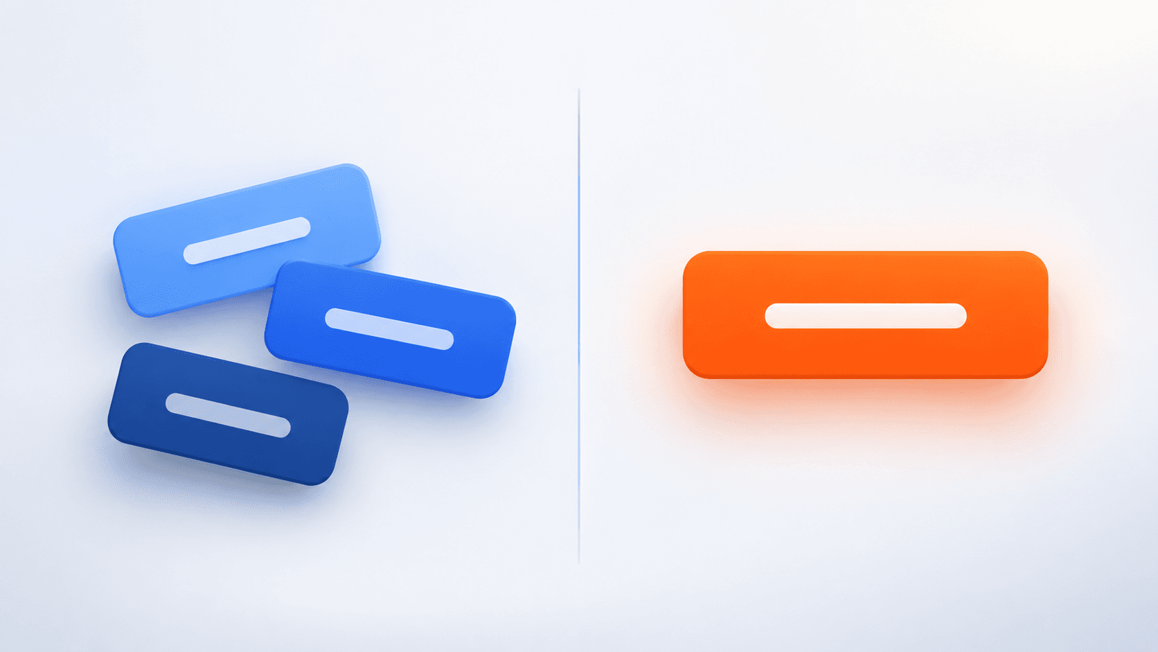
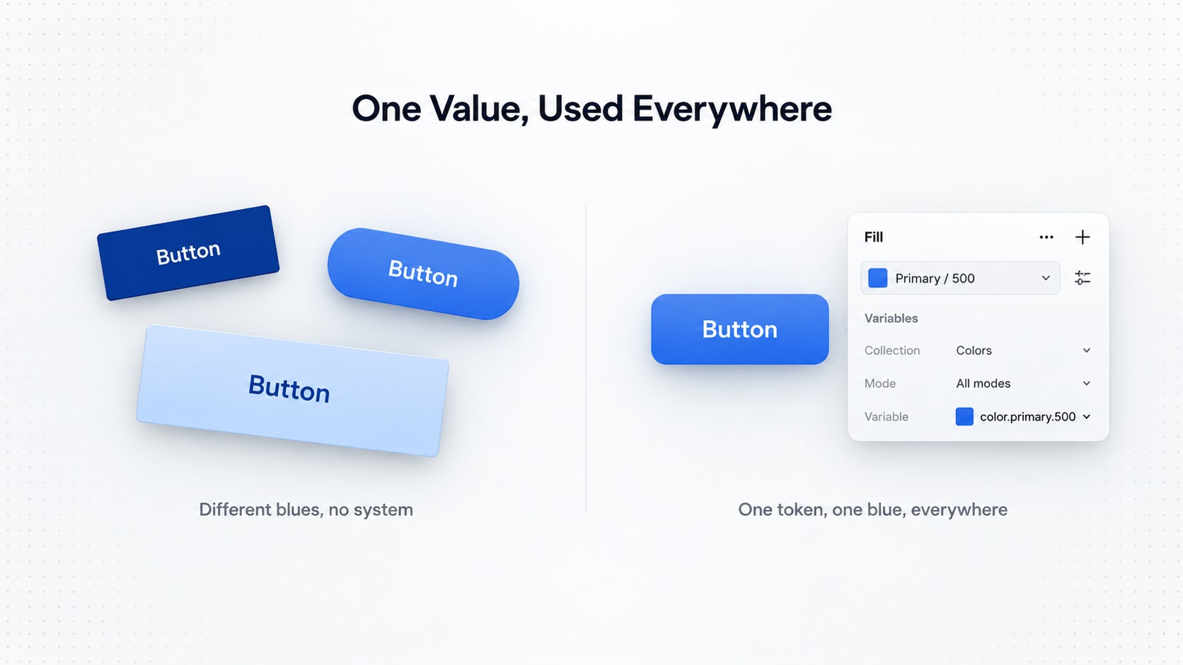
One button uses #2563EB. Another one, mysteriously, uses #1D4ED8. Nobody knows who added it or why. It's basically a crime scene at this point. A third button has a slightly different border radius, like it went rogue during a caffeine-deprived Friday deploy. Designers start inventing new spacing values on the spot because "8px felt cramped and 16px felt like a hug that lasted too long."
Here's the plot twist though: the components were never the problem. Buttons don't wake up one day and decide to be chaotic. The real issue is there's no shared foundation holding everything together, like a company with no HR department. Vibes only. No structure.
That foundation is called a design token system.
In this tutorial, we are going to build one from scratch, the enterprise kind, the kind that survives 200 designers, four brands and one very opinionated stakeholder who insists "can we just make the button pop more."
What Are Design Tokens?
A design token is basically a fancy nickname you give to a design decision, so nobody has to memorize hex codes like they're bank OTPs.
Instead of scattering raw values everywhere like confetti:
color: #2563EB;
padding: 16px;
border-radius: 8px;
we give these decisions actual names, like adults:
color: var(--color-action-primary);
padding: var(--space-4);
border-radius: var(--radius-md);
Looks like a tiny change. It is not tiny. It is the design equivalent of switching from typing passwords manually to using a password manager. Same result, drastically less suffering.
The first version says: "this thing is blue."
The second version says: "this thing is the system's primary action color, and if that color ever changes, I will not personally have a breakdown updating 400 files."
That's the whole upgrade.
Why Not Just Use Variables?
You're probably already using variables in Figma or CSS and thinking, "cool, I basically already do this, why is this man lecturing me."
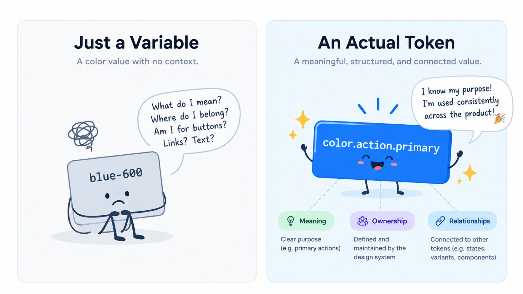
Fair. But a token is not just a variable wearing a name tag at a networking event. A good token carries meaning, ownership and relationships, not just a value.
blue-600 tells you what the value is.
color.action.primary tells you what it's for, like the difference between someone's Tinder bio and their actual LinkedIn job title.
This gap doesn't matter on day one, when it's just you and your laptop and a dream. It matters a LOT once your team has more people than a WhatsApp family group.
Why Enterprise Products Need Design Tokens
Small products can survive without a fancy token setup, the same way a college student survives on instant noodles and vibes. It works, until it really, really doesn't.
Now imagine this org:
8 products
4 web applications
2 mobile applications
15 product teams
200 designers and developers
light and dark themes
multiple brands
multiple platforms
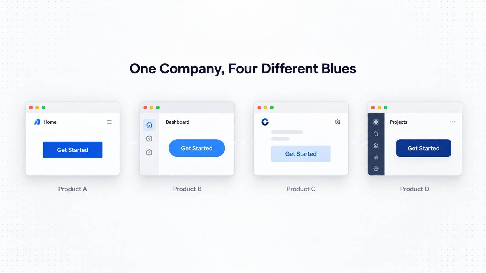
That's not a company anymore. That's a small civilization. And without a shared token system, visual decisions quietly drift apart, like coworkers who used to be close before everyone went remote.
Product A → Blue A
Product B → Blue B
Product C → Blue C

Product A → 8px radius
Product B → 10px radius
Product C → 12px radius
Every single one of these choices seemed totally fine in isolation. Nobody sat in a meeting and voted "let's make our products look like they belong to three unrelated companies." It just happens, one Friday deploy at a time.
A token system gives everyone a shared vocabulary, like a company-wide Slack emoji pack, except this one actually improves productivity:
                 Core Token System
                         │
          ┌──────────────┼──────────────┐
          ↓              ↓              ↓
      Product A      Product B      Product C
          ↓              ↓              ↓
         Web           Mobile       Enterprise
Each product still gets its own personality, its own flows, its own quirks. They just stop looking like they were designed by three teams that have never met, which, let's be honest, is usually exactly what happened.
The Three-Layer Token Architecture
A scalable token system breaks down into three layers, like a corporate org chart, except this one actually makes sense:
Primitive Tokens
       ↓
Semantic Tokens
       ↓
Component Tokens
Let's go through each one, no jargon, promise.
1. Primitive Tokens
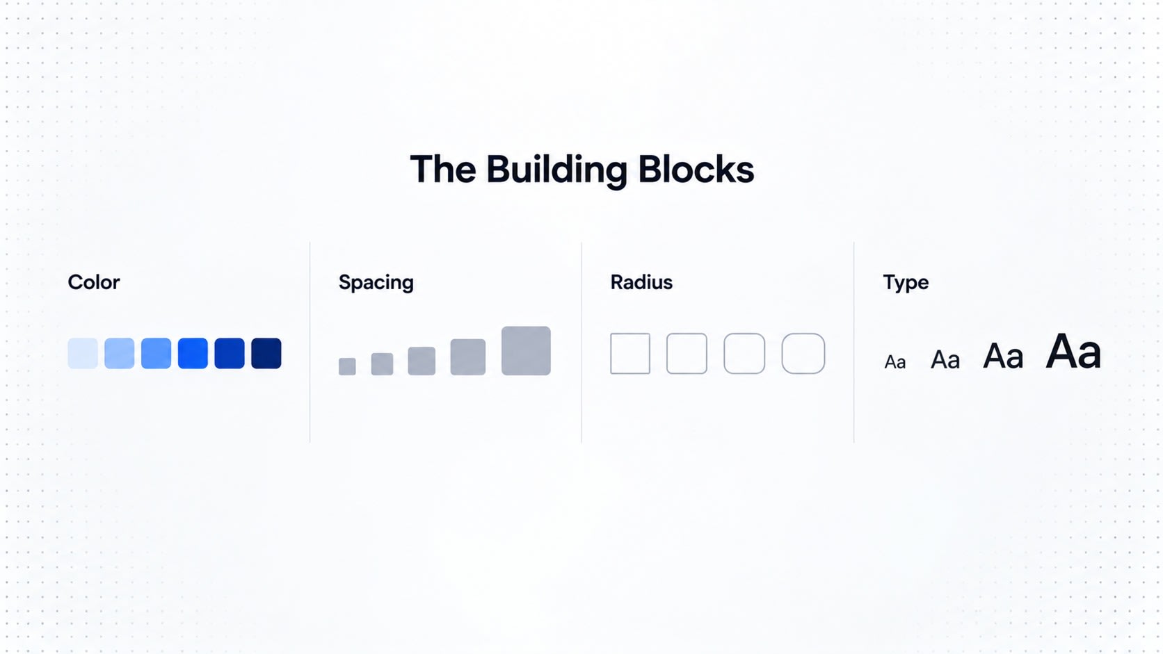
Primitive tokens are the raw ingredients. The flour and sugar before anyone's baked a cake. They describe a value, nothing about where it's used yet.
Color
blue-50
blue-100
blue-200
blue-300
blue-400
blue-500
blue-600
blue-700
blue-800
blue-900
Spacing
space-1
space-2
space-3
space-4
space-5
space-6
space-8
space-10
space-12
Radius
radius-none
radius-sm
radius-md
radius-lg
radius-xl
radius-full
Typography
font-size-xs
font-size-sm
font-size-md
font-size-lg
font-size-xl
This is your raw vocabulary. Basically the alphabet before you've written any actual sentences with it.
2. Semantic Tokens
If primitive tokens tell you what a value IS, semantic tokens tell you what it's FOR. Like the difference between a job title and a job description that actually explains what you do all day.
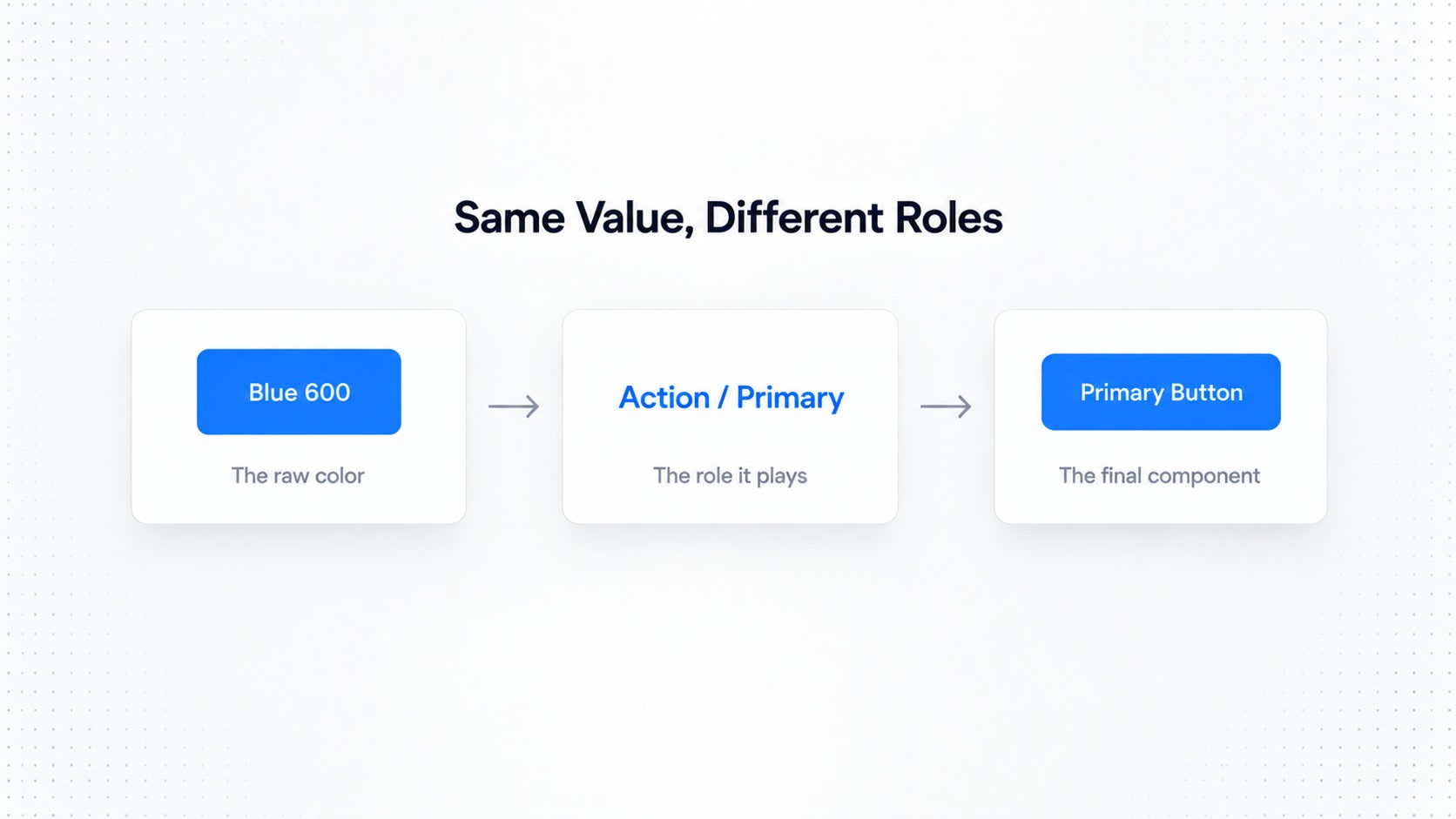
Instead of letting a button directly grab blue-600 like it's raiding the fridge at 2am, we introduce color.action.primary, which quietly points back to blue-600 behind the scenes.
More examples:
color.text.primary
color.text.secondary

color.background.primary
color.background.secondary

color.border.default

color.action.primary
color.action.primary.hover

color.action.danger
Now the system understands intent, not just appearance.
color.action.primary
        ↓
     blue-600
Flip to dark mode:
color.action.primary
        ↓
     blue-400
Notice what didn't change: the component itself. Only the mapping underneath shifted, quietly, like someone changing the office thermostat without telling anyone but somehow everyone's just comfortable now.
3. Component Tokens
Component tokens live right next to the actual UI, the closest layer to what users actually see and click on without a second thought (unlike your last performance review, which people definitely thought about).
For a button:
button-primary-background
button-primary-background-hover
button-primary-background-active
button-primary-background-disabled

button-primary-text

button-border-radius

button-padding-x
button-padding-y

button-height-sm
button-height-md
button-height-lg
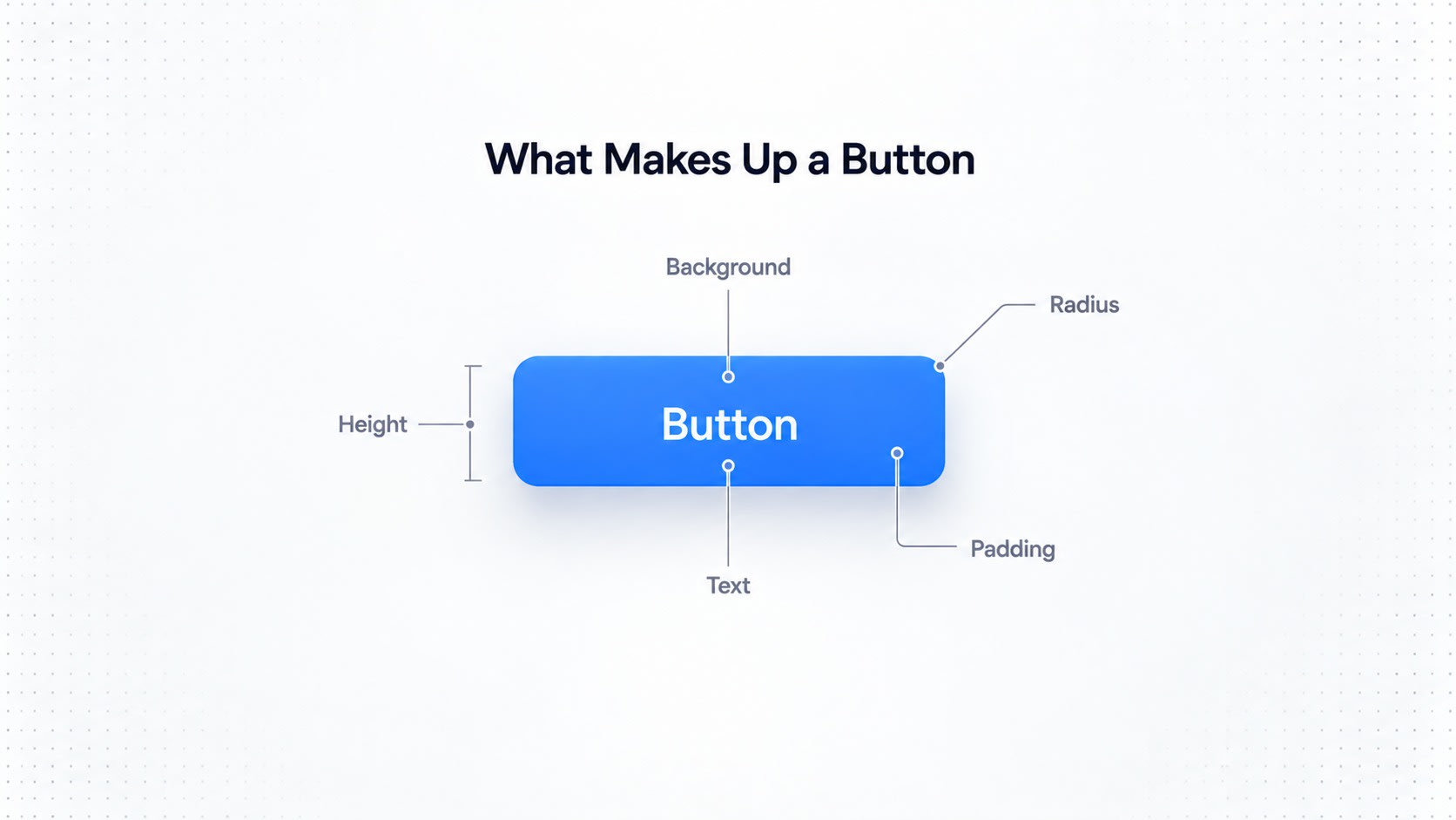
This is basically the button's employment contract. Clear terms, clear expectations, no surprises during onboarding.
Button
 ├── background → button-primary-background
 ├── text → button-primary-text
 ├── radius → button-border-radius
 └── padding → button-padding-x / y
Instead of manually updating hundreds of buttons one by one like some kind of design intern punishment, you change one token, and every button falls in line. Beautifully obedient.
The Most Important Concept: Token Aliases
Here's the classic rookie mistake, connecting components directly to primitives, skipping the semantic layer entirely, like skipping leg day but somehow expecting your squat form to hold up.
Don't do this:
Button
   ↓
blue-600
Do this instead:
Button
   ↓
button-primary-background
   ↓
color.action.primary
   ↓
blue-600
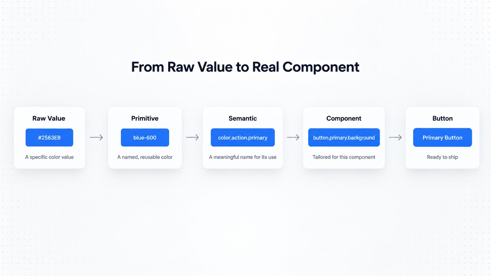
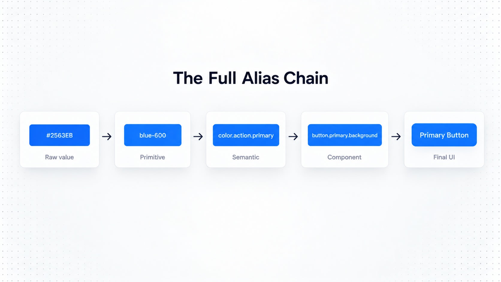
This chain of references is called an alias relationship. The full chain:
#2563EB
   ↓
blue-600
   ↓
color.action.primary
   ↓
button-primary-background
   ↓
Primary Button
Each layer adds meaning, like layers of an onion, except this one won't make you cry during a design review.
Building Themes With Tokens
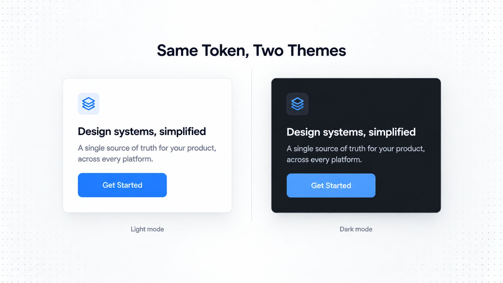
Once components consume semantic tokens instead of raw values, theming becomes almost free. Like a company perk that's actually good, instead of a "wellness Wednesday" email nobody reads.
Theme
├── Light
├── Dark
└── High Contrast
Light:
background.primary → white
text.primary → gray-900
action.primary → blue-600
Dark:
background.primary → gray-950
text.primary → white
action.primary → blue-400
The button doesn't need a separate build for dark mode. It just consumes color.action.primary, and whichever theme is active quietly decides what that actually turns into, like the office AC settings that mysteriously change based on who complained loudest.
Multi-Brand Token Systems
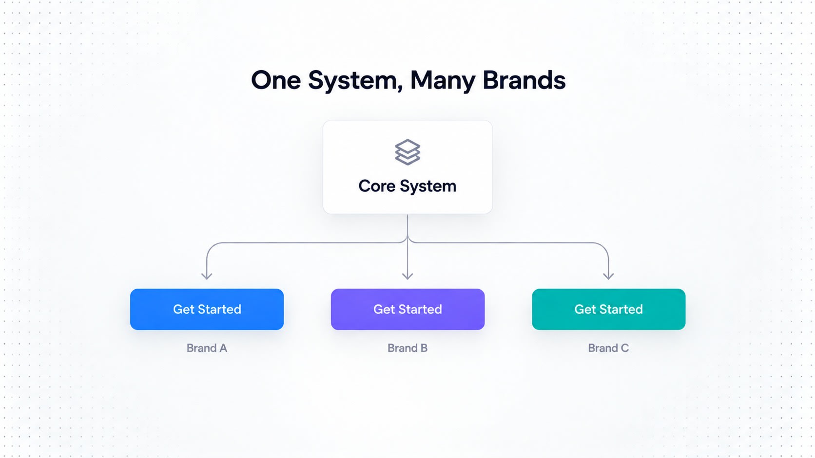
The same architecture scales sideways too, across brands, the same way one person can be "different" at work, at home, and in the family WhatsApp group, while still fundamentally being the same human underneath.
Core Design System
        │
        ├── Enterprise Brand
        ├── Consumer Brand
        ├── Healthcare Brand
        └── Partner Brand
All brands share the exact same components:
Button
Input
Modal
Table
Dropdown
Navigation
while token values quietly change underneath.
Brand A:
action.primary → blue-600
radius.md → 8px
Brand B:
action.primary → purple-600
radius.md → 12px
The component architecture stays untouched. Only the visual costume changes. Extremely handy for companies juggling multiple products, or ones that acquired three other startups and now need everything to feel like one family and not a hostage situation.
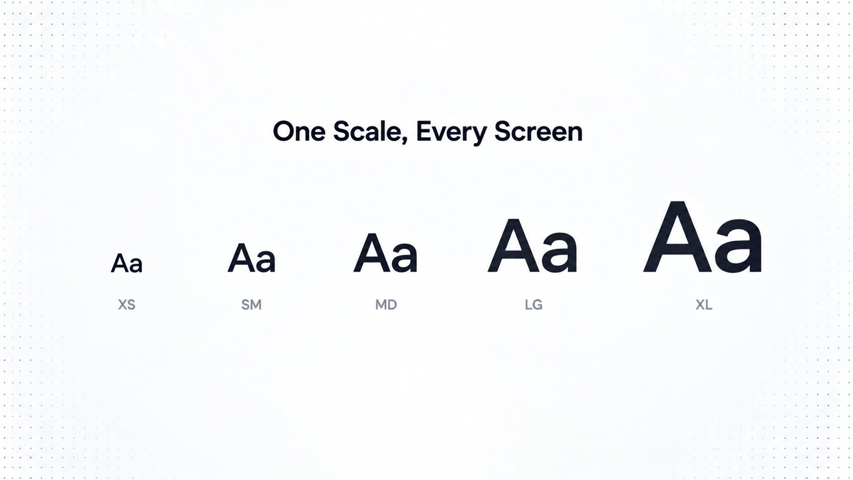
Typography Tokens
Typography deserves the same semantic glow-up.
Instead of naming raw sizes:
font-size-16
font-size-18
font-size-24
define roles instead:
text-body-sm
text-body-md
text-body-lg

text-label-sm
text-label-md

text-heading-sm
text-heading-md
text-heading-lg

text-display-sm
text-display-md
Then map roles down to primitives:
text-body-md
      ↓
font-size: 16px
line-height: 24px
font-weight: 400
Now the type scale can evolve later without redesigning every screen, unlike that one rebrand meeting that somehow took four months and ended with everyone agreeing on... the exact same blue.
Spacing Tokens
A mature system shouldn't rely on someone eyeballing values like:
13px
17px
22px
27px
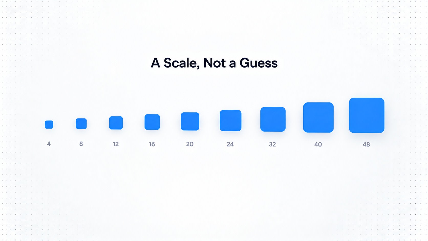
We've all been there, nudging a div by 2 pixels at 11pm because "it just feels off," then closing the laptop feeling like you solved world peace. Instead, set up a scale everyone agrees to actually follow:
space-1  → 4px
space-2  → 8px
space-3  → 12px
space-4  → 16px
space-5  → 20px
space-6  → 24px
space-8  → 32px
space-10 → 40px
space-12 → 48px
Components then define relationships using these:
button-padding-x
button-gap
card-padding
form-field-gap
section-spacing
The goal isn't just consistency. It's controlled consistency, the design equivalent of a well-run meeting that actually ends on time.
State Tokens
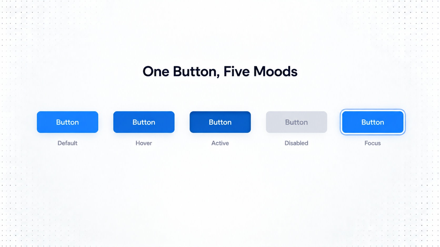
Every UI element has moods, honestly, kind of like a coworker on a Monday morning:
default
hover
active
focus
disabled
selected
loading
error
warning
success
For example:
button-primary-background-default
button-primary-background-hover
button-primary-background-active
button-primary-background-disabled
Or through semantic state relationships:
action-primary
action-primary-hover
action-primary-active
action-primary-disabled
This keeps things consistent even across wildly different components. A button, a dropdown, a checkbox and a menu item can all follow the same emotional range without anyone needing therapy.
Accessibility Tokens
Accessibility should never be the thing someone remembers at 6pm the night before launch, whispering "wait, does this pass contrast checks."
Tokens let you bake accessibility straight into the foundation, not staple it on later like a last-minute PowerPoint slide:
focus-ring-color
focus-ring-width
focus-ring-offset

minimum-touch-target

text-disabled
border-disabled
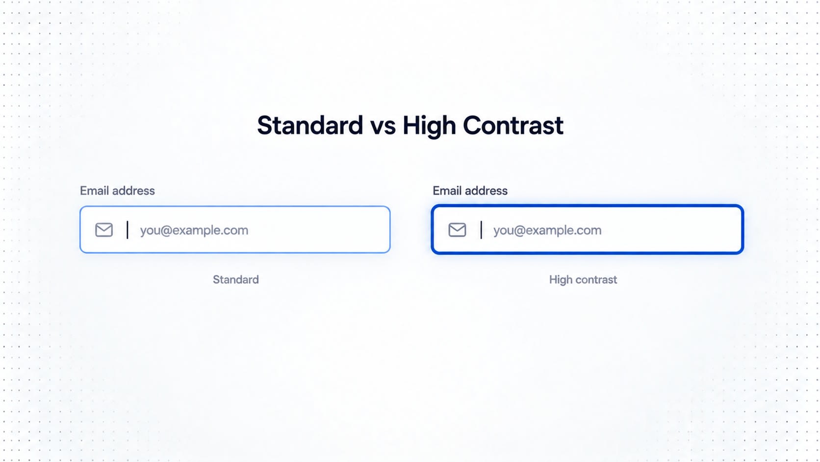
You can also build a dedicated high-contrast theme:
High Contrast
      ↓
stronger borders
higher text contrast
stronger focus indicators
This turns accessibility from a guilty afterthought into actual infrastructure, quietly doing its job in the background, like the one teammate who never gets credit but keeps everything from falling apart.
Motion Tokens
Motion deserves standardizing too, so your app doesn't feel like it has main character syndrome with a different animation personality on every screen.
motion-duration-fast
motion-duration-normal
motion-duration-slow

motion-ease-standard
motion-ease-emphasized

motion-distance-sm
motion-distance-md
Components consume them:
Dropdown
→ motion-duration-fast

Modal
→ motion-duration-normal
And reduced motion is handled cleanly:
Default
→ 200ms

Reduced Motion
→ 0ms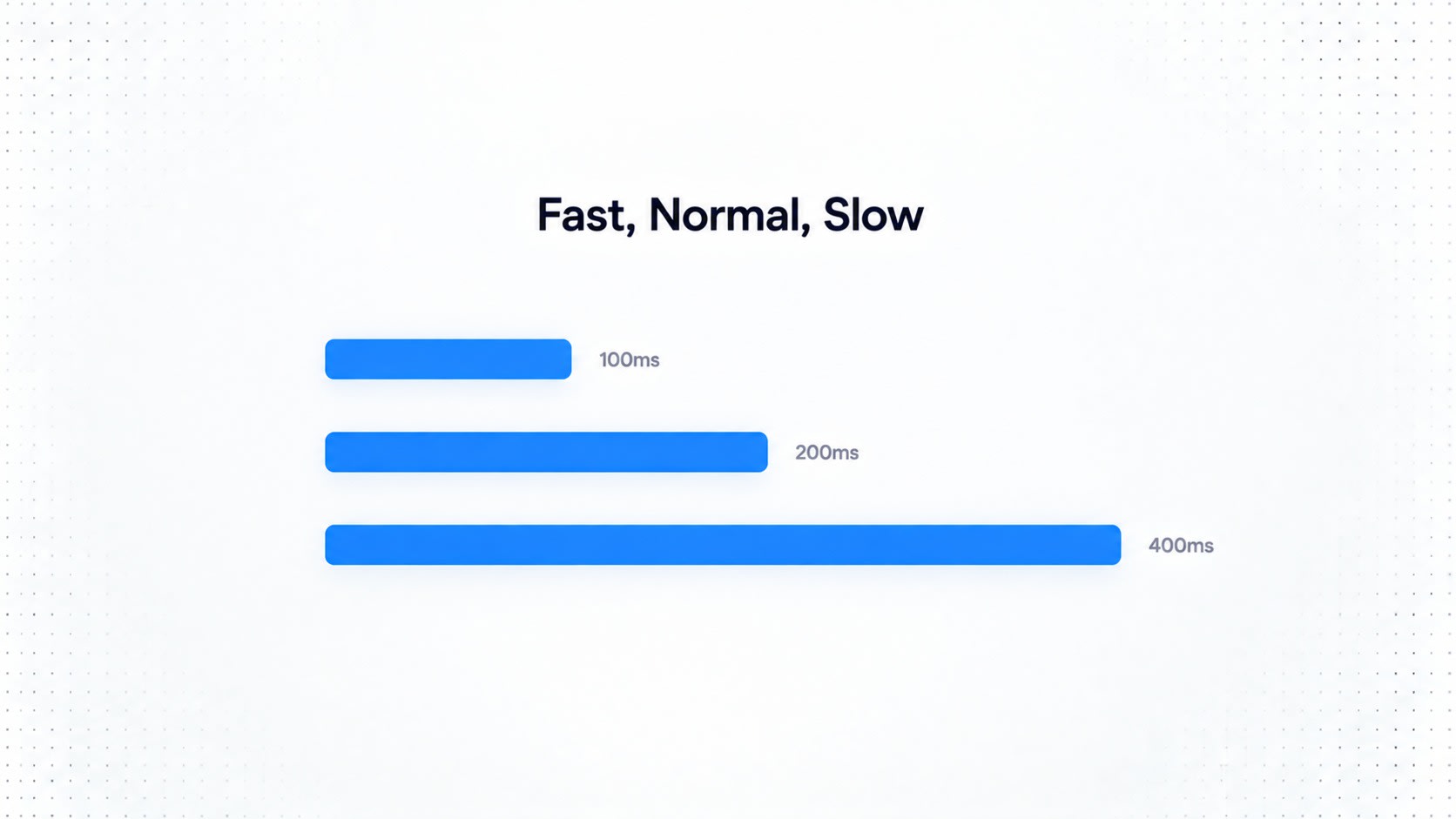
Elevation Tokens
Instead of manually guessing a shadow every time something needs to feel "important":
shadow-sm
shadow-md
shadow-lg
use semantic elevation instead:
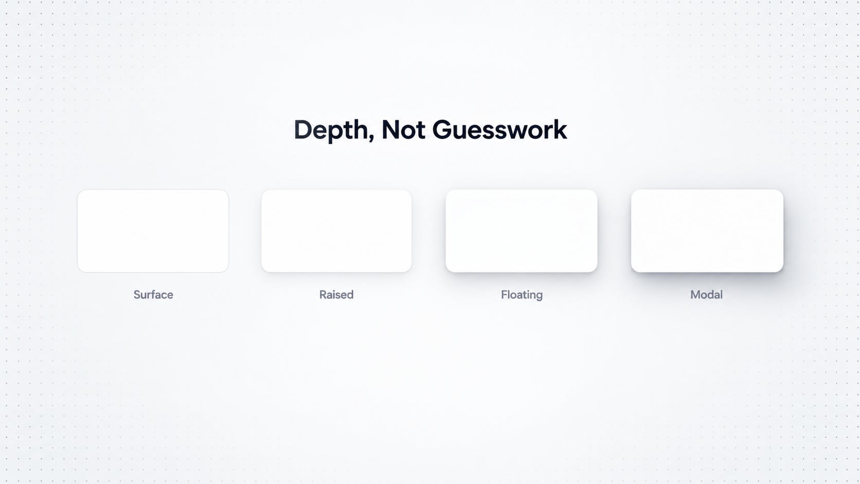
elevation-surface
elevation-raised
elevation-floating
elevation-modal
This makes your visual hierarchy explicit, instead of vibes-based, like an org chart that actually reflects who does the work versus who's just in a lot of meetings.
Putting the Token Architecture Together
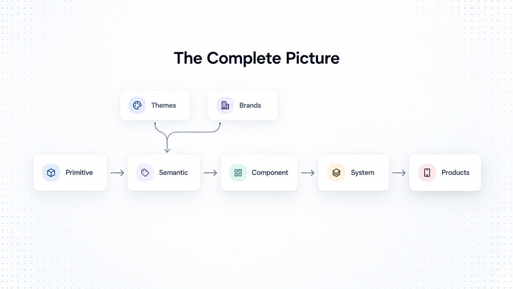
At this point, the whole system looks like this:
FOUNDATIONS
│
├── Color
├── Typography
├── Spacing
├── Sizing
├── Radius
├── Border
├── Elevation
├── Motion
├── Opacity
└── Breakpoints

        ↓

SEMANTIC TOKENS
│
├── Content
├── Surface
├── Border
├── Action
├── Feedback
├── Focus
└── Overlay

        ↓

COMPONENT TOKENS
│
├── Button
├── Input
├── Select
├── Checkbox
├── Radio
├── Switch
├── Card
├── Modal
├── Dropdown
├── Tooltip
├── Table
└── Navigation

        ↓

PRODUCTS
│
├── SaaS
├── Dashboard
├── Admin
├── Mobile
└── Marketing
This is the point where tokens stop being "a pile of variables someone made in 2022" and quietly turn into design infrastructure the whole company depends on, whether they know it or not, like the office WiFi.
Bringing Tokens Into Figma
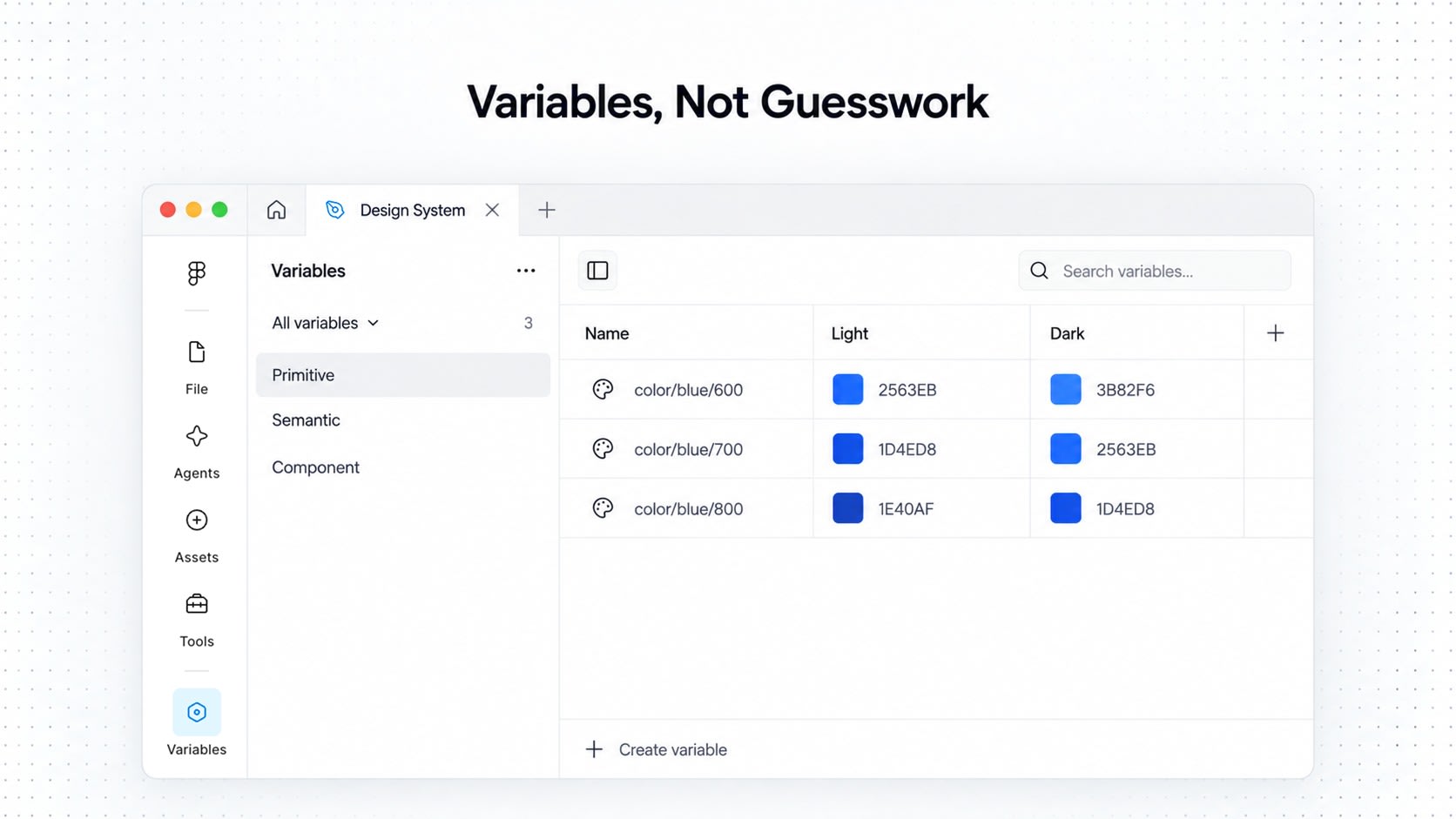
If you're building this inside Figma, variables give you the actual bones to implement all of this.
Simplified structure:
Primitive
Color / Blue / 600
then:
Semantic
Color / Action / Primary
      → Blue / 600
then:
Component
Button / Primary / Background
      → Action / Primary
You can also use modes for theming, right inside the same variable, no separate files, no chaos:
Color / Action / Primary

Light → Blue 600
Dark  → Blue 400
One rule to tattoo on your monitor bezel: components should consume semantic or component-level decisions, not raw primitives directly, wherever possible.
Bringing Tokens Into Code
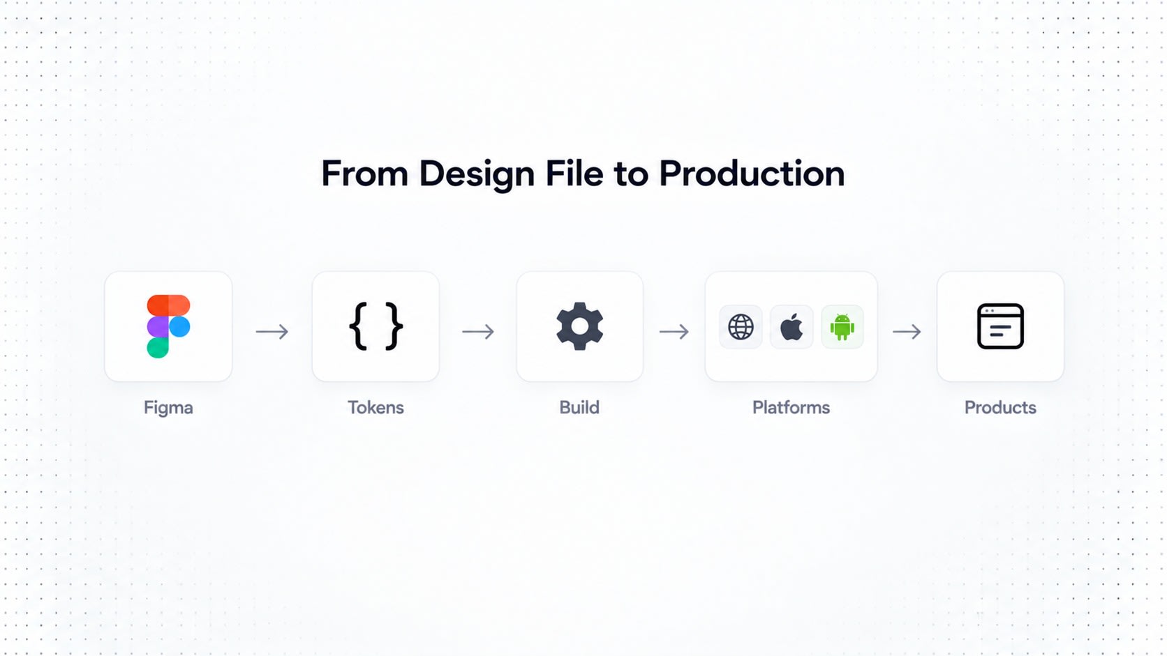
Tokens shouldn't just live inside the design tool, quietly gathering dust while developers hardcode hex values separately like it's still 2014.
Token structure in code:
{
  "color": {
    "blue": {
      "600": "#2563EB"
    },
    "action": {
      "primary": "{color.blue.600}"
    }
  }
}
That becomes a CSS variable:
--color-action-primary: #2563EB;or platform-specific output:
Web     → CSS variables
React   → TypeScript tokens
iOS     → Swift
Android → Kotlin
This is the moment tokens stop being "a Figma thing" and become a shared source of truth both design and engineering can actually trust, instead of that one spreadsheet everyone secretly hates but keeps using anyway.
Token Governance
A token system can turn into absolute chaos fast if anyone is allowed to create whatever they feel like, whenever they feel like it, no approvals, no questions asked, like a group chat with no admin.
Picture 15 designers, each independently inventing their own version of the exact same token:
blue-main
primary-blue
brand-blue
button-blue
blue-primary
main-action-blue
Congratulations, you didn't build a system. You built six slightly different opinions wearing a trench coat pretending to be a system.
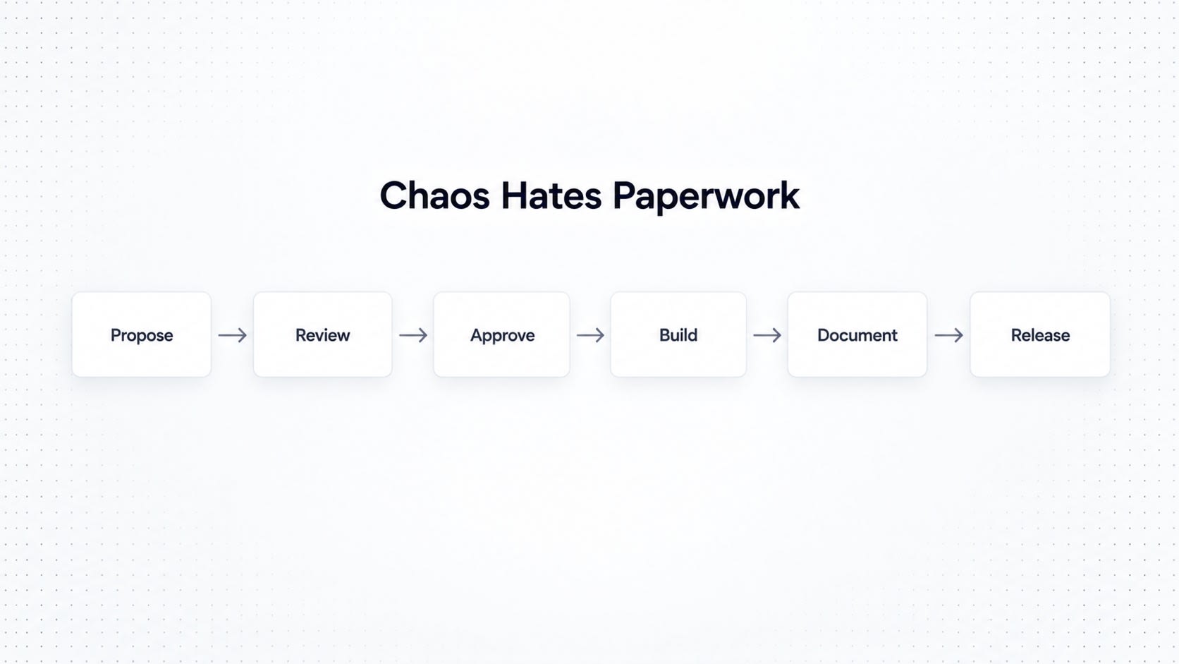
Enterprise token systems need real governance. Define:
who can create tokens
who can modify tokens
naming conventions
ownership
review processes
versioning
deprecation
documentation
breaking-change policies
A typical lifecycle:
New Token
    ↓
Proposal
    ↓
Design-System Review
    ↓
Approved
    ↓
Implementation
    ↓
Documentation
    ↓
Release
Yes, it looks like a mini approval workflow from a corporate expense report. That's the point. Chaos hates paperwork.
Naming Tokens Correctly
Naming is one of the most underrated parts of this entire process, and also the part everyone gets lazy about first, right after "we'll document it later" (you will not document it later).
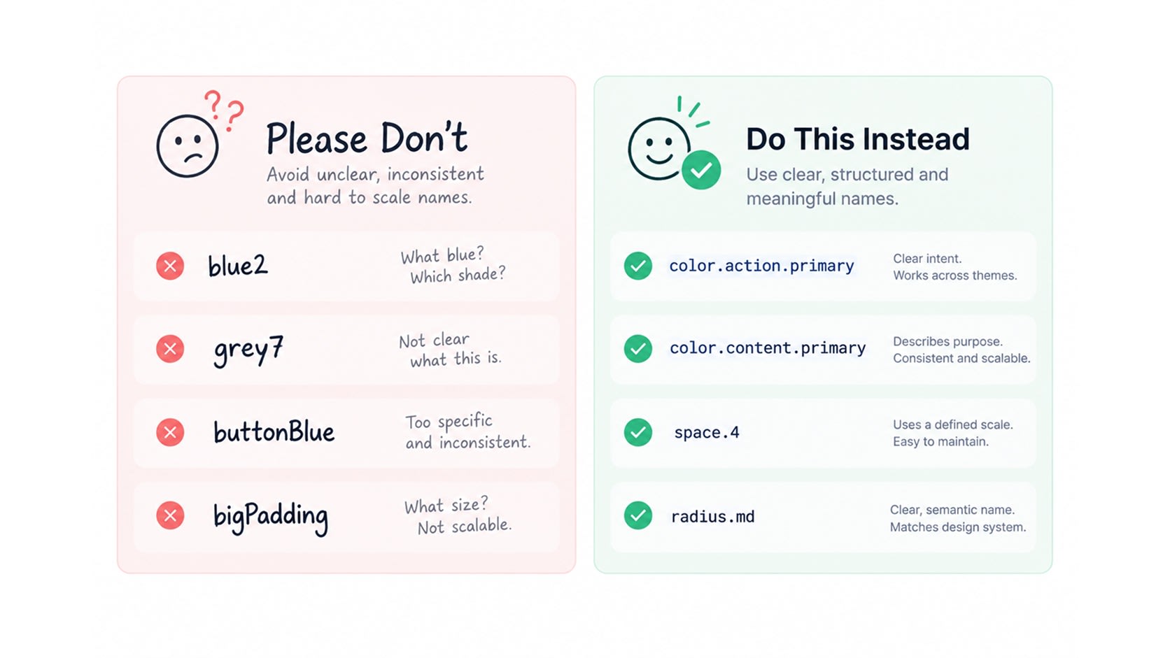
Avoid names like:
blue2
grey7
buttonBlue
bigPadding
These read like Wi-Fi passwords, not design decisions.
Prefer names based on role and intent:
color.action.primary
color.content.primary
space.4
radius.md
At the component layer:
component.button.primary.backgroundThe exact naming convention will differ across teams, and that's fine. But the underlying rule shouldn't budge:
Name the decision by its role, not by how it currently looks.
If your primary action color changes from blue to purple tomorrow because marketing "had a vision," the token name shouldn't need to change with it. That's the entire point of doing this right.
When Should You Create a Token?
Not every value deserves to become a token. That way lies madness, and a token list longer than your company's onboarding deck.
A useful question to ask:
Is this value a reusable design decision that needs to stay consistent, change globally, or get used across multiple components?
If yes, it probably deserves a token.
16px on its own doesn't mean much, it's just a number floating around, unsupervised. But space.4 represents a deliberate, repeatable spacing decision used across the entire system.
Same with #2563EB, just a color value, minding its own business. But color.action.primary represents an actual, intentional product decision, the kind that survives a rebrand.
A Practical Enterprise Token Checklist
Before declaring your token architecture "mature" (a word normally reserved for cheese and whiskey, but sure), run through this:
Foundations
Do we have a controlled color scale?
Do we have a spacing system?
Are typography values standardized?
Are radius and elevation controlled?
Are motion values defined?
Semantics
Do components consume semantic tokens?
Are tokens based on intent rather than appearance?
Are states standardized?
Themes
Can the system support light and dark modes?
Can we add high-contrast modes?
Can themes change without rebuilding components?
Brands
Can multiple brands share the same component architecture?
Can visual identity change through token mappings alone?
Engineering
Can tokens be consumed outside Figma?
Is there a single source of truth?
Can tokens generate platform-specific outputs?
Governance
Is there a naming convention?
Is ownership clearly defined?
Are deprecated tokens managed properly?
Are breaking changes controlled?
If you can say yes to most of these, congratulations, you're no longer running a variable library. You're running actual design infrastructure, the kind that survives layoffs, rebrands, and that one PM who insists everything should "pop more."
The Mental Model to Remember
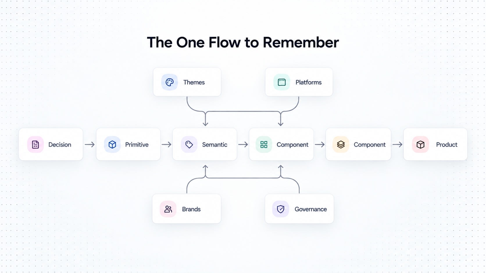
If you forget literally everything else in this document, remember just this one flow:
DESIGN DECISION
      ↓
PRIMITIVE TOKEN
      ↓
SEMANTIC TOKEN
      ↓
COMPONENT TOKEN
      ↓
COMPONENT
      ↓
PRODUCT
And wrapped around that core, holding it all together like duct tape holding together most successful startups:
                   THEMES
                      │
                      ↓
BRANDS → TOKEN SYSTEM ← PLATFORMS
                      ↑
                      │
                 GOVERNANCE
The goal was never to create a mountain of neatly labeled variables just to feel productive. The real goal is building relationships between design decisions, so the whole thing can scale without imploding every time a new brand shows up or someone joins the team with strong opinions about corner radius.
Final Thought
A component library answers one question: what can we reuse?
A design system answers a bigger one: how should we design consistently?
A token architecture goes one level deeper than both of those: how do we encode and govern these decisions so they scale across products, teams, brands and platforms, without forty different shades of blue quietly multiplying like rabbits?
That's really why design tokens matter this much at enterprise scale.
They're not just variables sitting quietly in a JSON file somewhere, ignored, unloved, occasionally referenced during a design review nobody prepared for.
They're the actual infrastructure holding the whole interface together, the unpaid intern of your design system, doing the real work while the components get all the credit.
Written (and mildly overcaffeinated) by Vishal Anand (Founder) and Syed Musuddiq (Head of Design) at UI Pirate.
Personalized Help
Struggling with Design Tokens: How to Build an Enterprise-Grade Token System? Let's talk about your product.
UI Pirate is a product design & development agency trusted by 50+ SaaS founders and enterprise teams across the US, UK & beyond. Tell us what you need.